
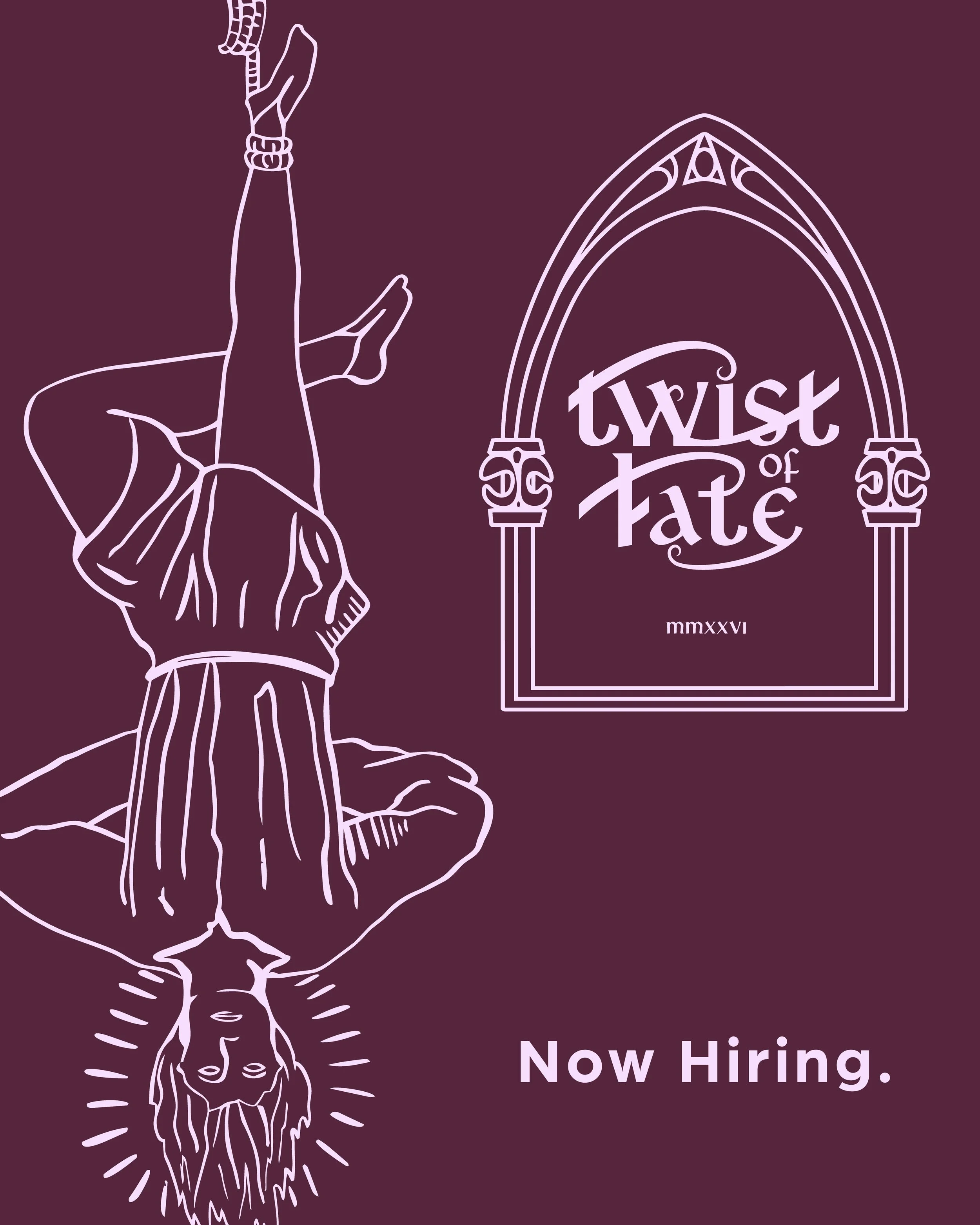
Twist of Fate
Art Direction, Graphic Design, Typography, Illustration
Tools
Procreate, Adobe Illustrator, Adobe Photoshop, Adobe After Effects, Adobe Indesign
Twist of Fate is a dive bar opening in Fremont, Seattle in June 2026. Located in a gutted and rebuilt house, the space retains the bones of something worn and lived-in while the interior has been entirely reimagined. The bar sits in one of Seattle's most creative and irreverent neighborhoods — Fremont (which does not respond to polish). It responds to character, grit, and things that feel like they have a history even when they are new.
The Business
Not a cocktail bar trying to be approachable. Not a sports bar. Not a theme bar. A dive bar with a point of view — the kind of place that has been here forever even though it just opened. The gothic references are atmospheric, not costume. Dark, layered, textured, and slightly mysterious without being alienating.
Positioning
Medieval gothic as atmosphere, not costume. Illuminated manuscript details, blackletter adjacent type used sparingly, heraldic structure without the kitsch, aged textures that feel earned rather than applied. Every element should feel like it could have existed in 1987 or 1387 and you are not entirely sure which.
Visual Design
Gothic without gatekeeping. Dark without cold. Historic without costume. The brand should feel like a place, not a theme. Every design decision is tested against one question: would every demographic of drinking age feel welcome here?
Constraint
Fremont locals aged 21 to 99. Creative, independent, skeptical of anything that tries too hard. They drink Rainier and mezcal in the same night. They notice when something is well made and they notice when something is fake. The brand has to earn their trust by not asking for it.
Audience
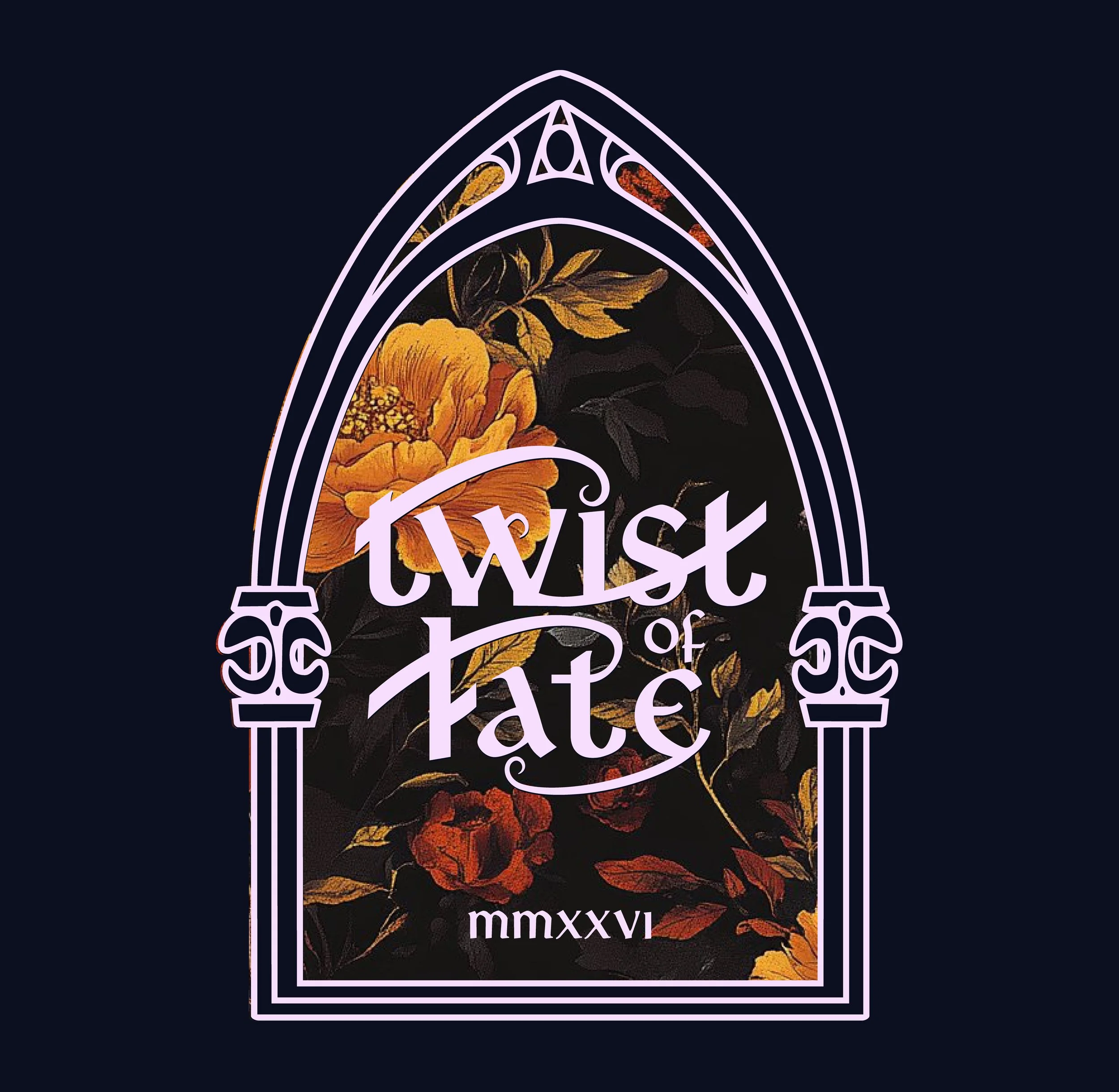
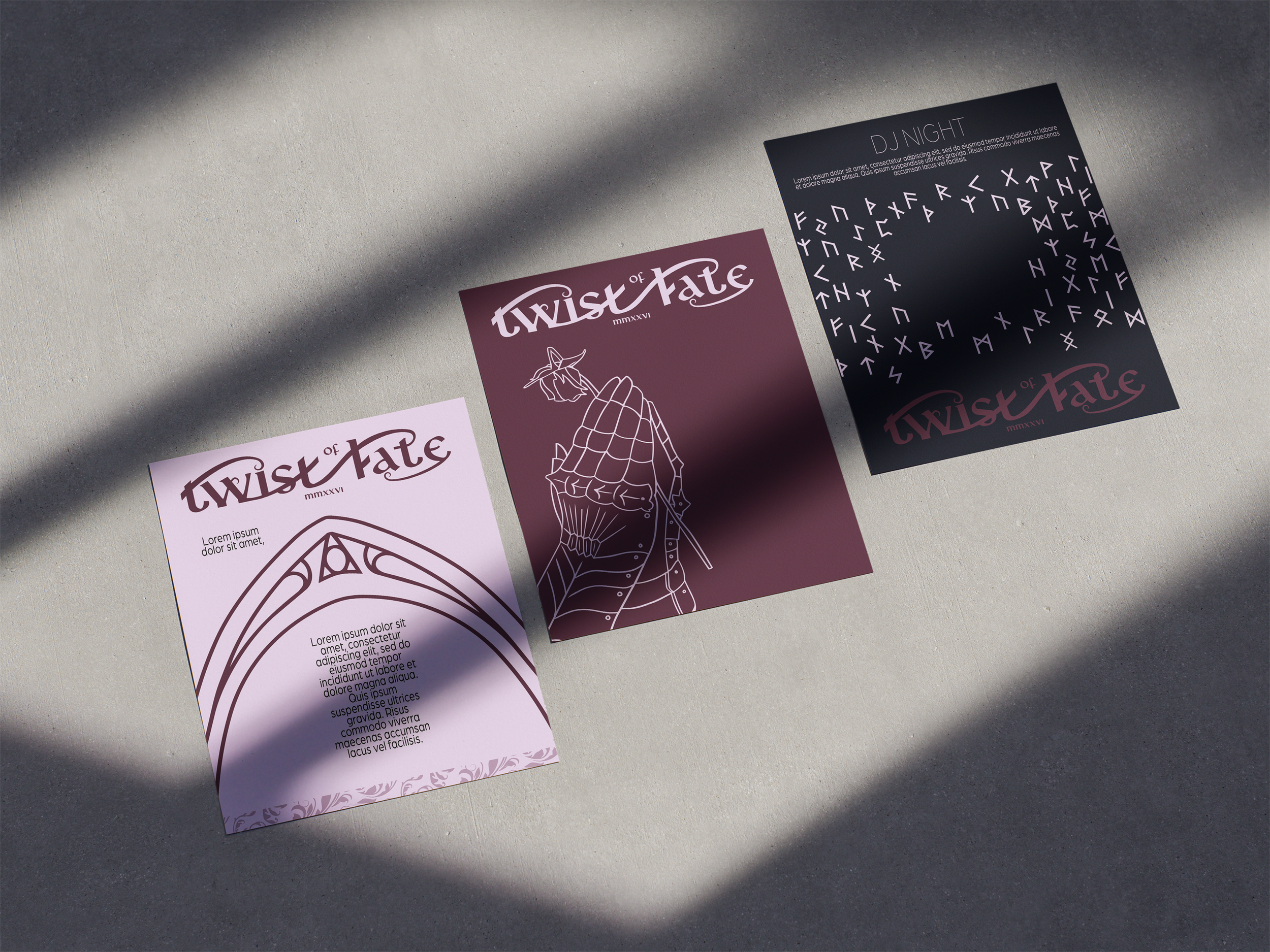
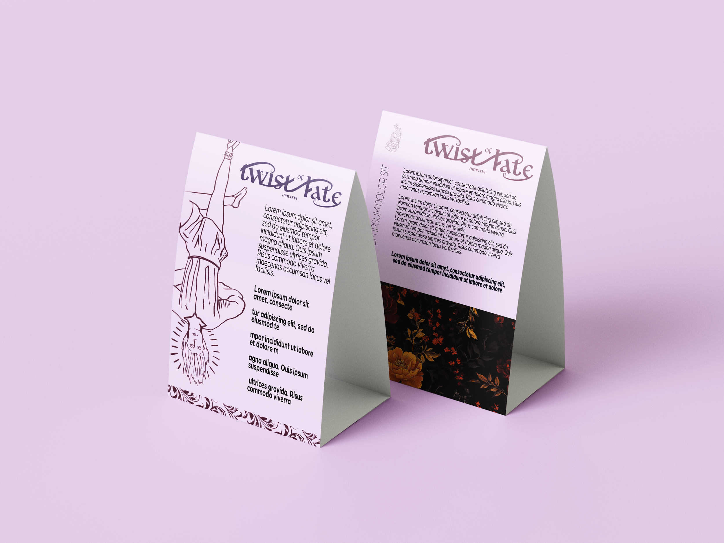
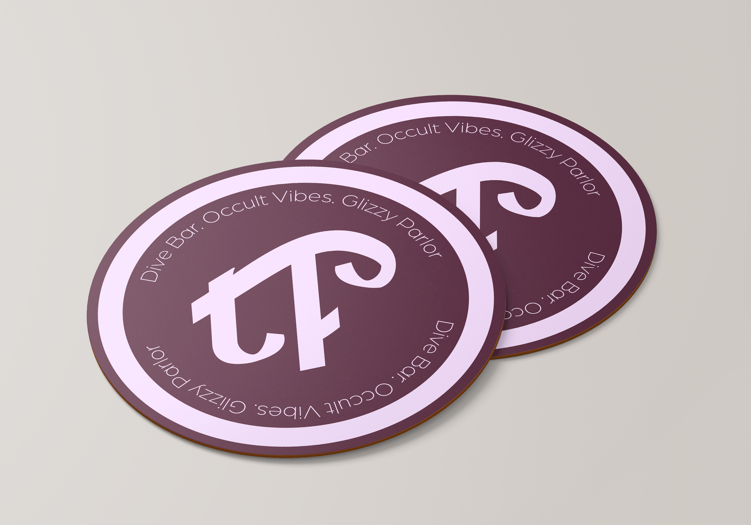
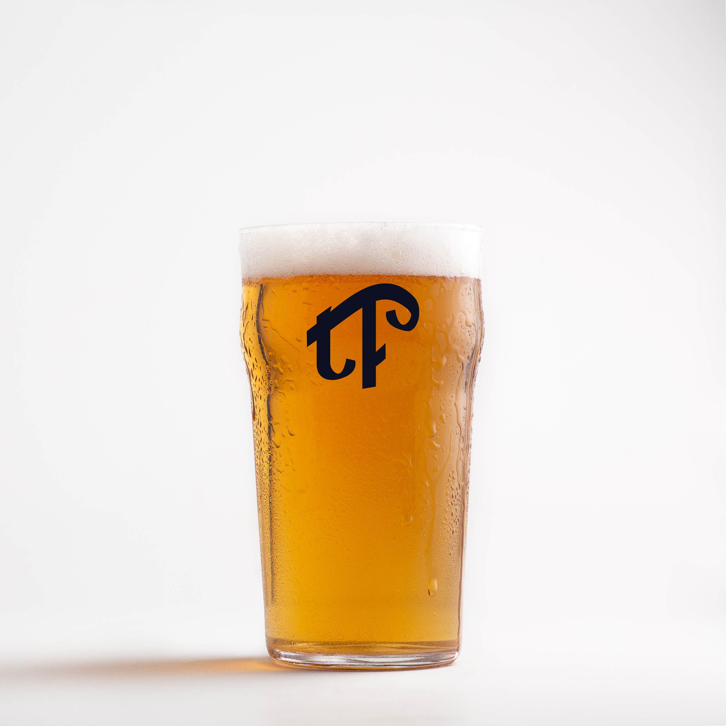
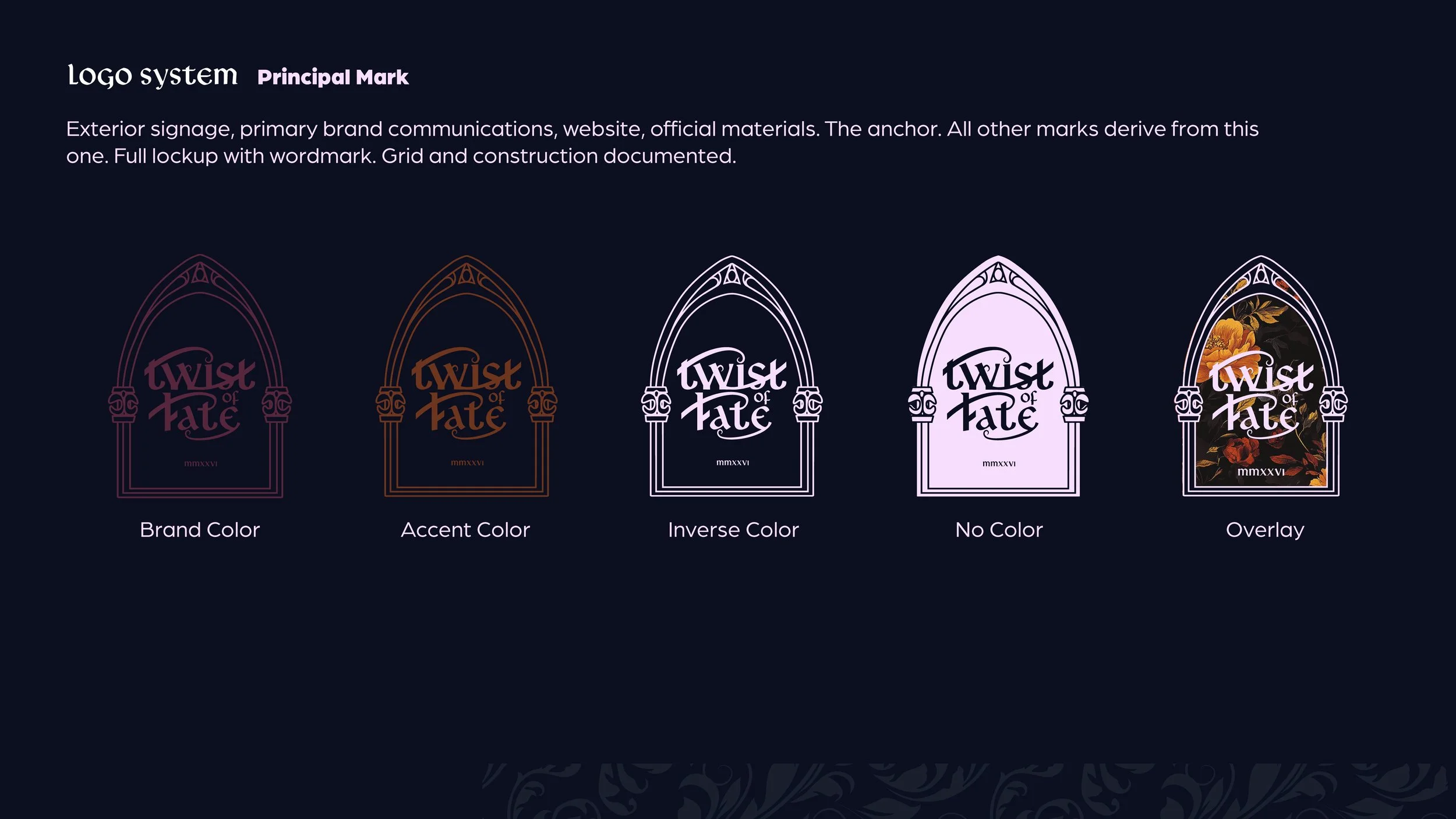
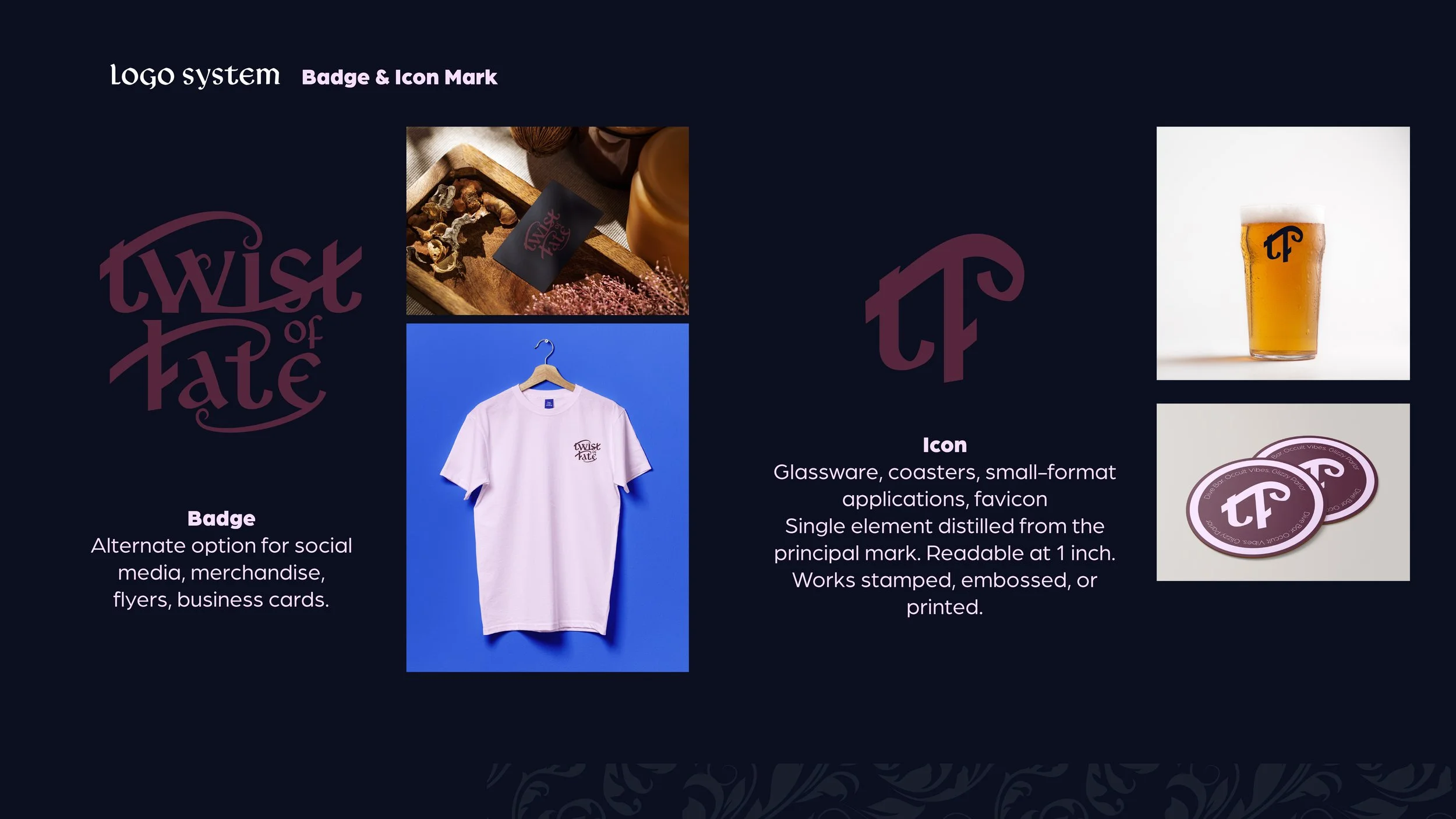
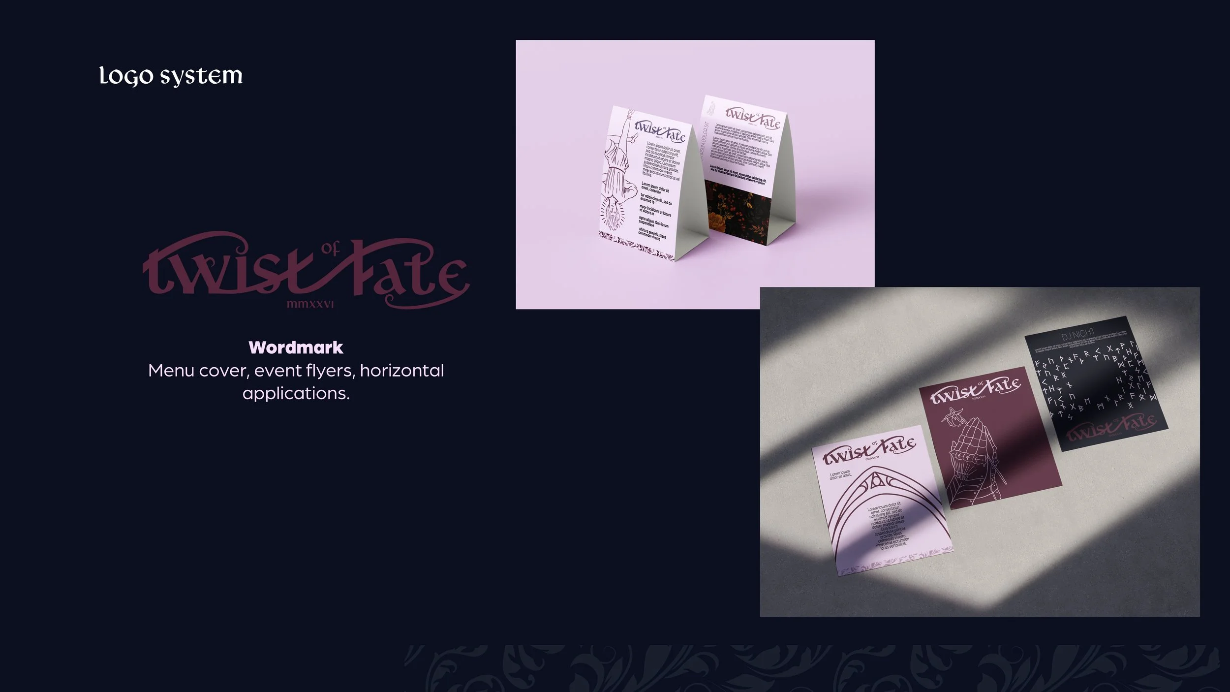
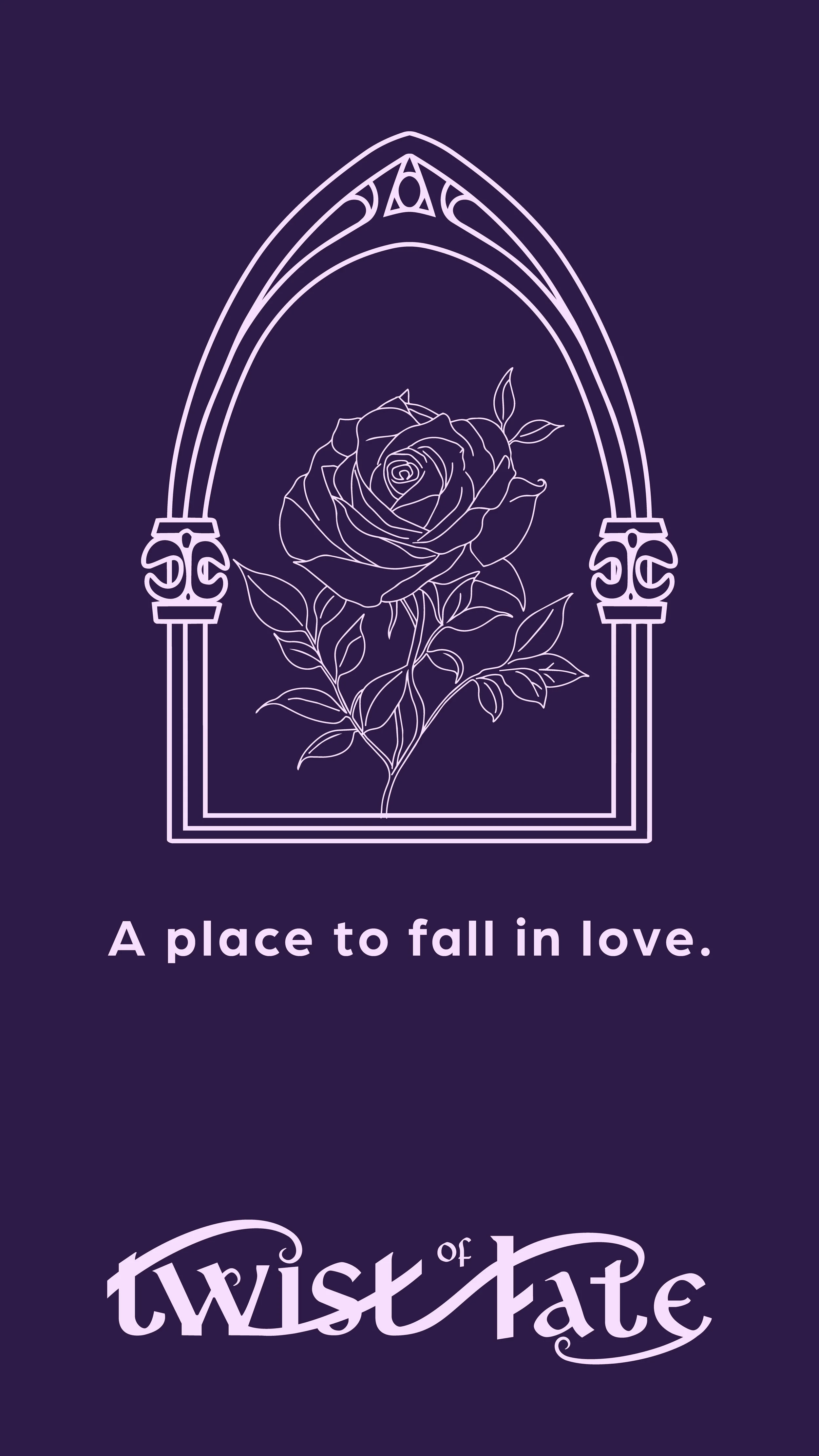
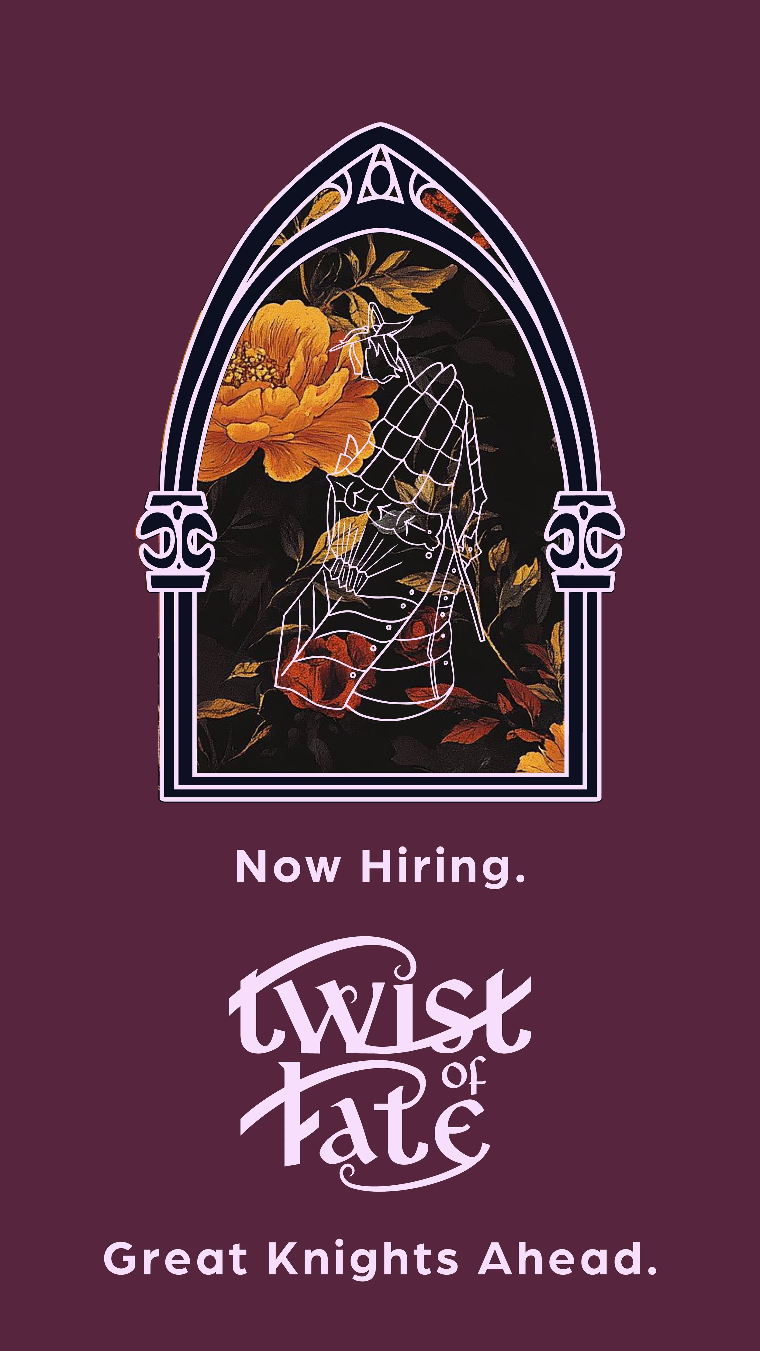
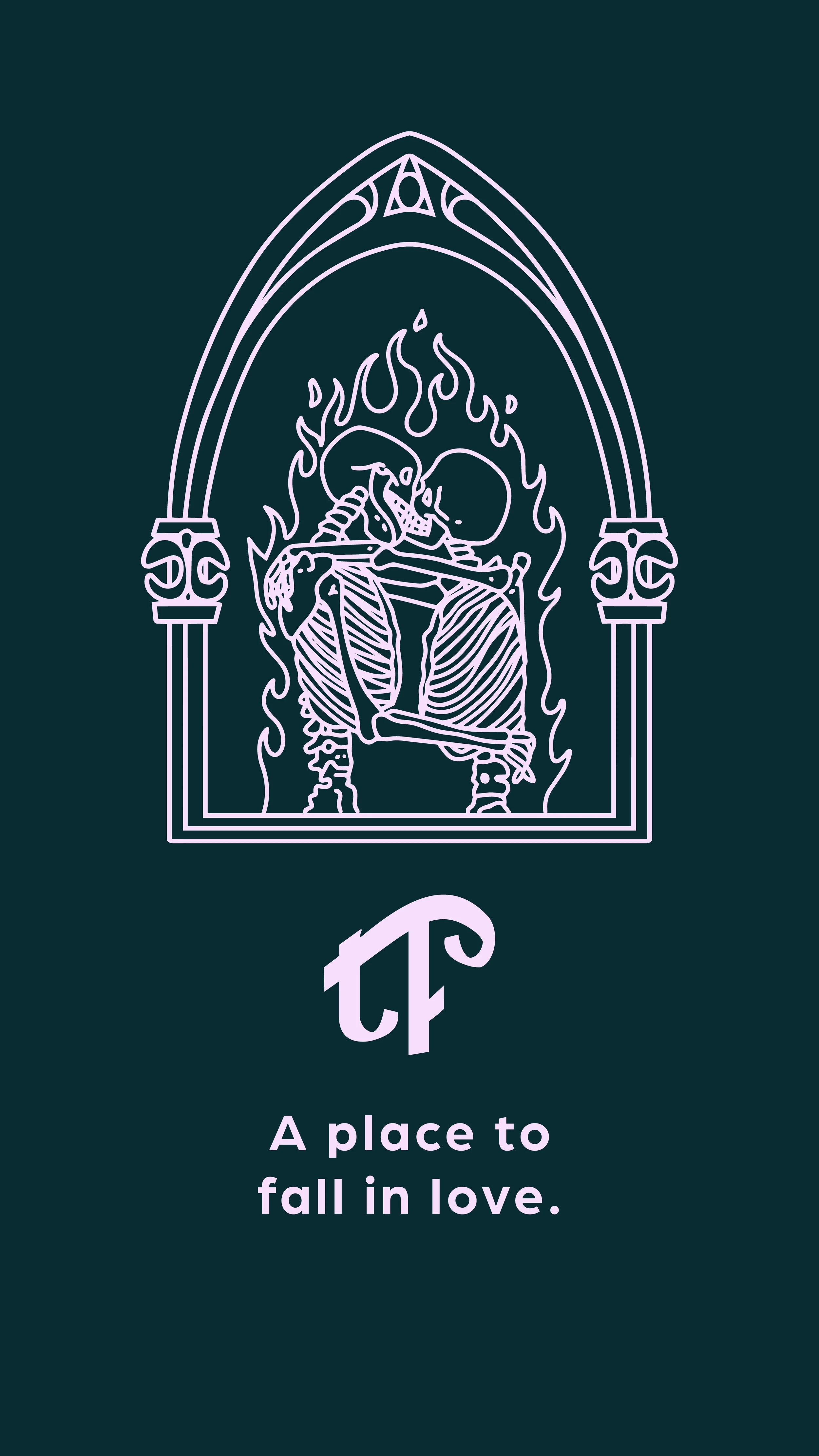
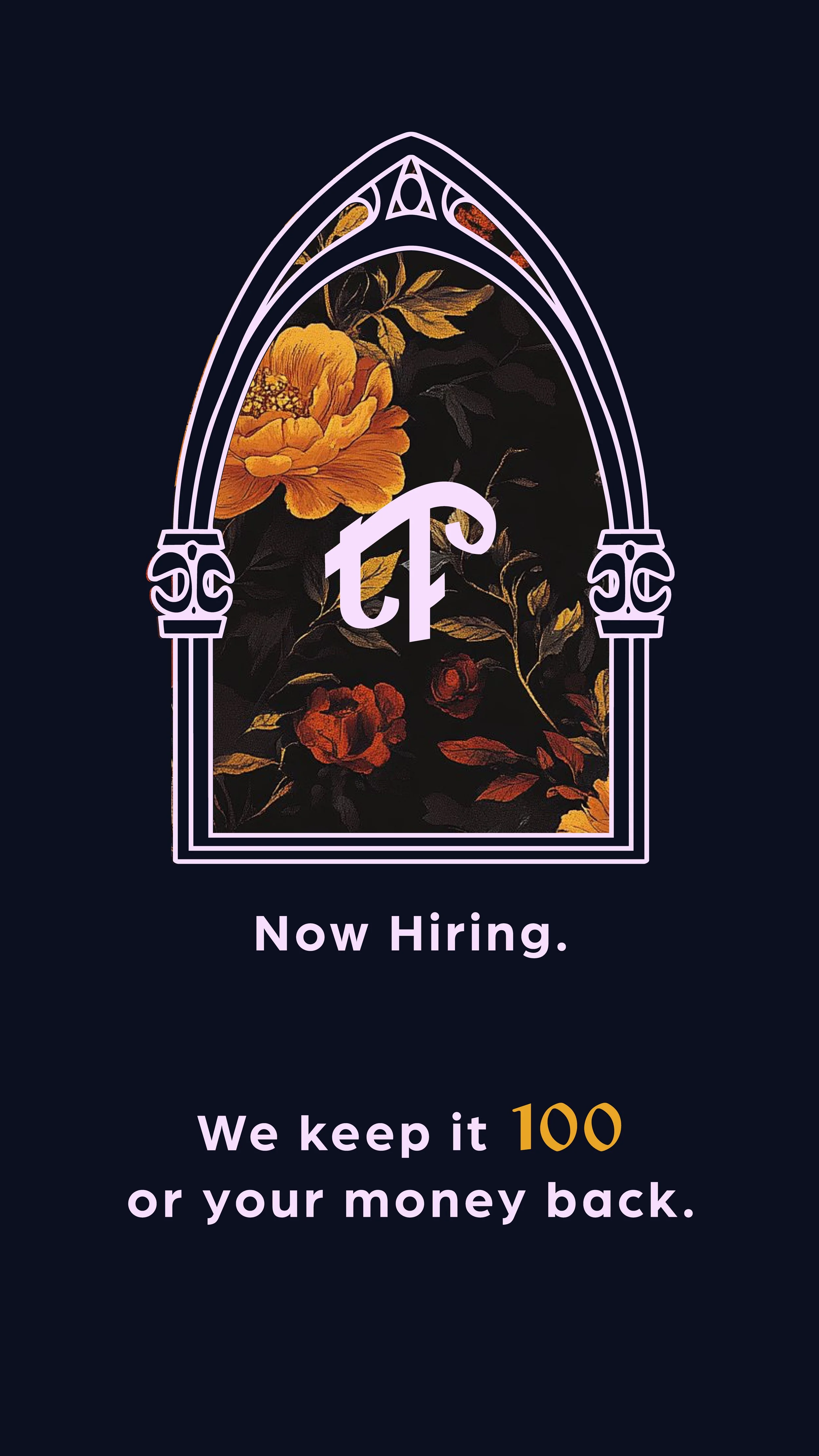
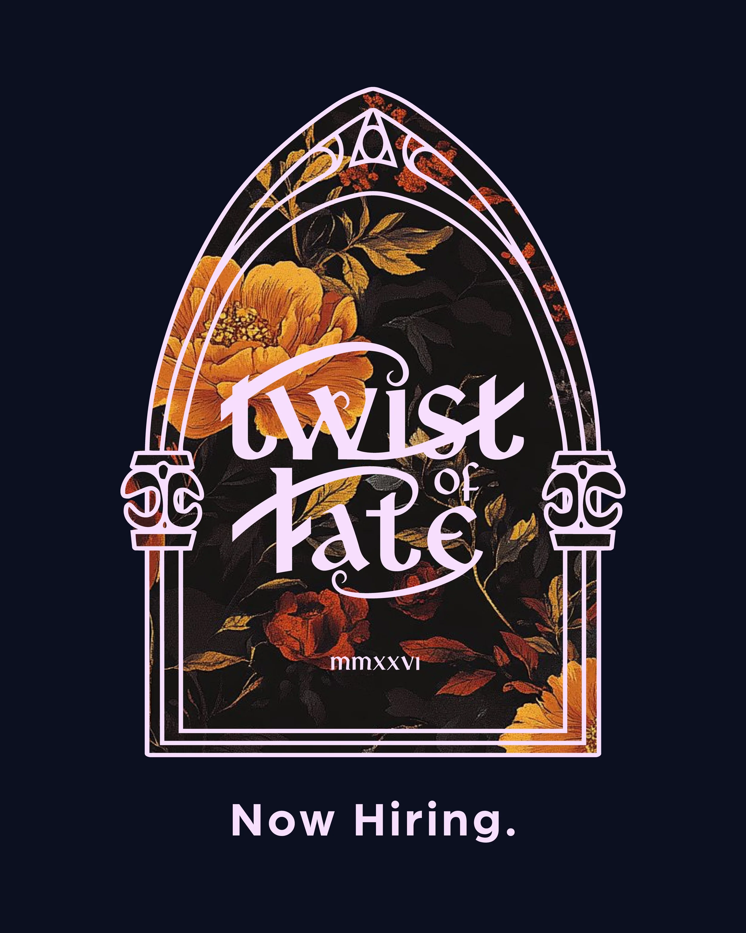
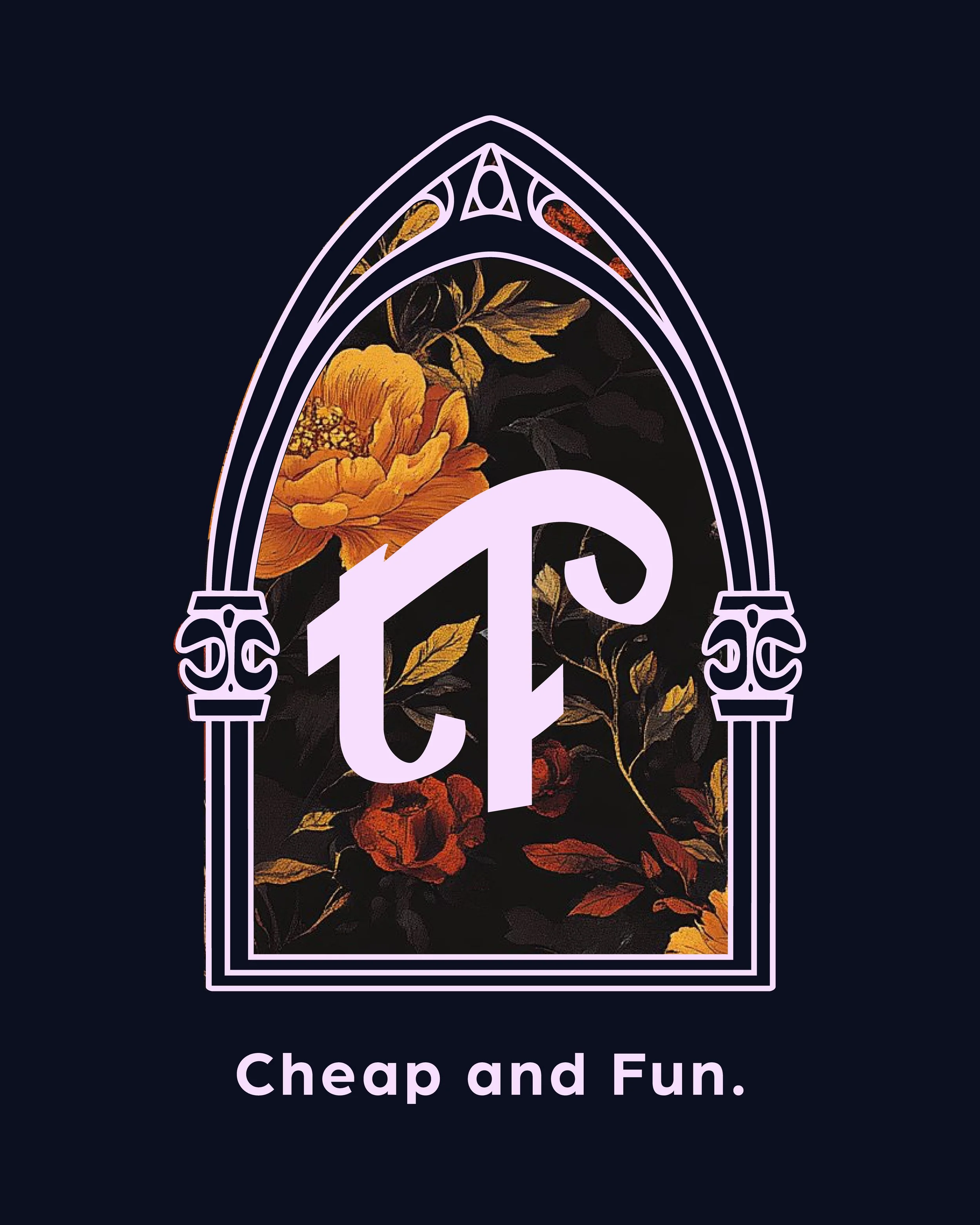
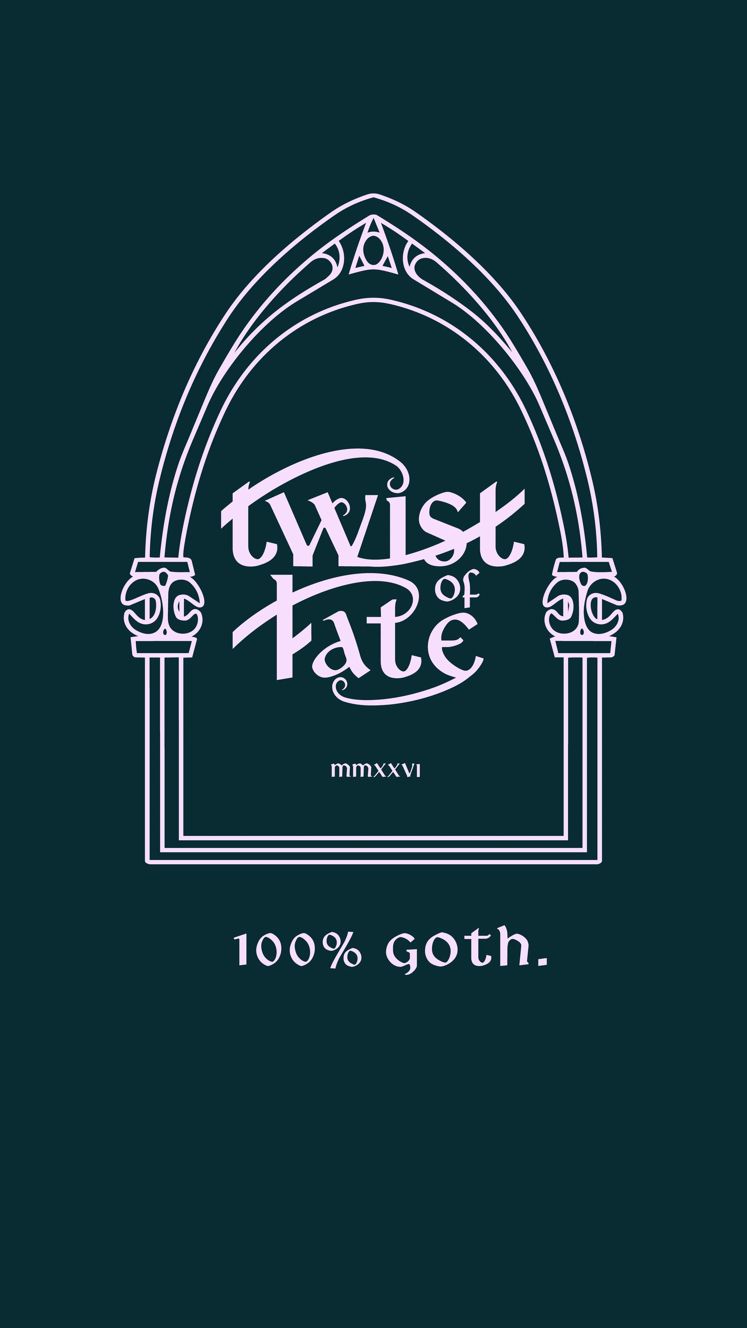
The brand uses a principal mark with a family of related marks — a system rather than a single logo. This is deliberate. Different marks for different surfaces and contexts, all traceable back to the same visual DNA. The principal mark anchors everything. Secondary marks adapt for glassware, signage, merchandise, and print without diluting the core identity. Multiple shifting logos are a feature of the brand, not a liability.
Logo System
Final Brand
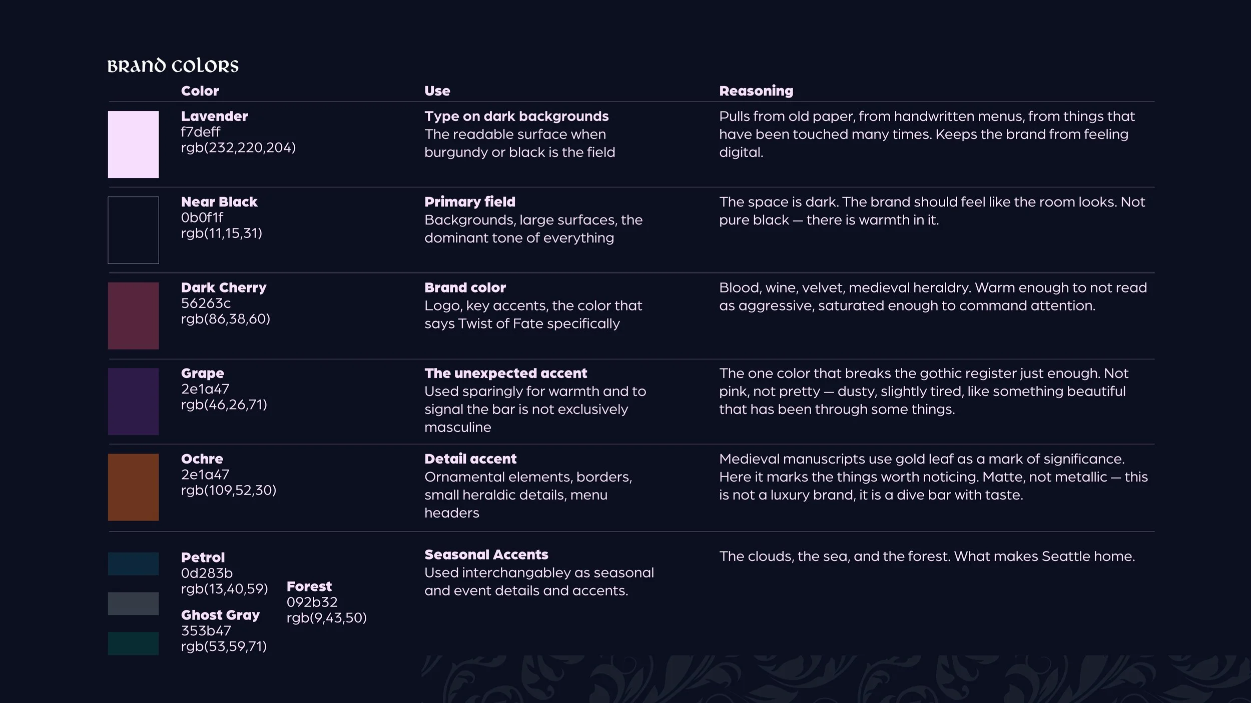
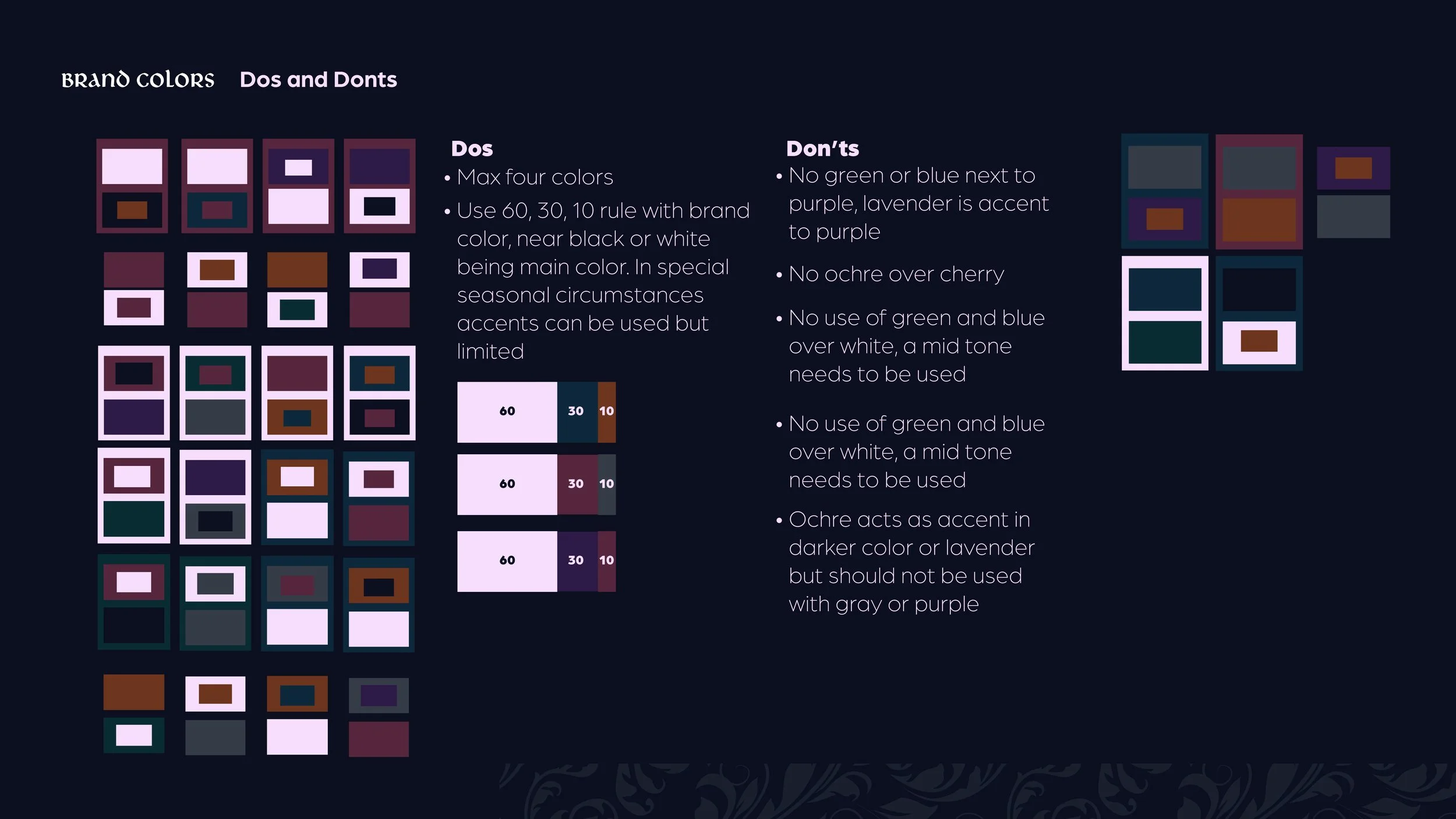
Brand Colors:
Lavender: Pulls from old paper, from handwritten menus, from things that have been touched many times. Keeps the brand from feeling digital.
Near Black: The space is dark. The brand should feel like the room looks. Not pure black — there is warmth in it.
Dark Cherry: Blood, wine, velvet, medieval heraldry. Warm enough to not read as aggressive, saturated enough to command attention.
Grape: The one color that breaks the gothic register just enough. Not pink, not pretty — dusty, slightly tired, like something beautiful that has been through some things.
Ochre: Medieval manuscripts use gold leaf as a mark of significance. Here it marks the things worth noticing. Matte, not metallic — this is not a luxury brand, it is a dive bar with taste.
(Seasonal) Petrol, Ghost Gray, Forest: The clouds, the sea, and the forest. What makes Seattle home.
Brand Development
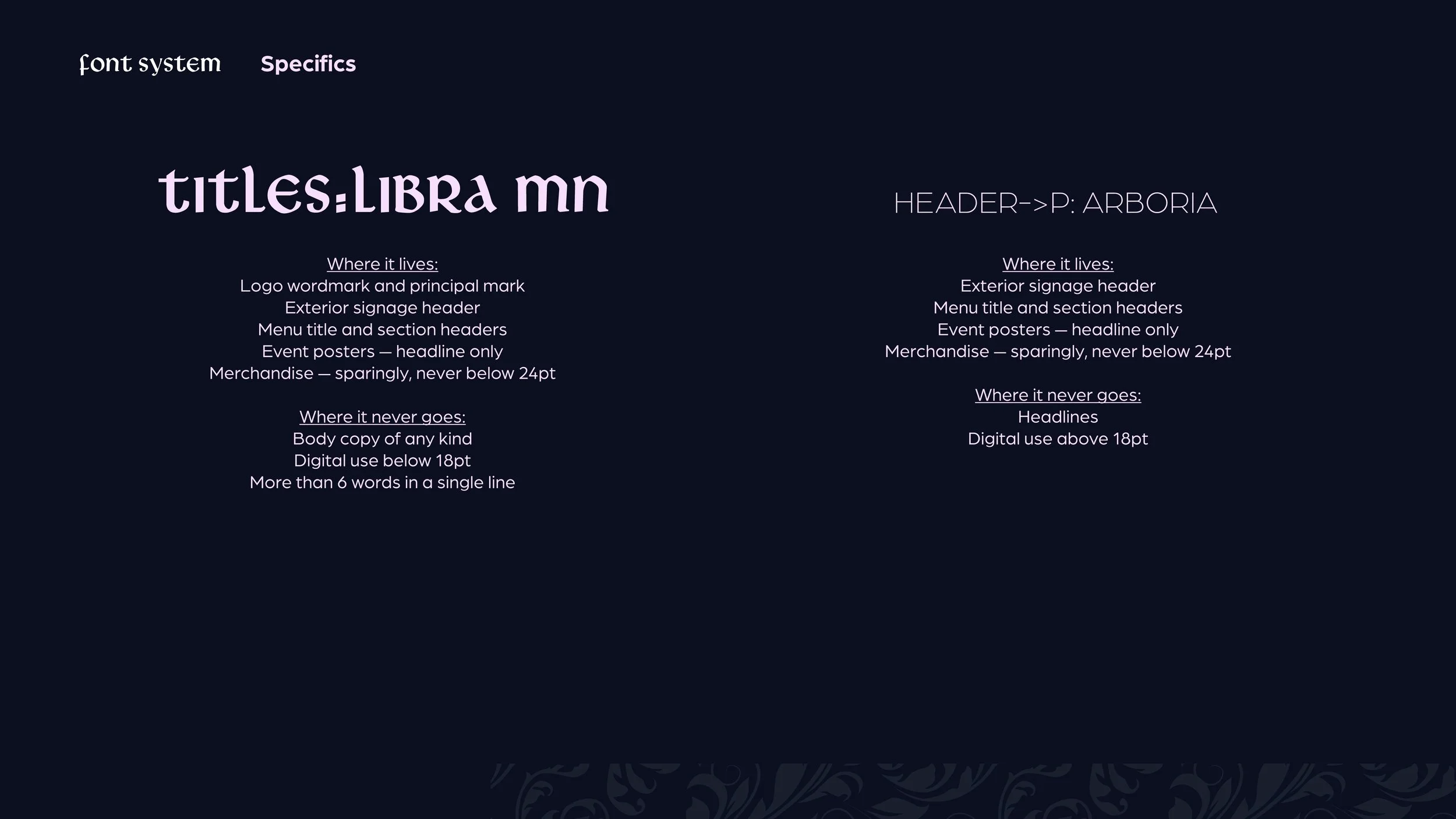
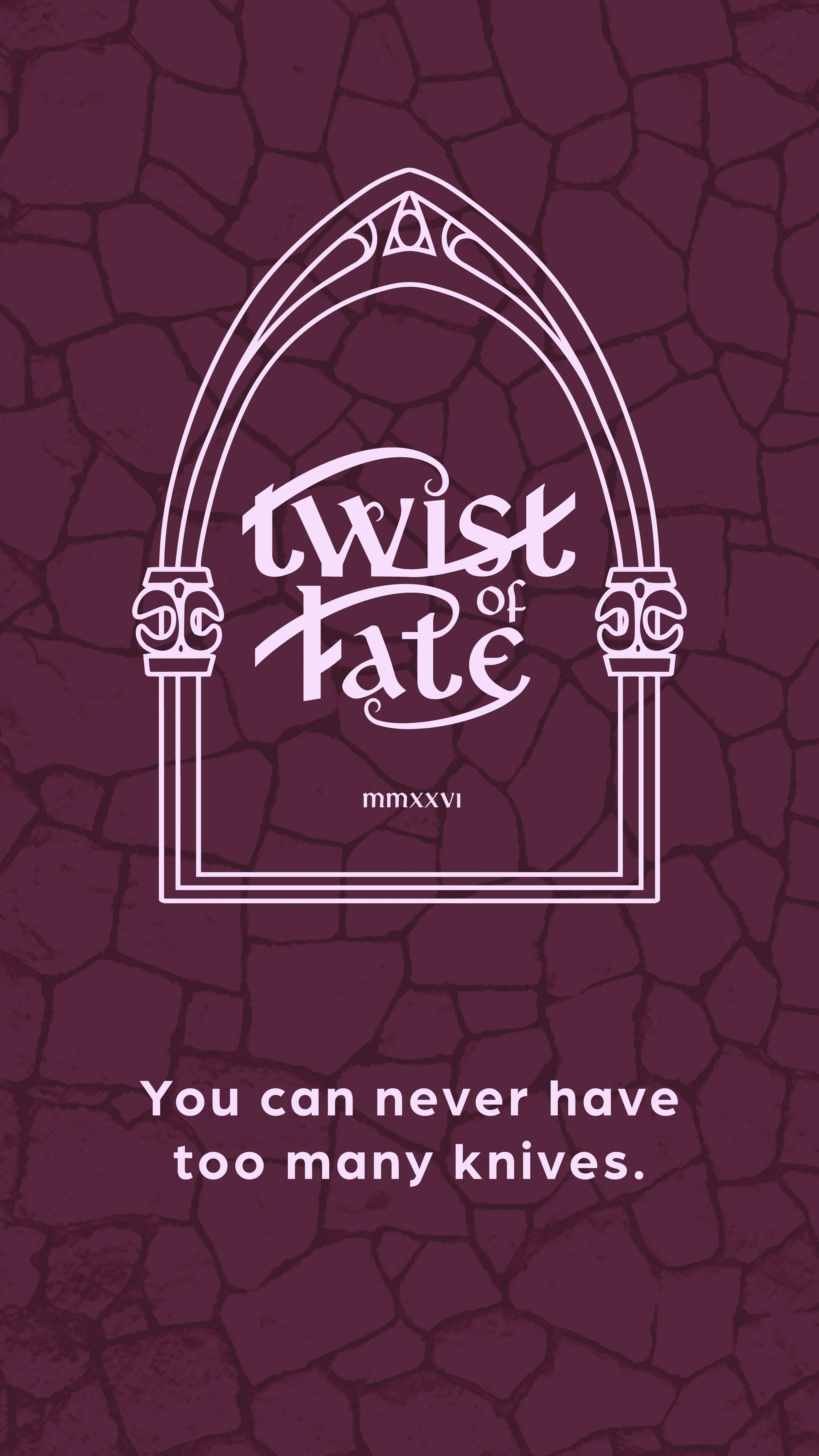
Font Development: Black letter was too on the nose to be the font choice in this project. There needs to be legibility and balance. The chosen font pair is Libra MN and Arboria. Libra is a medieval font which uses a mixture of capital and lowercase letters at the same heights which is a balanced serif both sporadic and elegant.
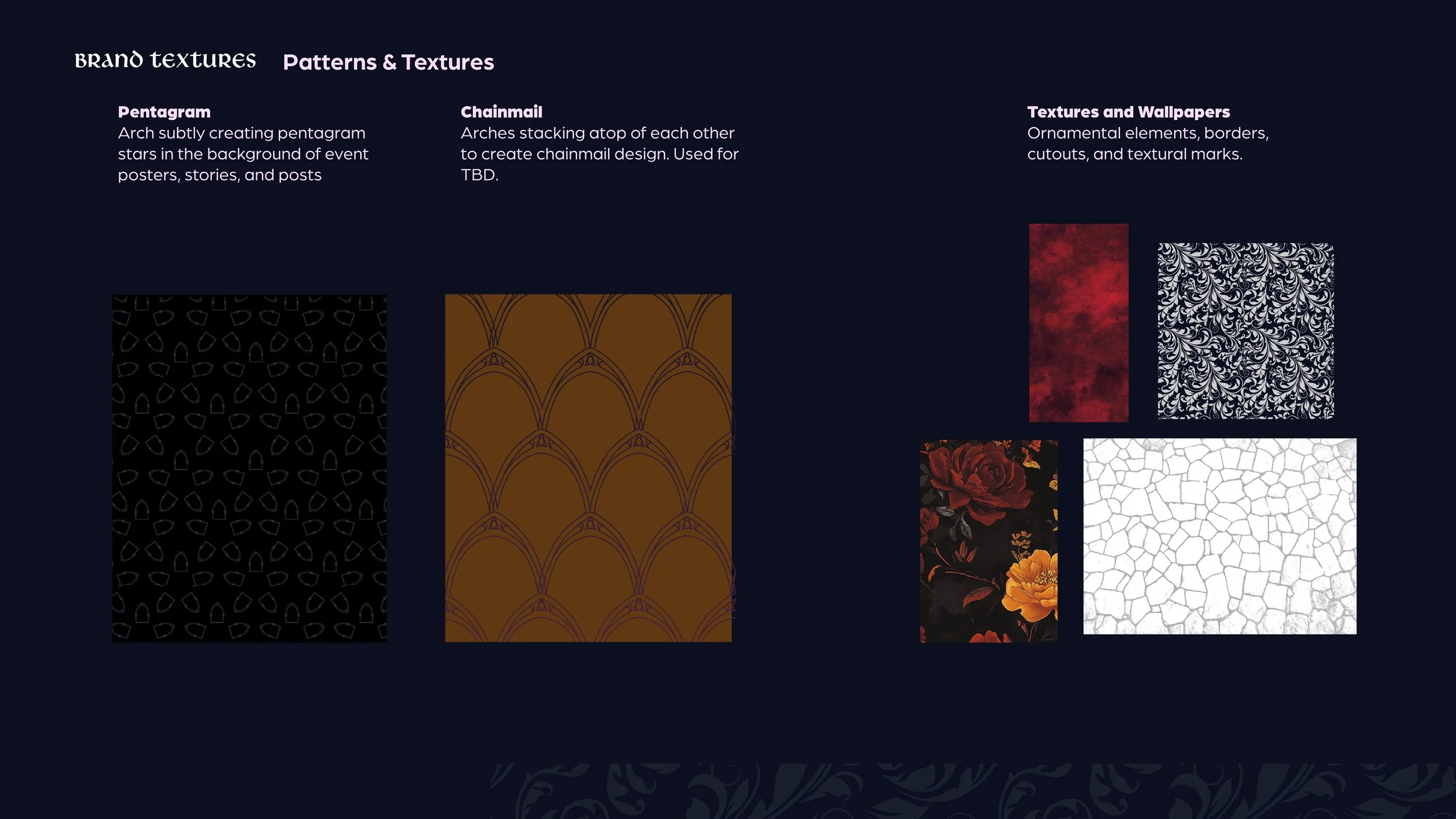
Pattern and Texture Development: The pentagram, chainmail, roses, broken stone, Venetian plaster, and paisley. Occult, medieval, gritty, and feminine.
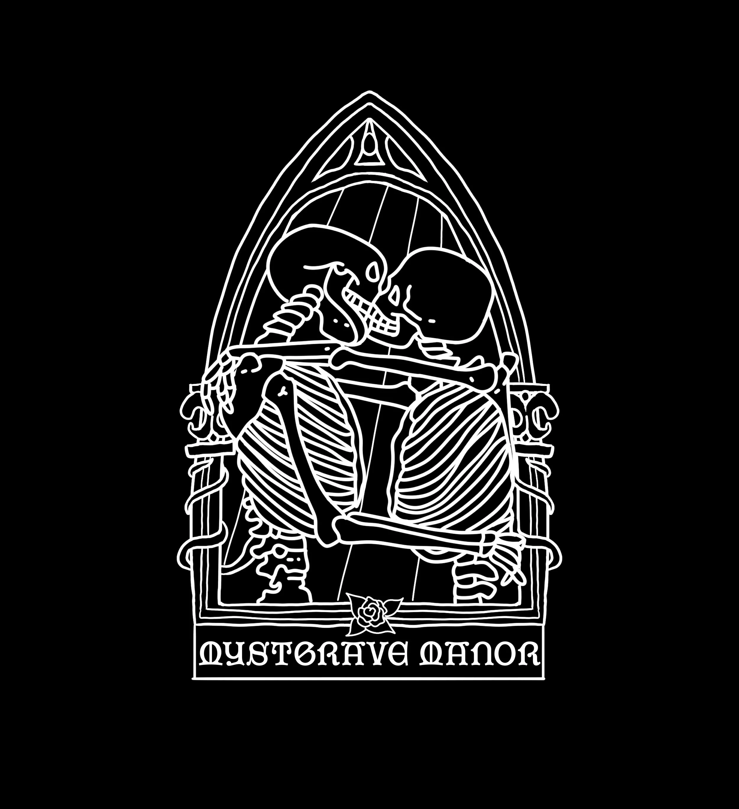
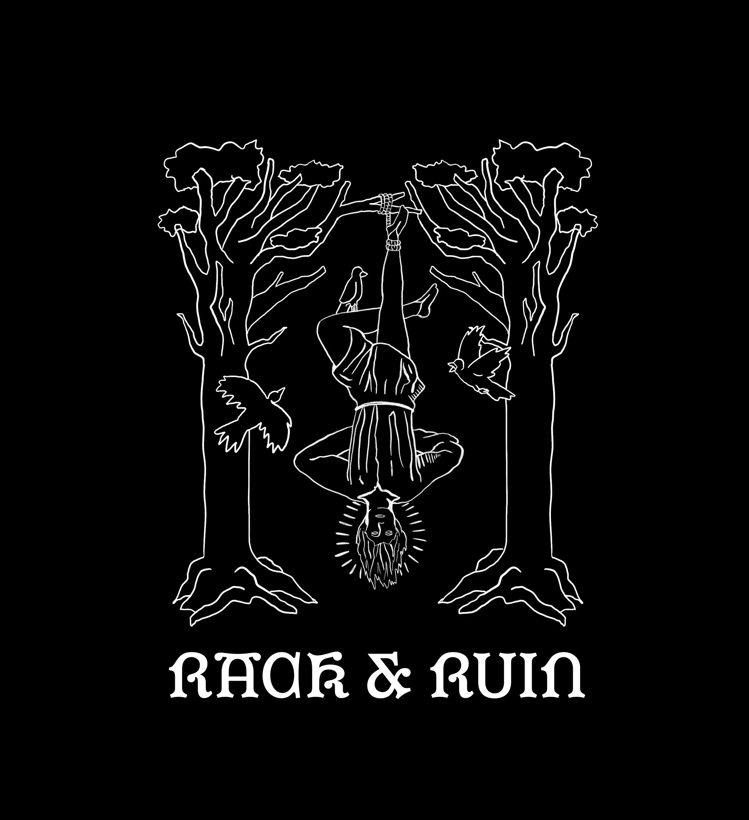
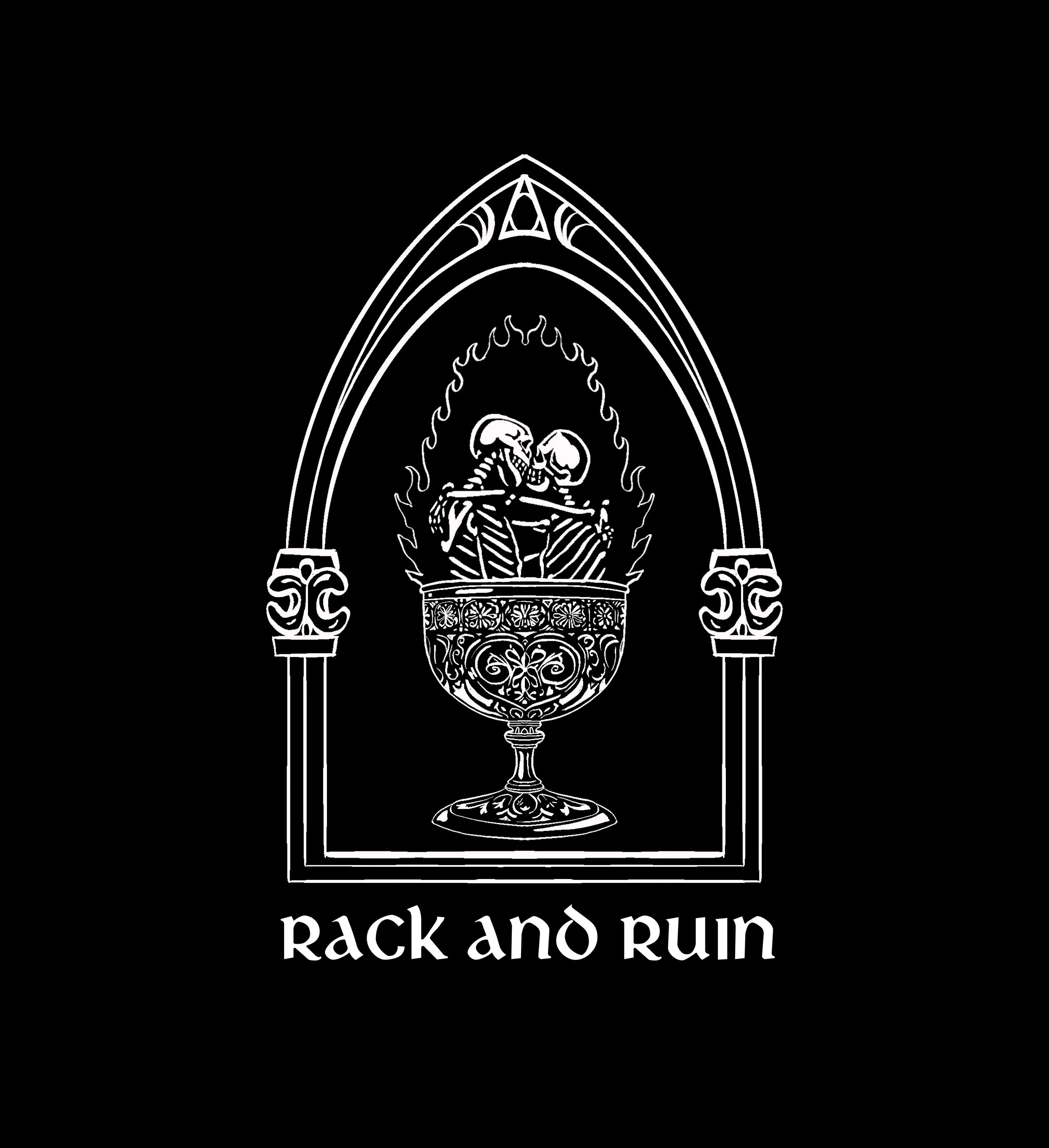
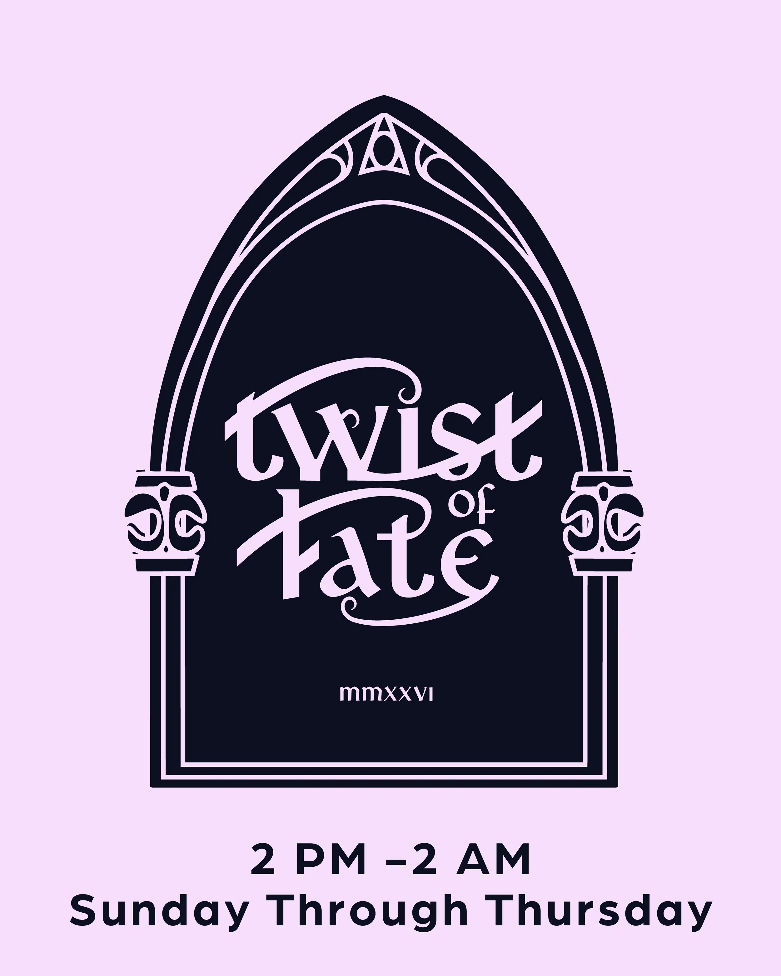
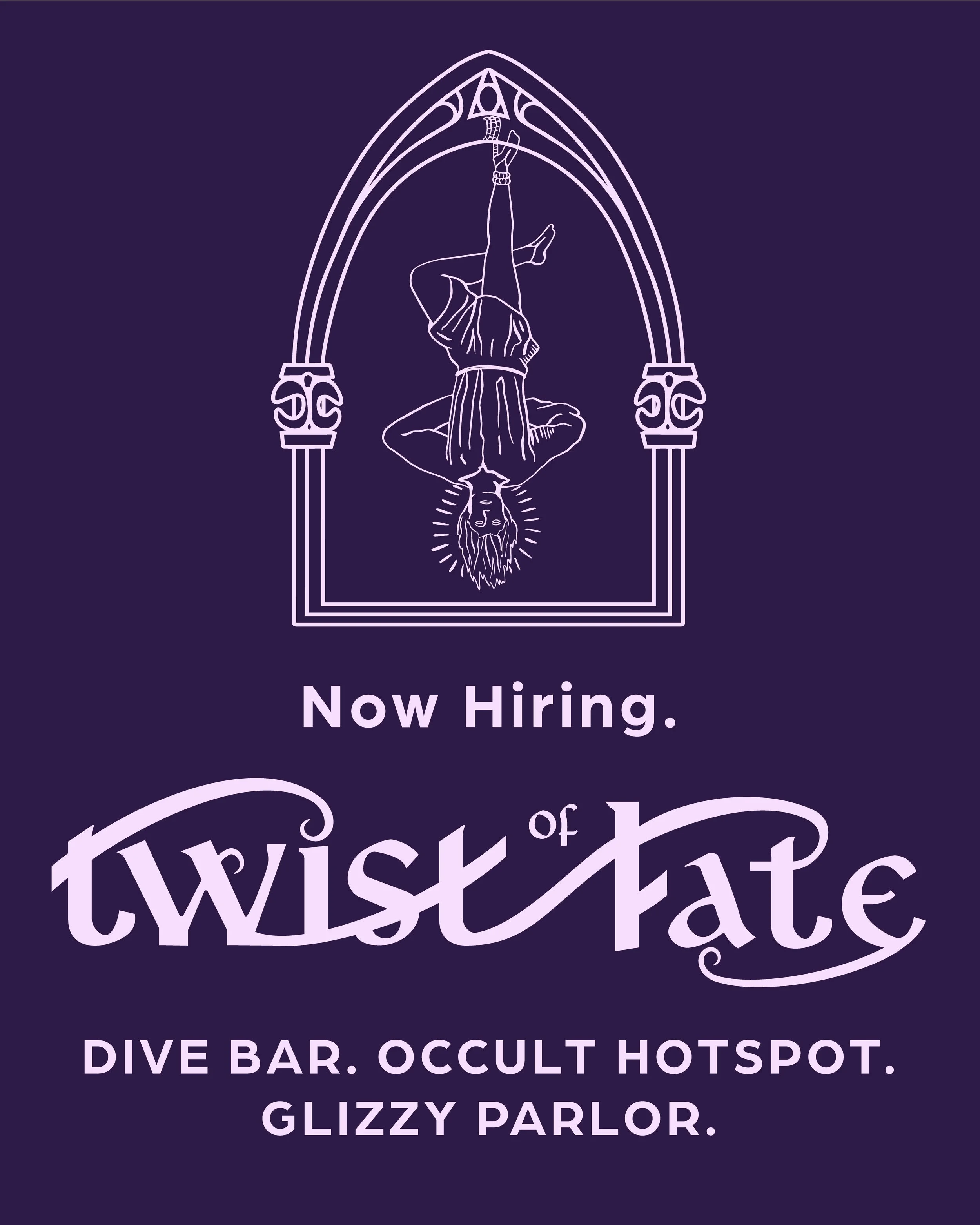
Logo Ideation: The possible names included Mystgrave Manor, Twist of Fate, House of Rack and Ruin, and Nightbound Manor. Originally drawing an gothic arch with skeletons kissing inside, the owner wanted to continue to explore the theme of under the arch. Here are ideas that I drew up in no particular order.
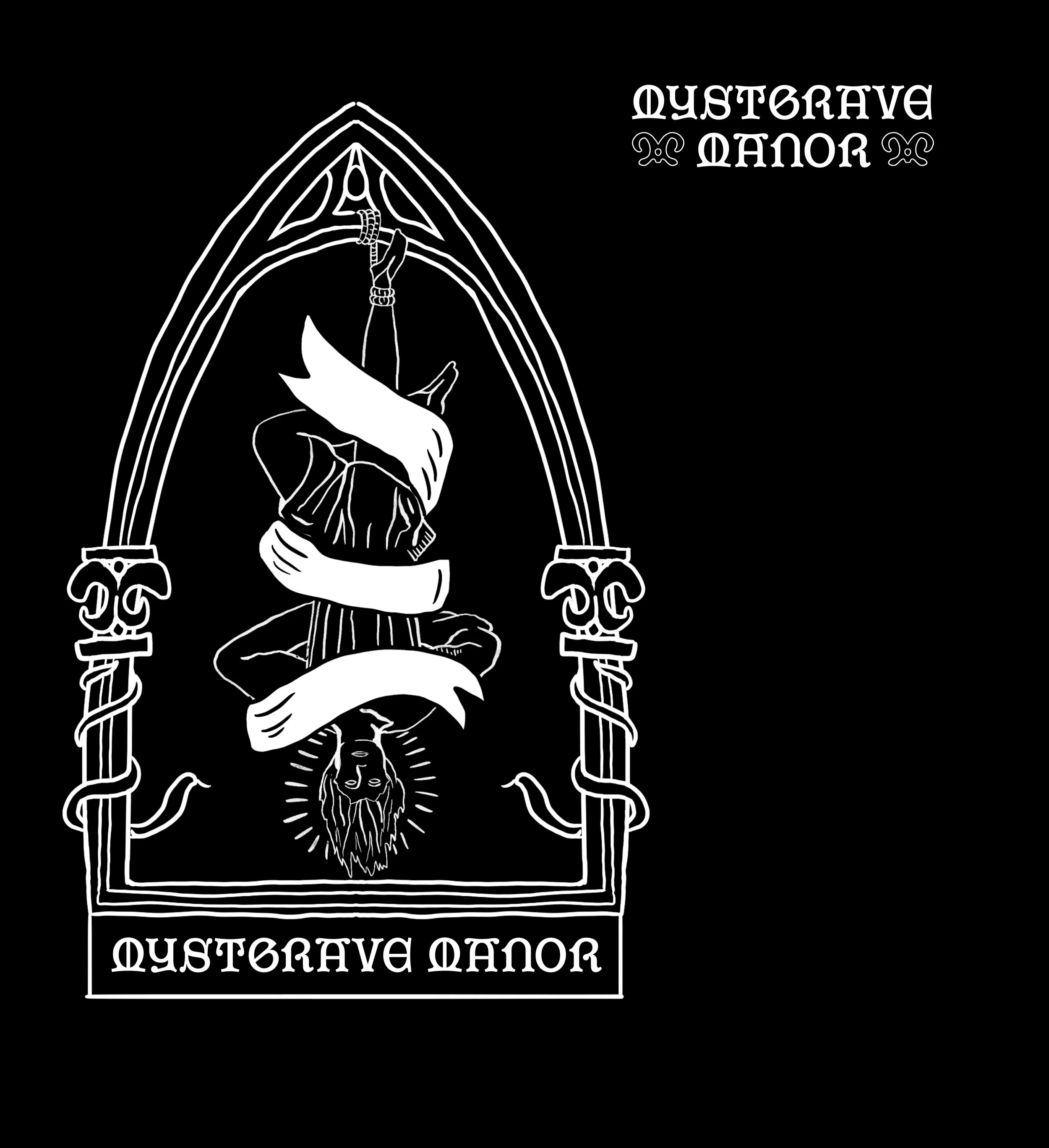
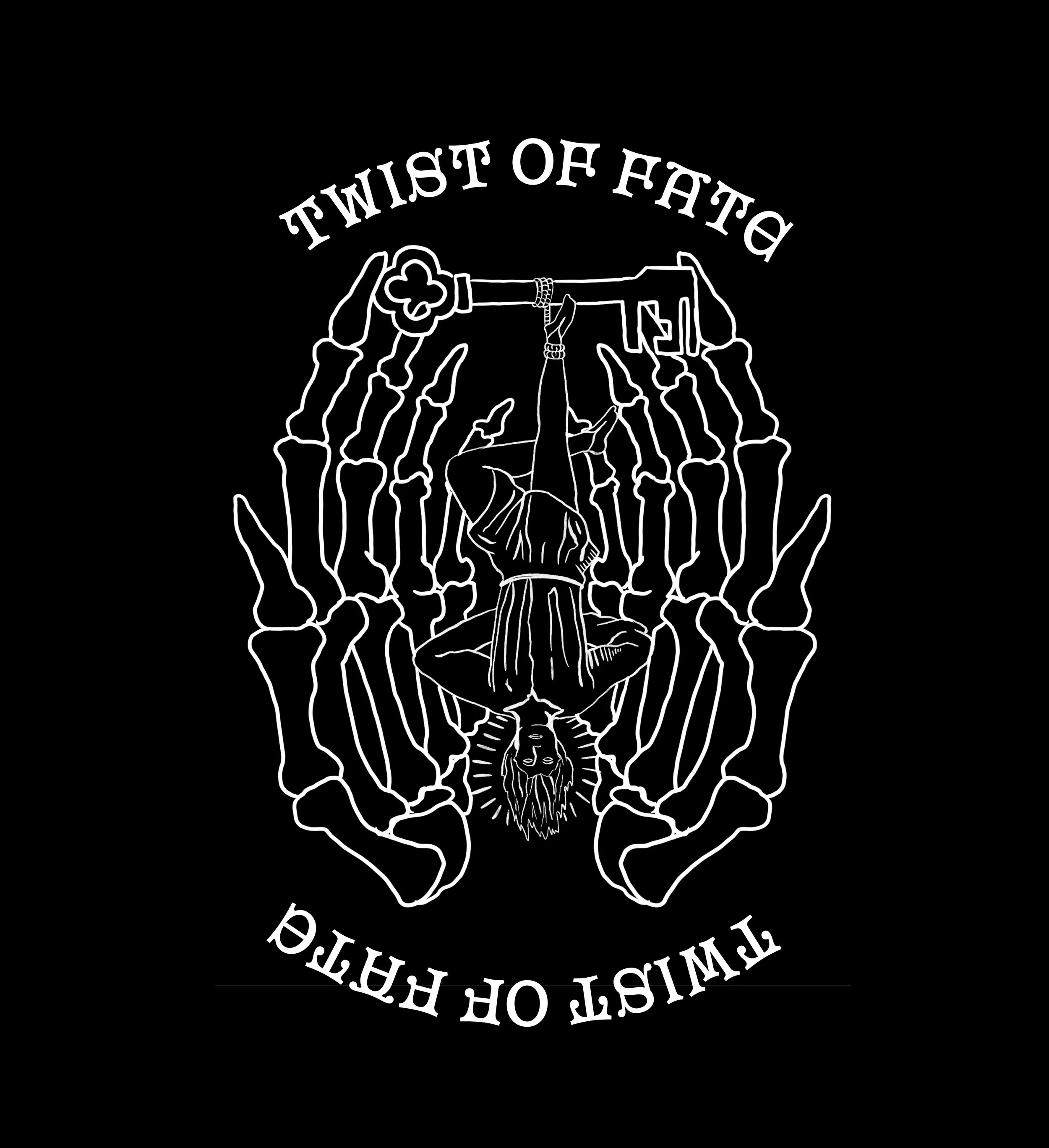
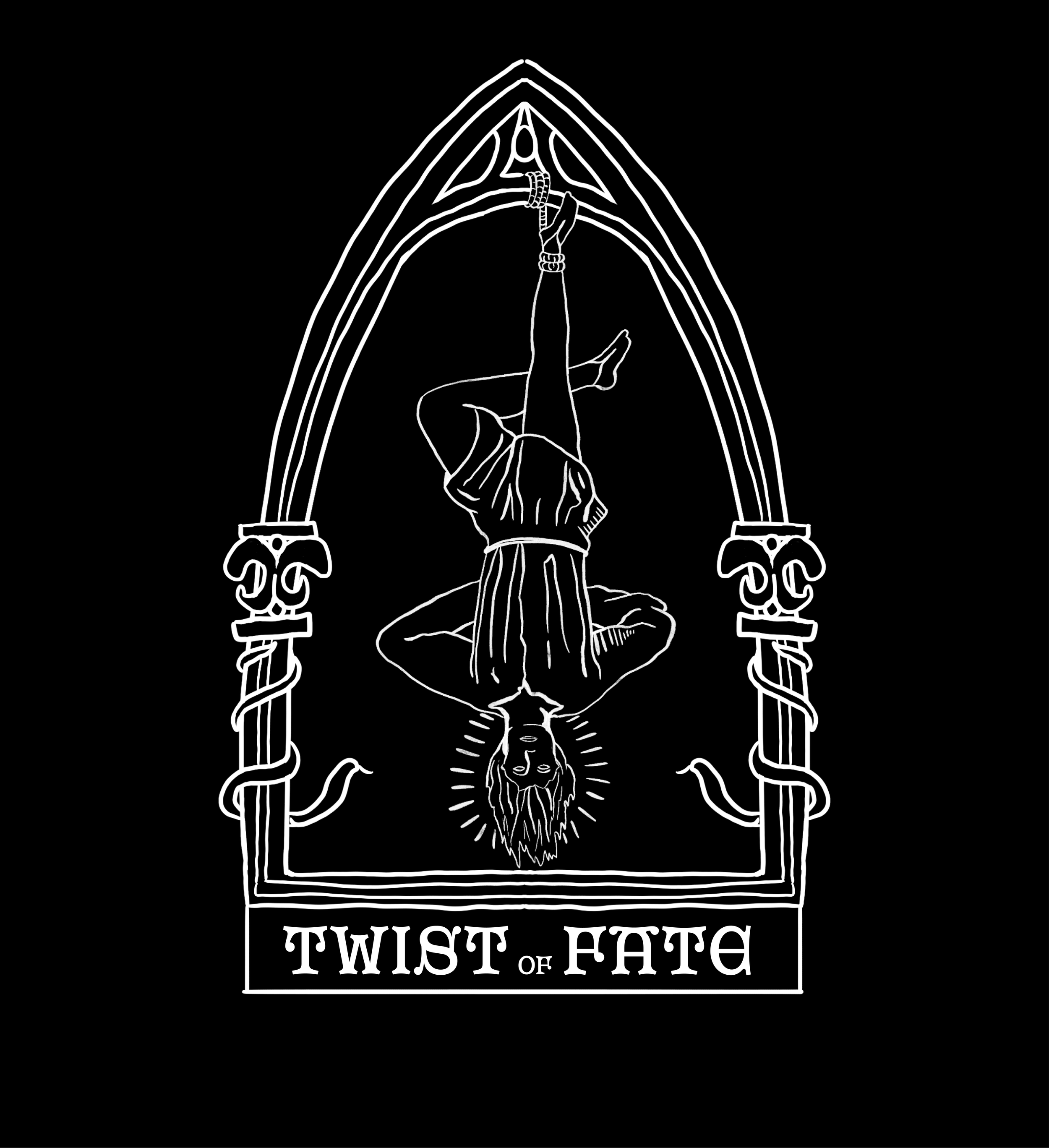
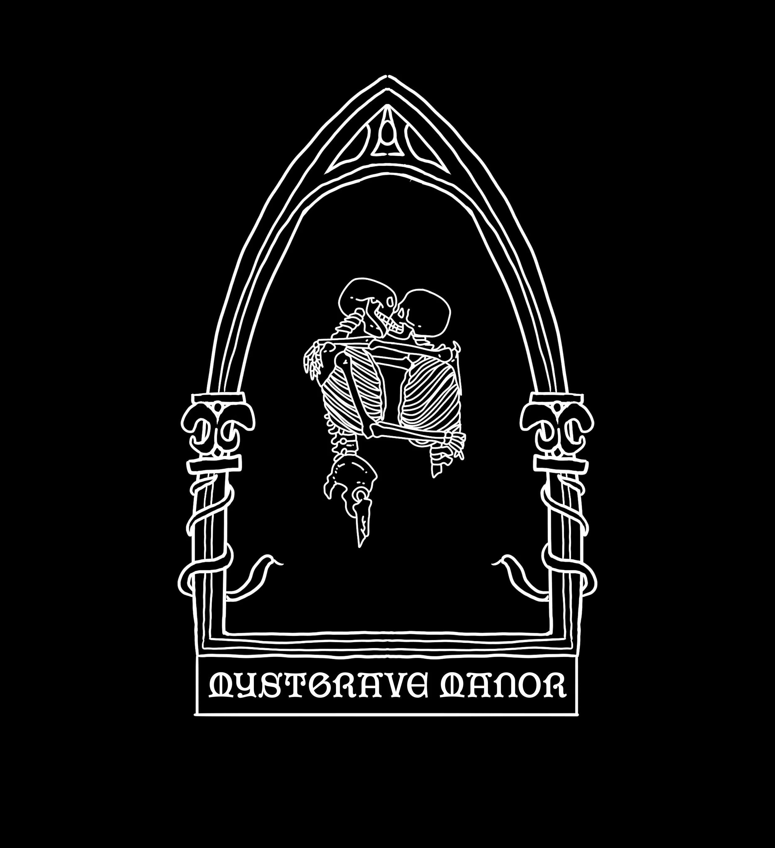
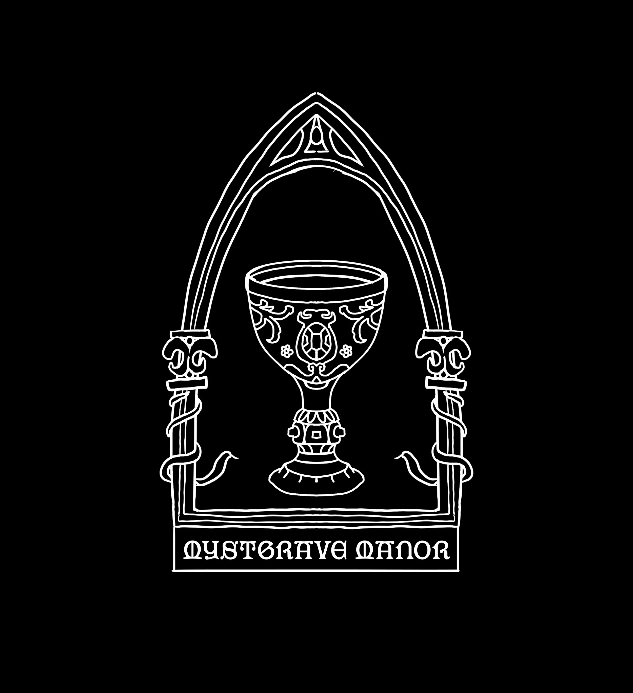
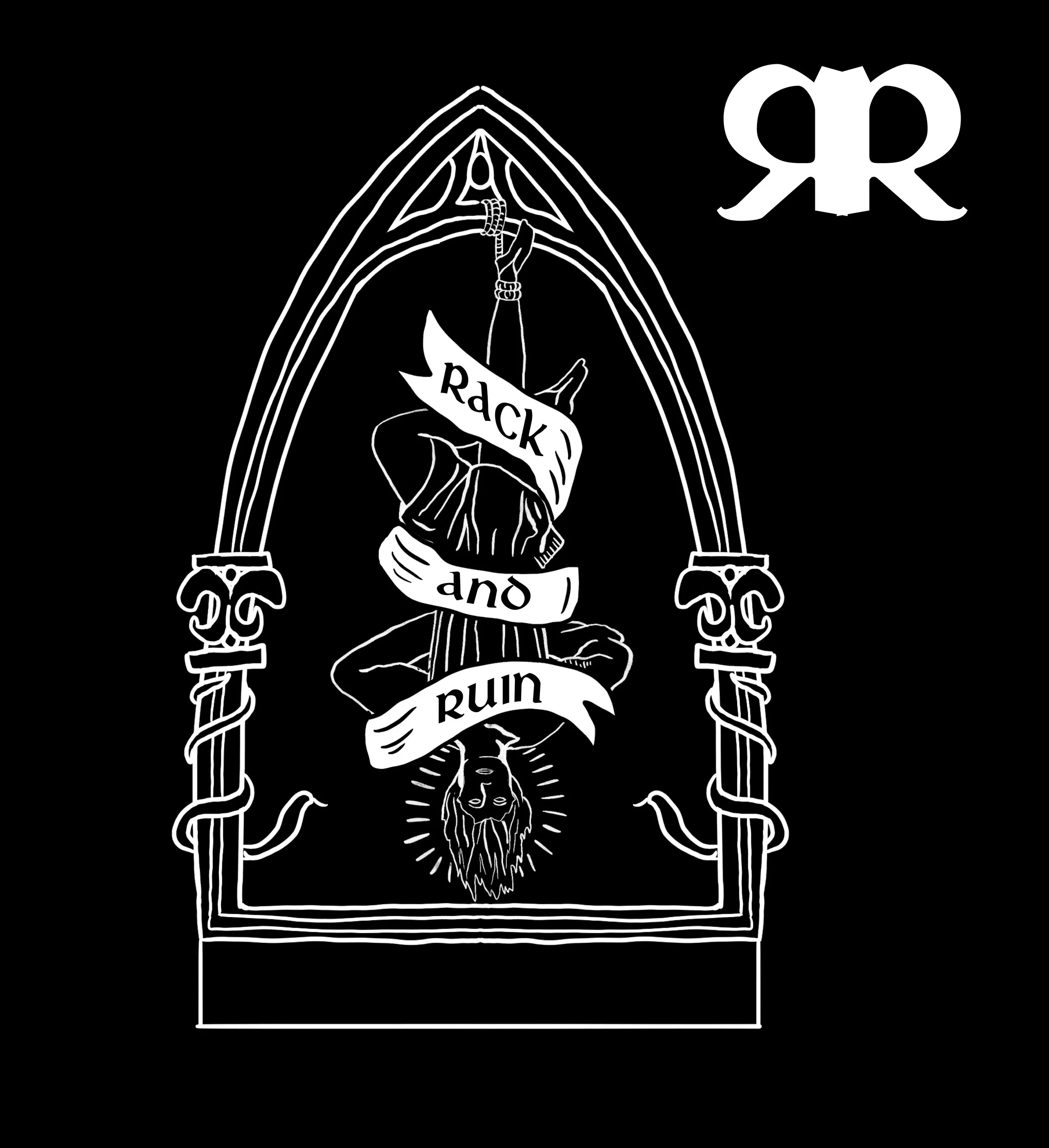
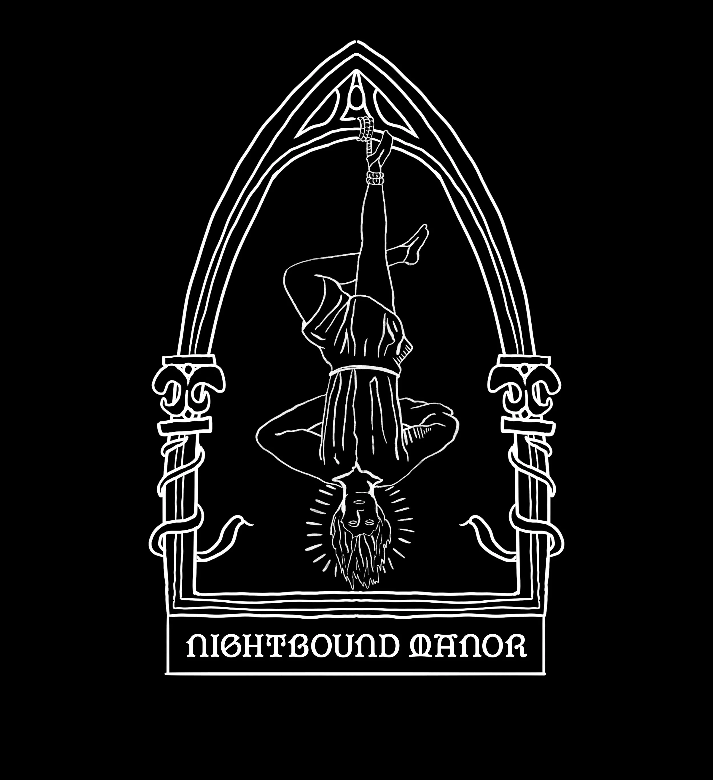
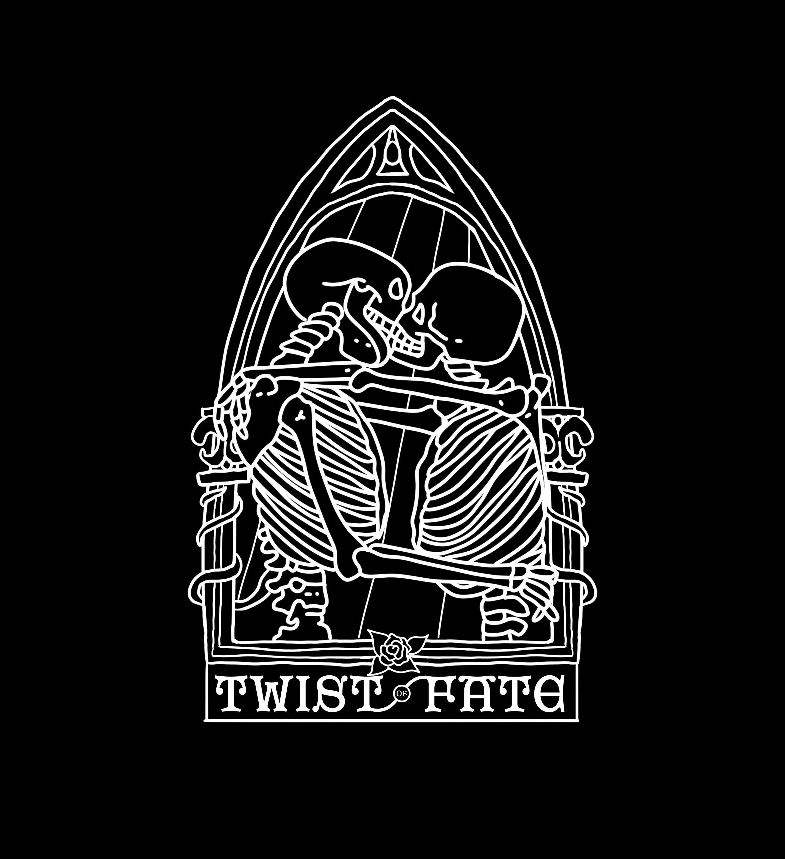
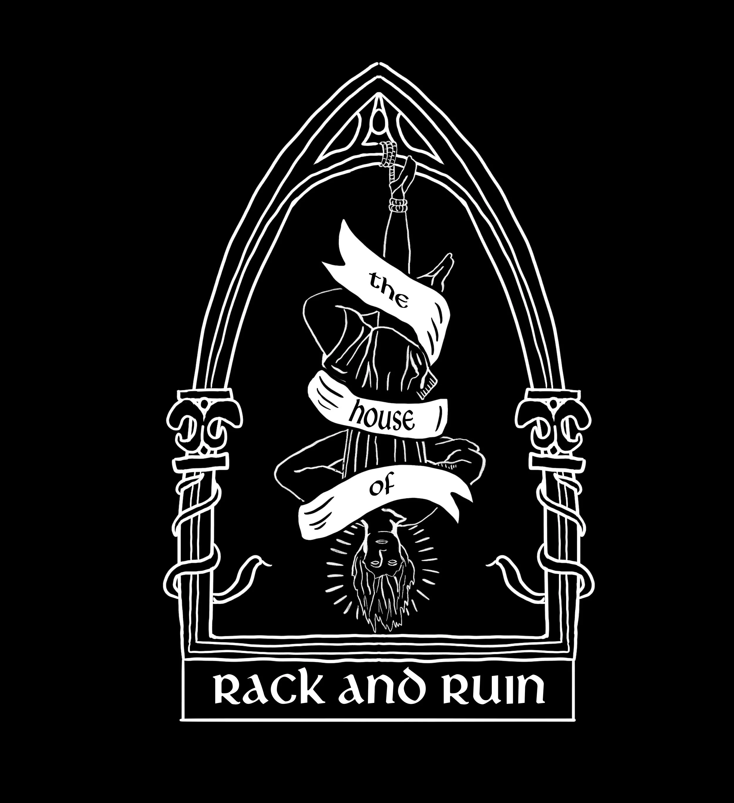
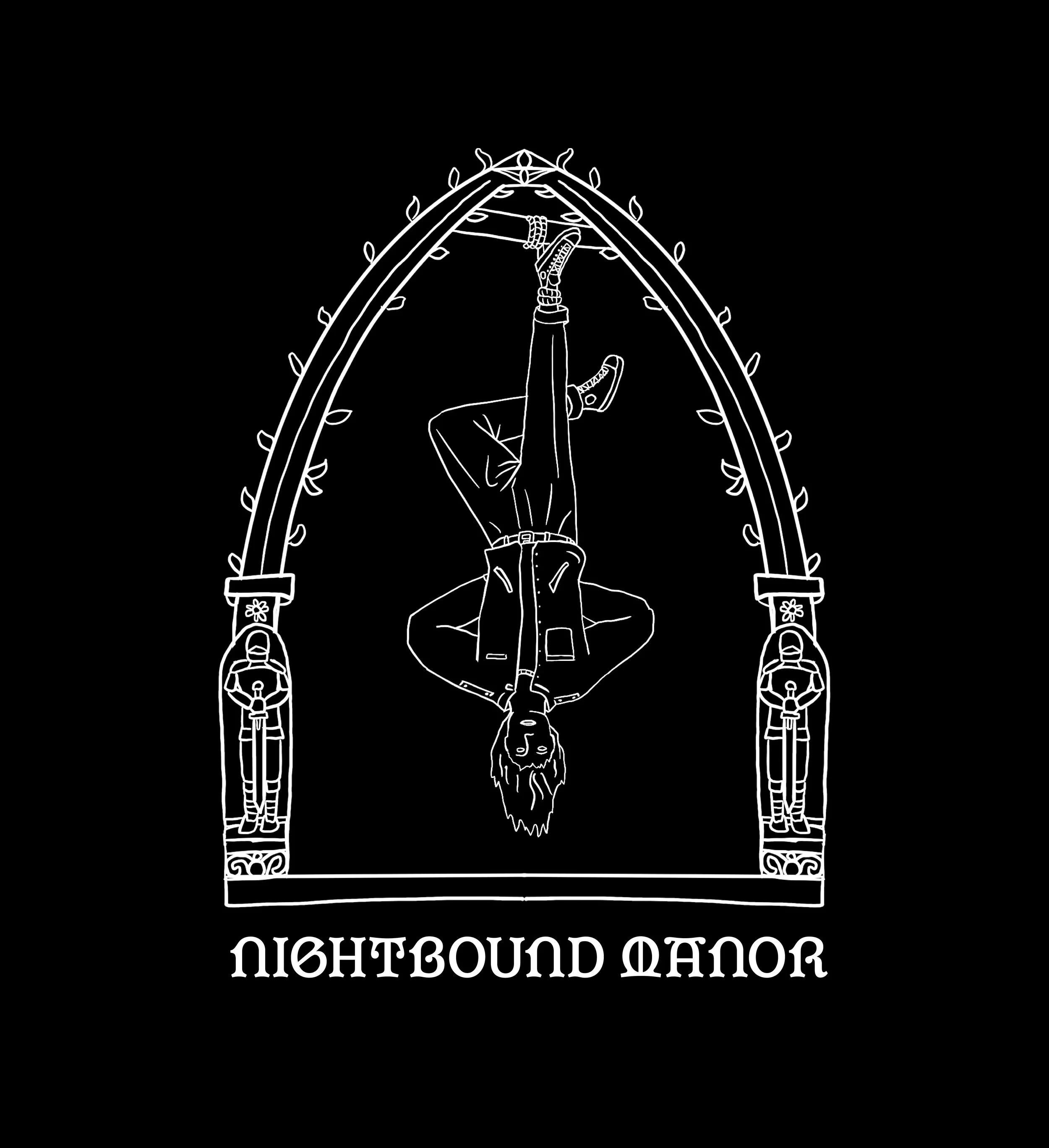
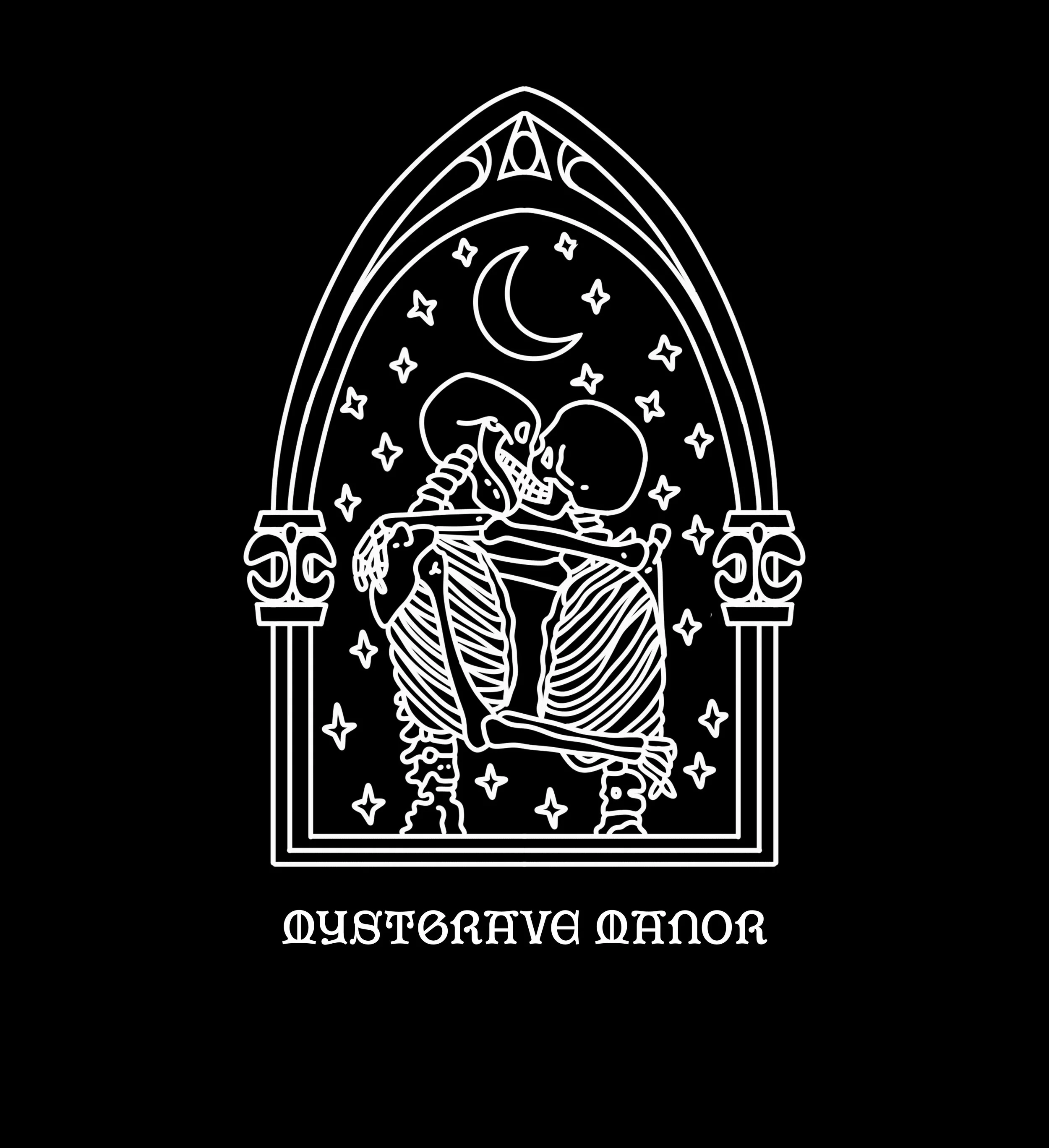
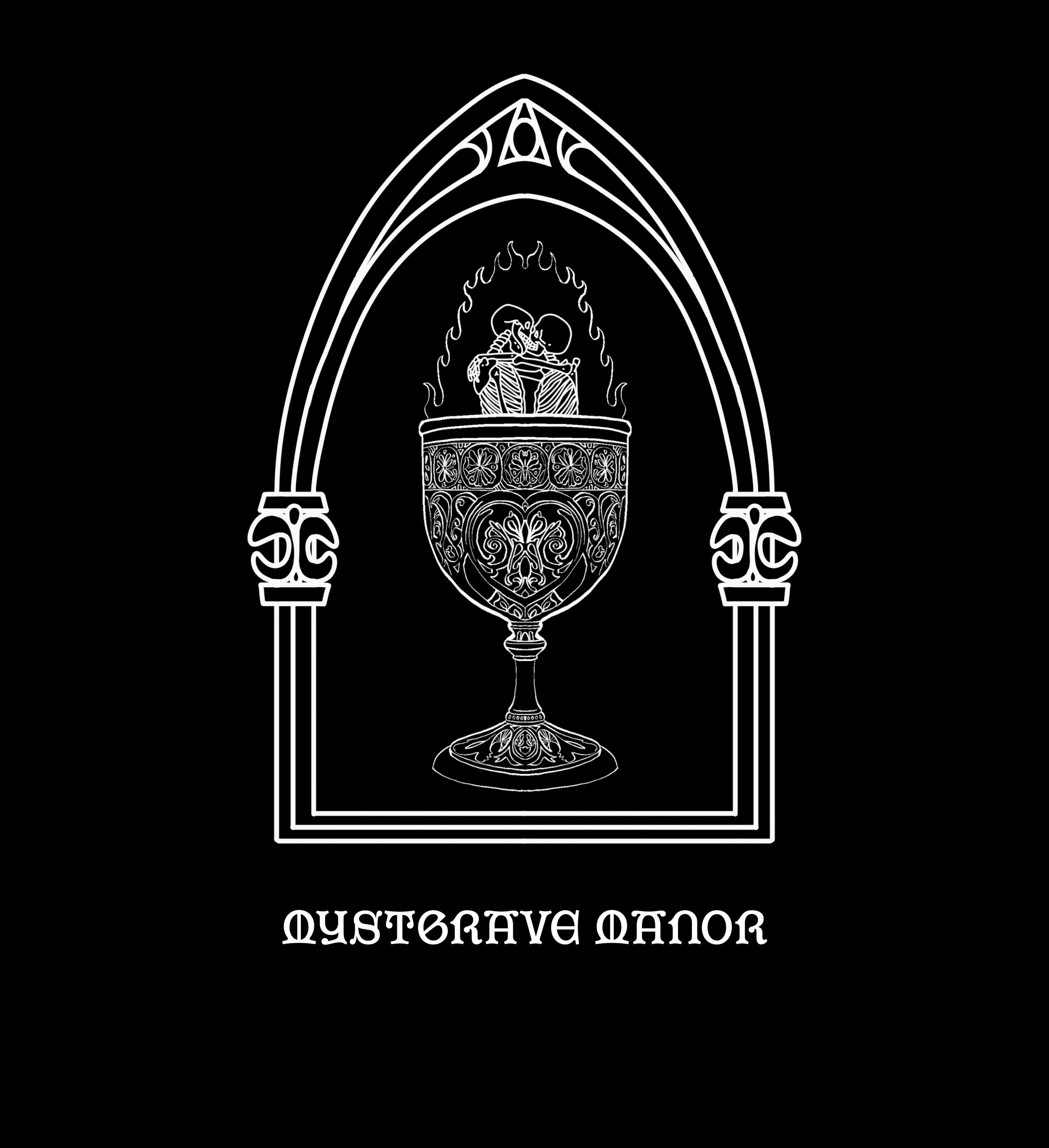
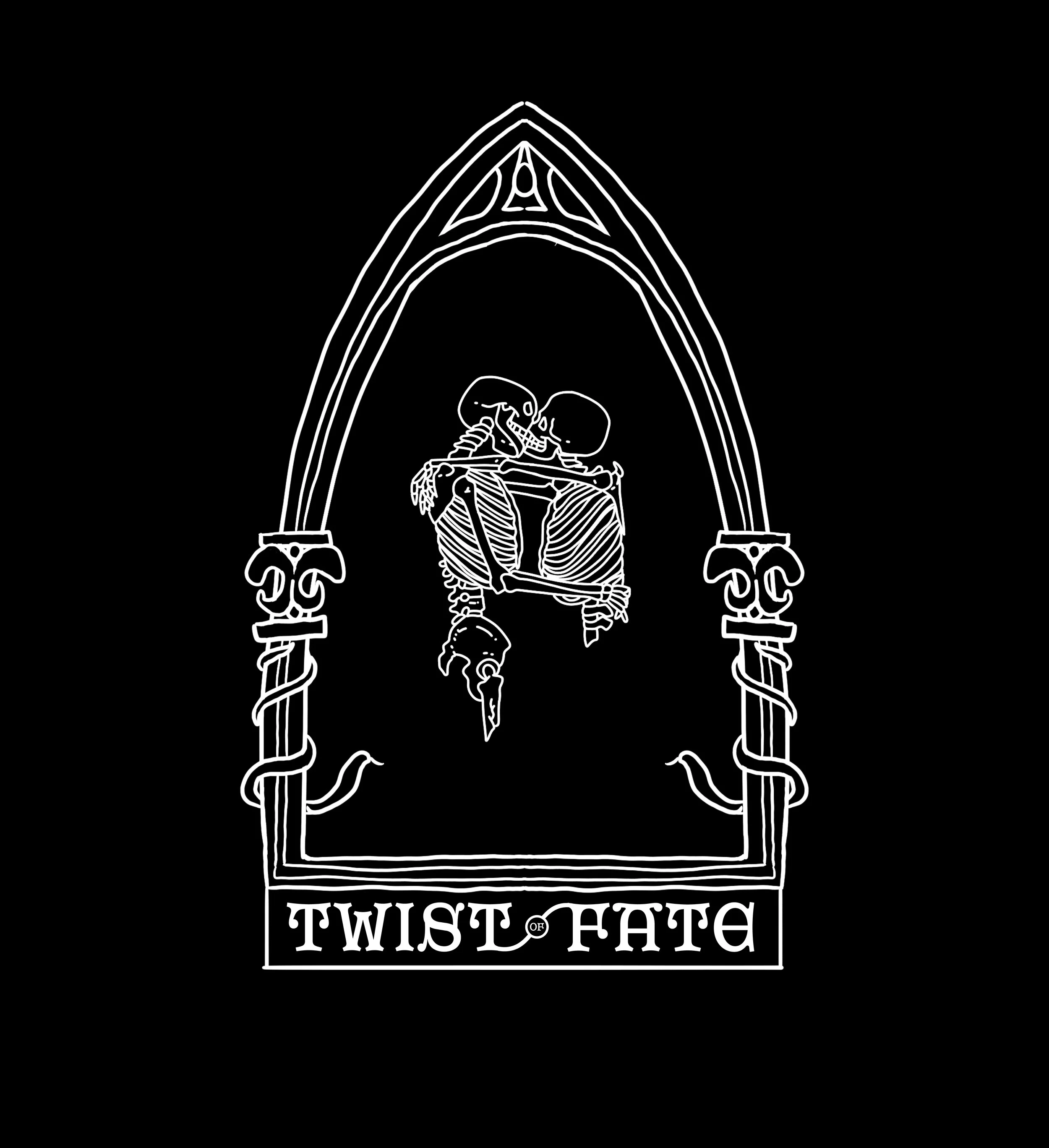
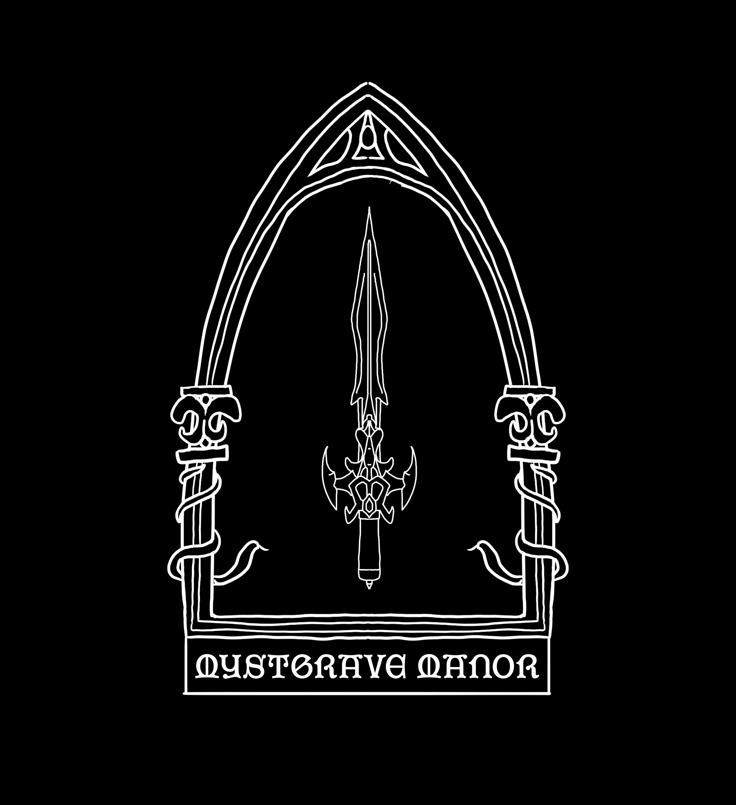
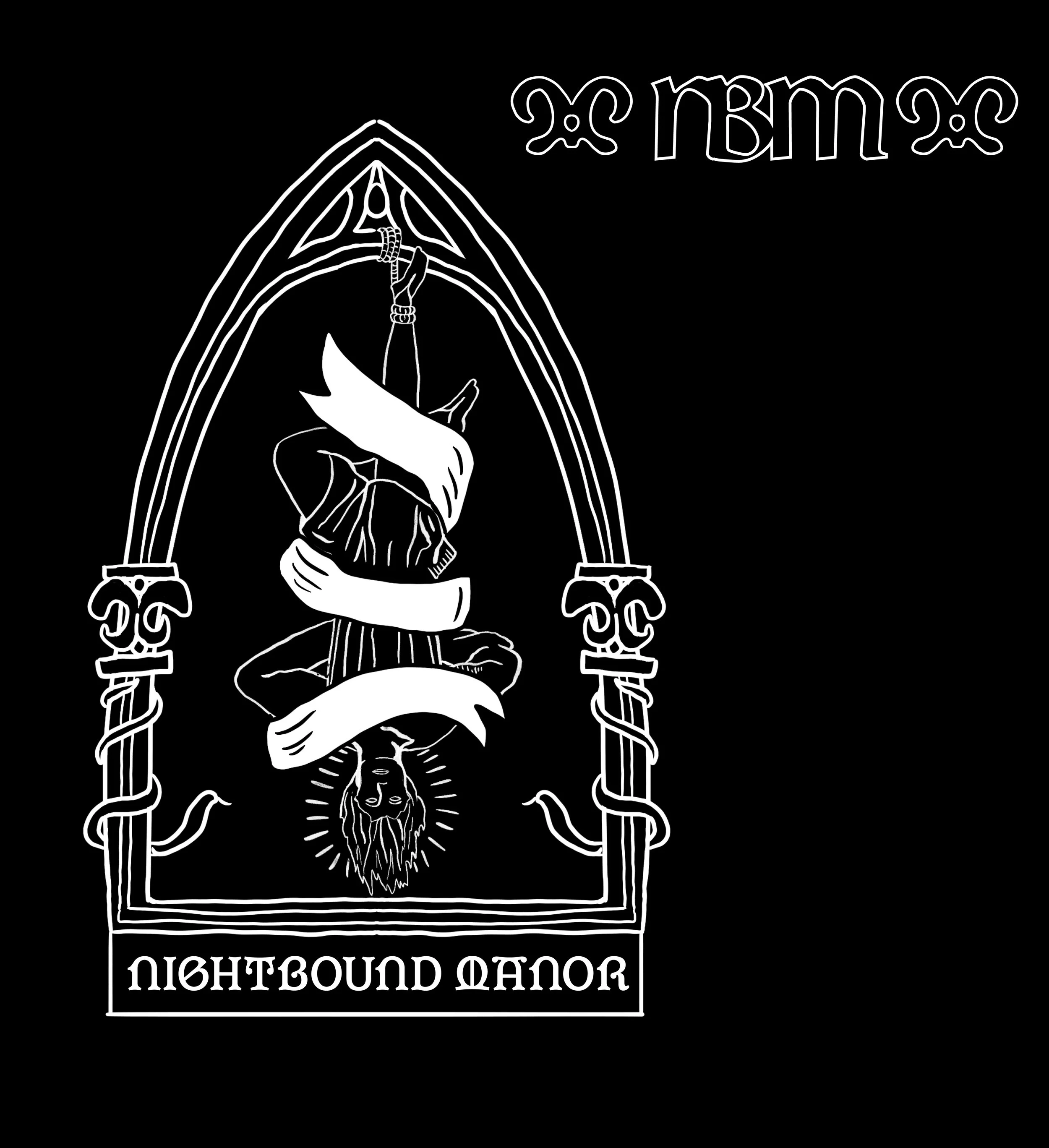
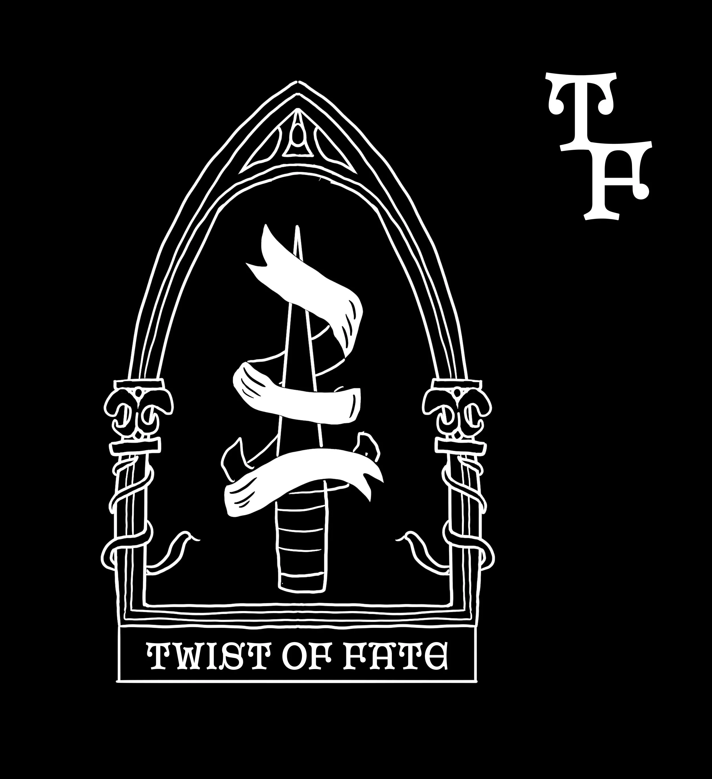
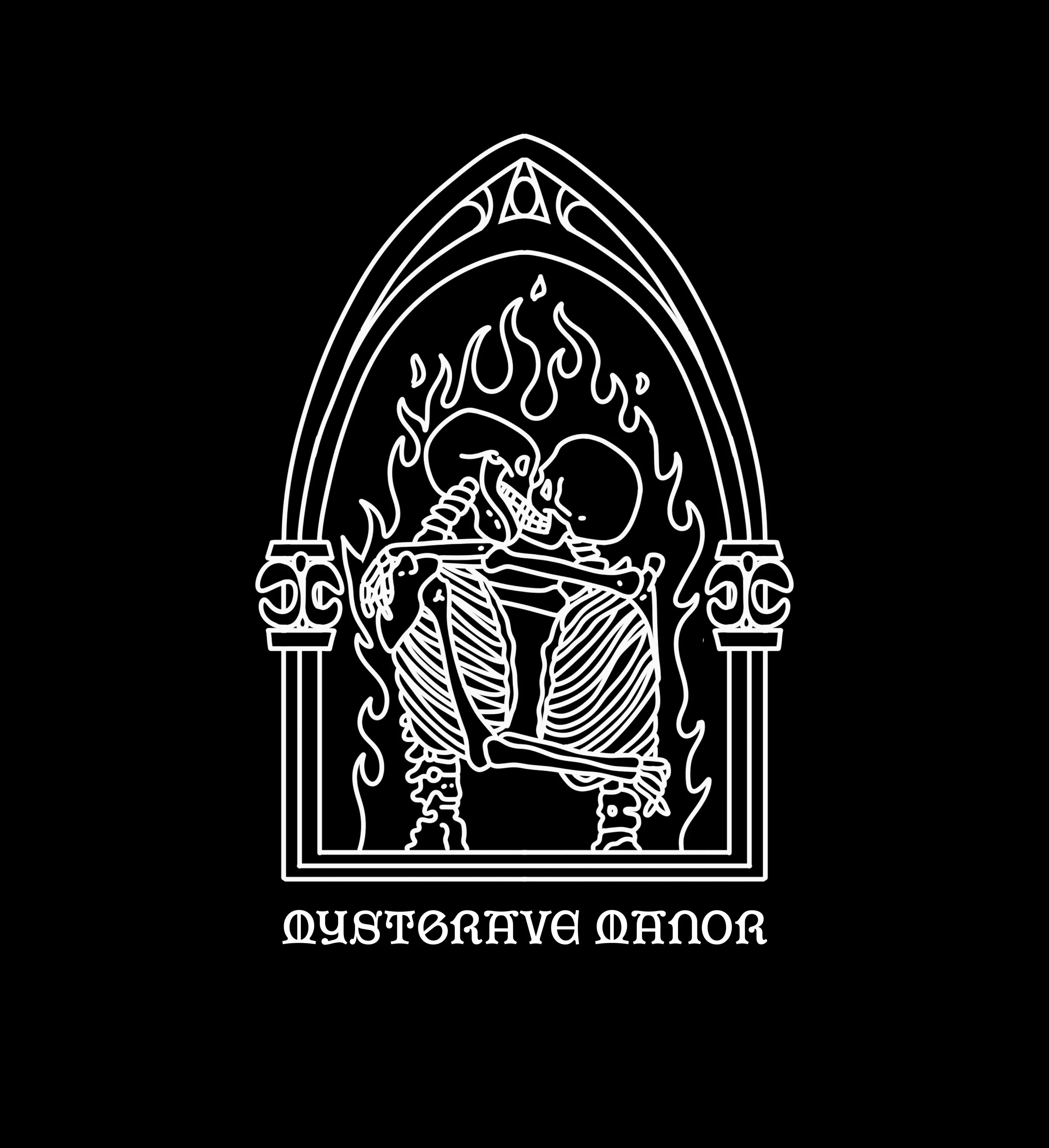
Logo System Creation: Because the owner wanted a ton of different artistic representations for the logo, and everytime it came out too busy to be viewed well at a distance, I advised that we create a simple font driven logo alongside the basic arch acting as an icon. That way we could populate the arch with different ideas for social, print, etc. but the main logo, a manipulation of libra mn, would always be our simple main system.
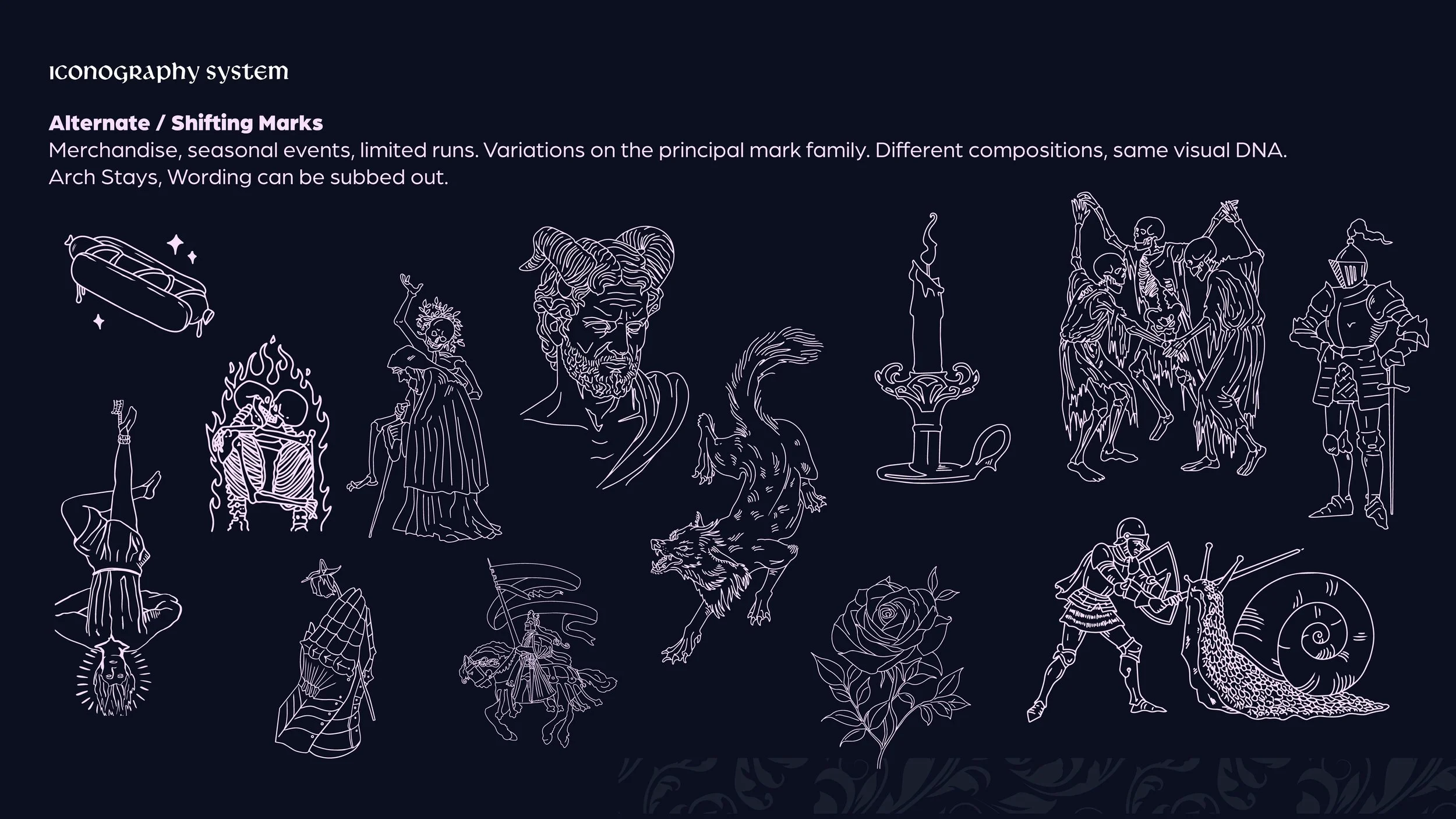
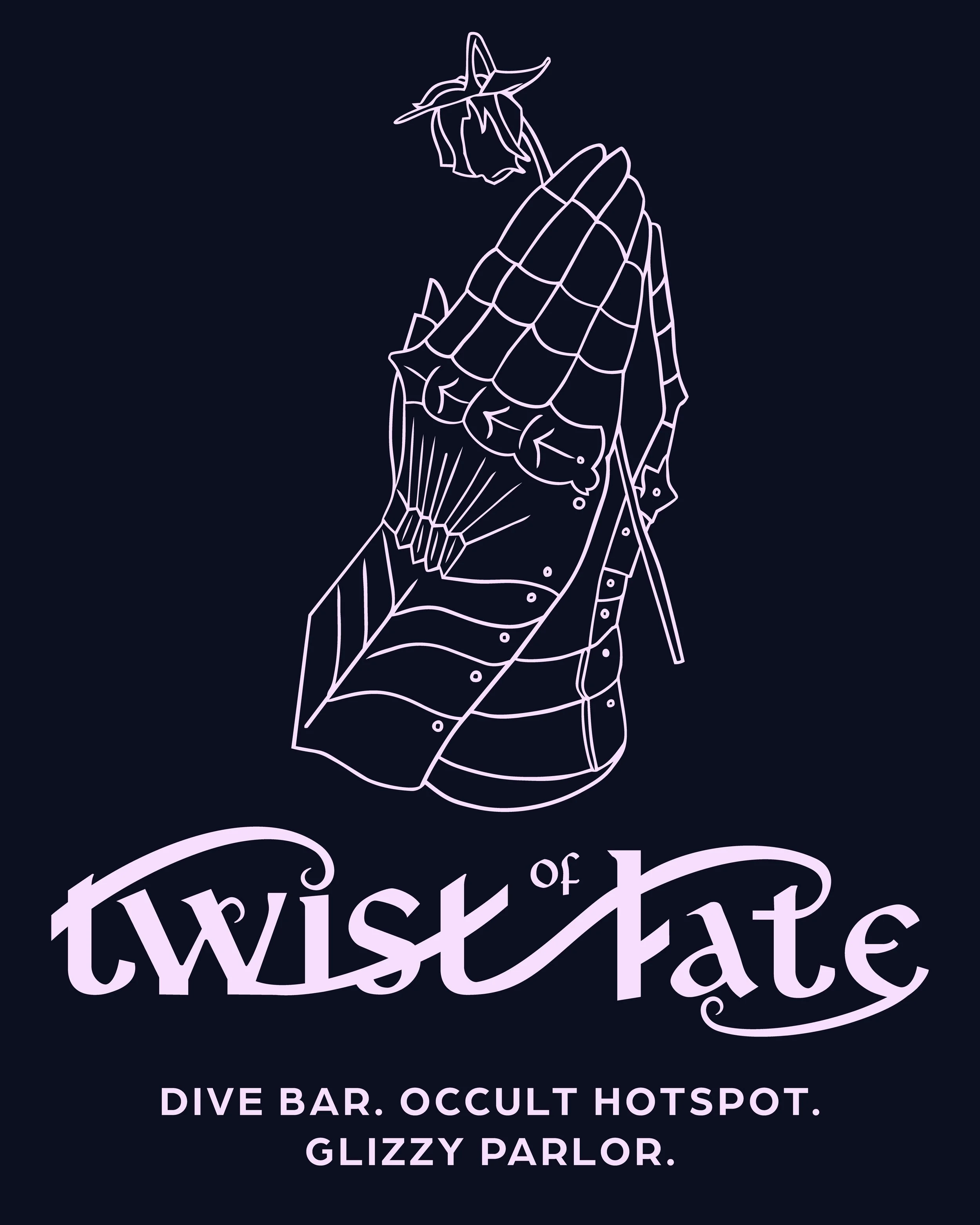
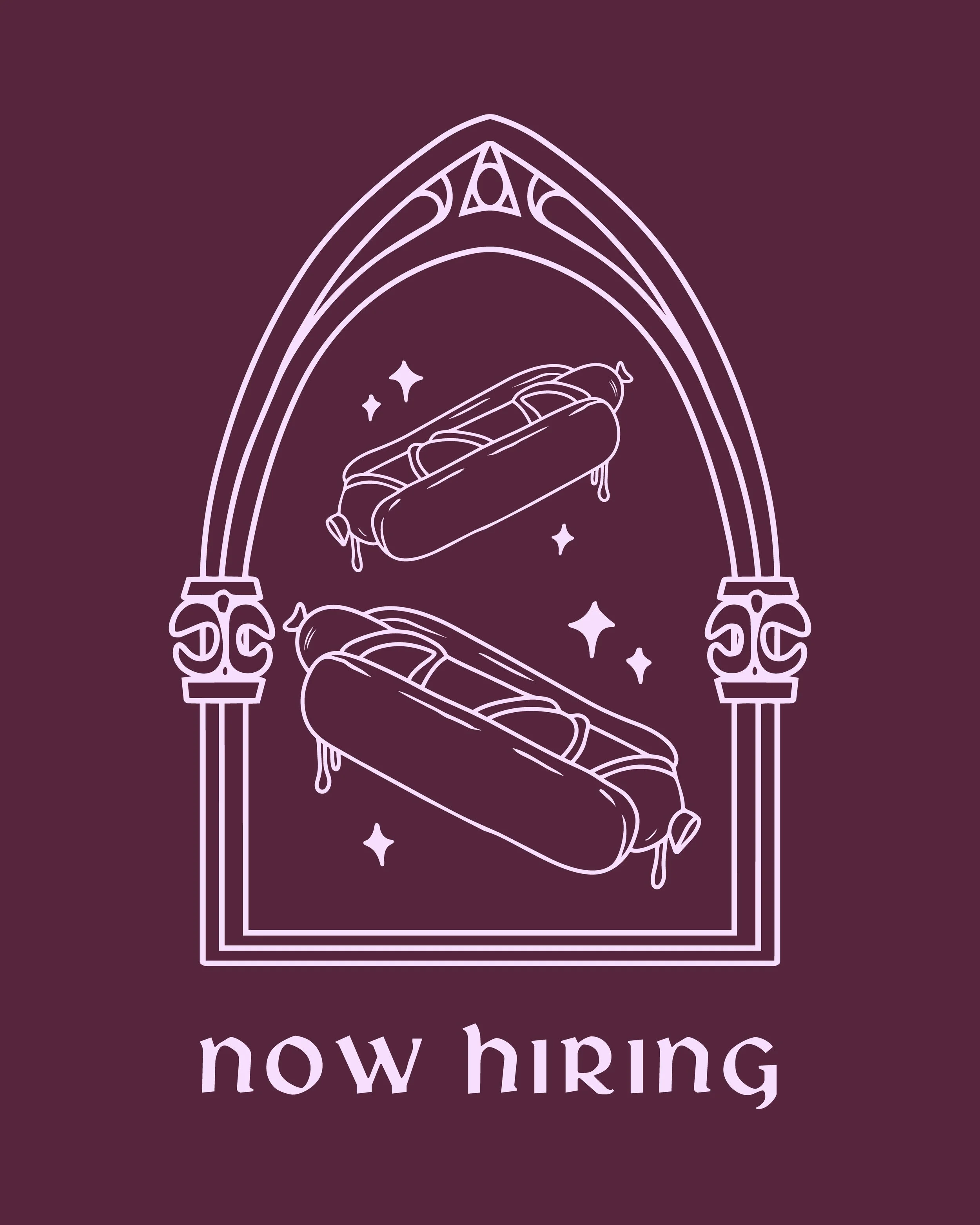
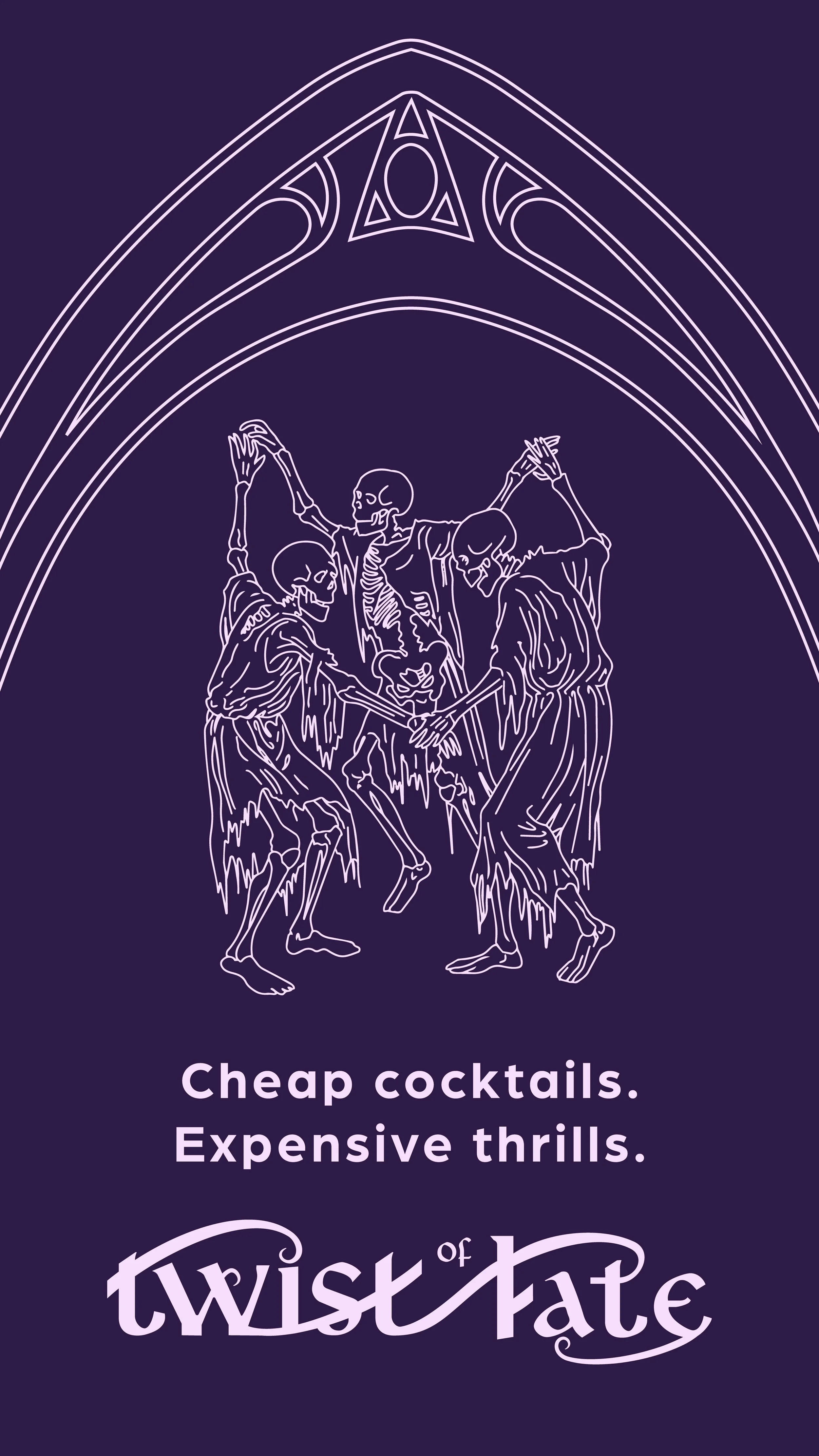
Alt Logo System: In order to achieve the owners goal of “set it and forget it” I’ve began a small repository of illustrations which can be used as collateral and alternate logos.
Social Posts
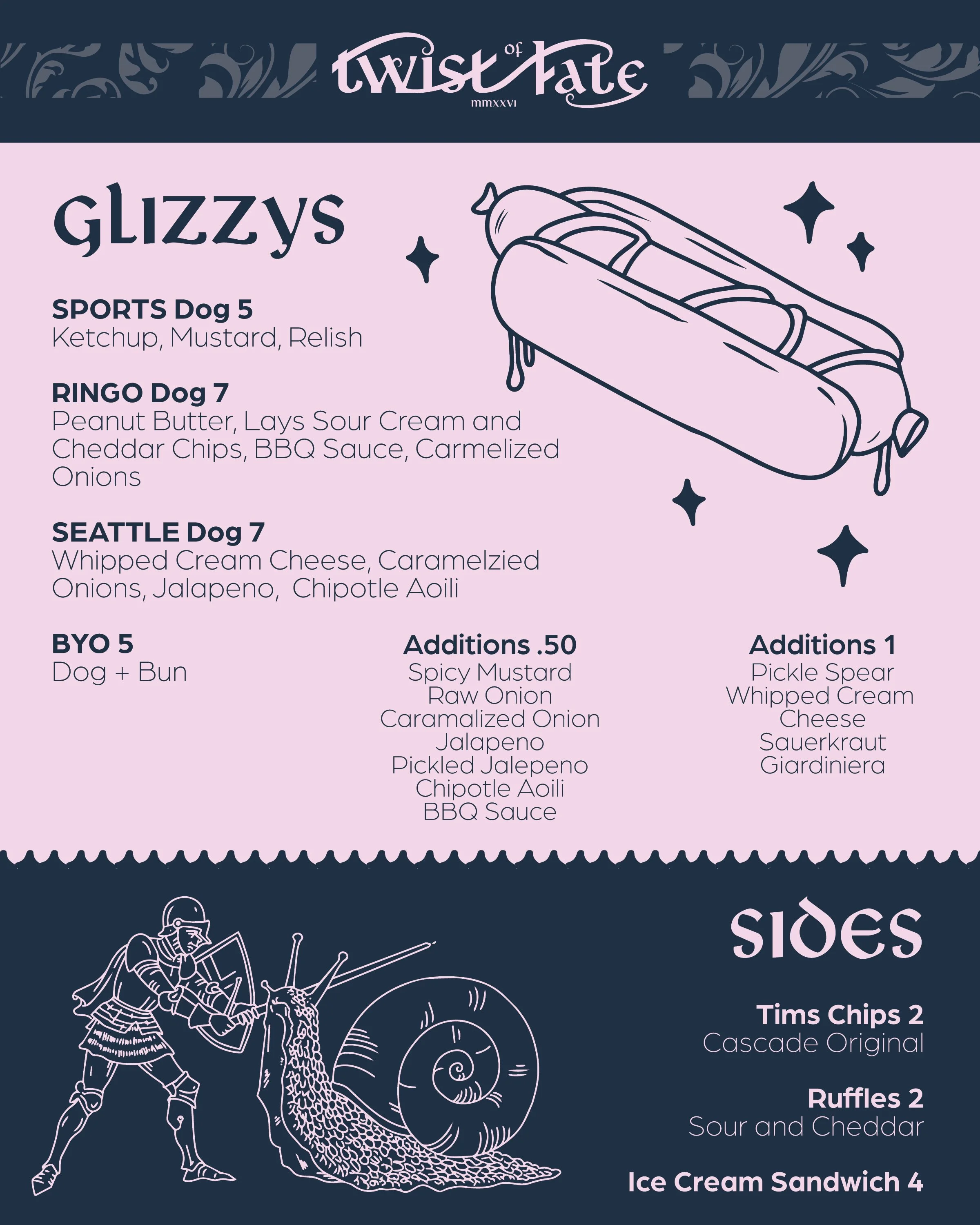
Kitchen Menu
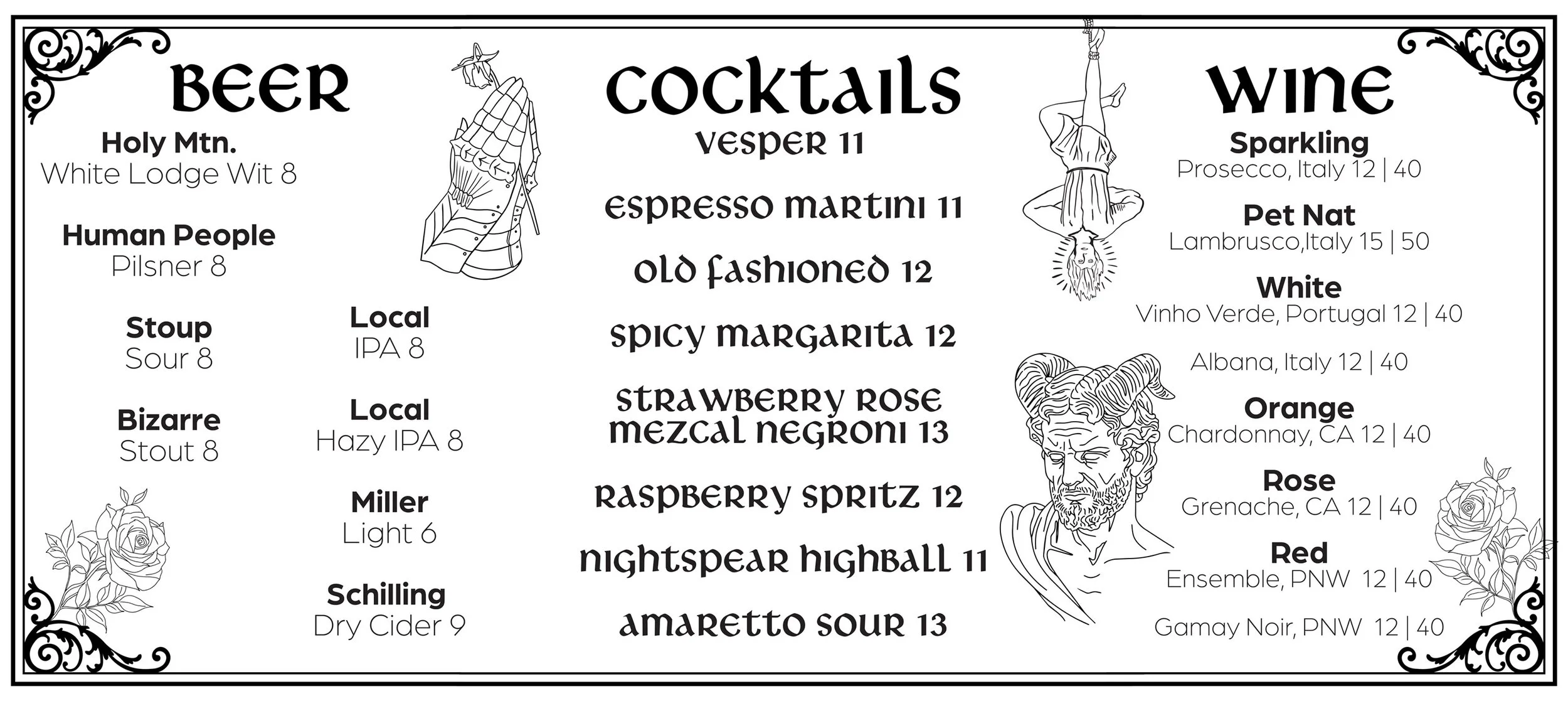
Banner Bar Menu
Contact Me