
Four Seasons Activity Book
Illustration, Layout Design, Business Strategy
Tools
Procreate, Adobe Illustrator, Adobe Indesign
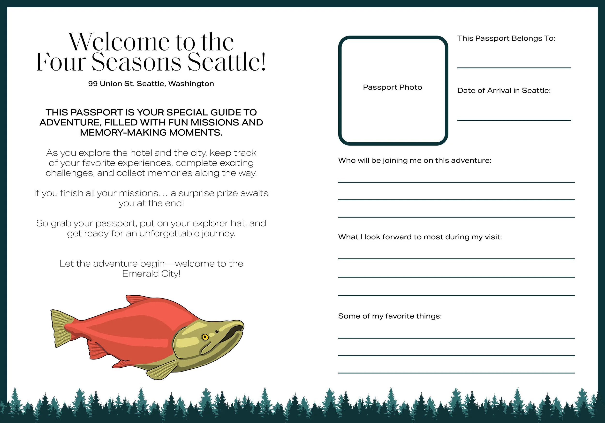
STORY: Four Seasons Hotel Seattle commissioned an original children's activity book to improve the guest experience for traveling families. The brief was to create something engaging enough for children to want to use it, sophisticated enough to belong in a Four Seasons room, and useful enough to reduce friction for parents during a stay.
The project required three things working simultaneously: original illustration of Seattle landmarks and characters, UX research into age-appropriate activity formats, and strict adherence to one of the most demanding brand standards in hospitality. The challenge was not any one of those things in isolation, it was solving all three at once without any of them compromising the others.
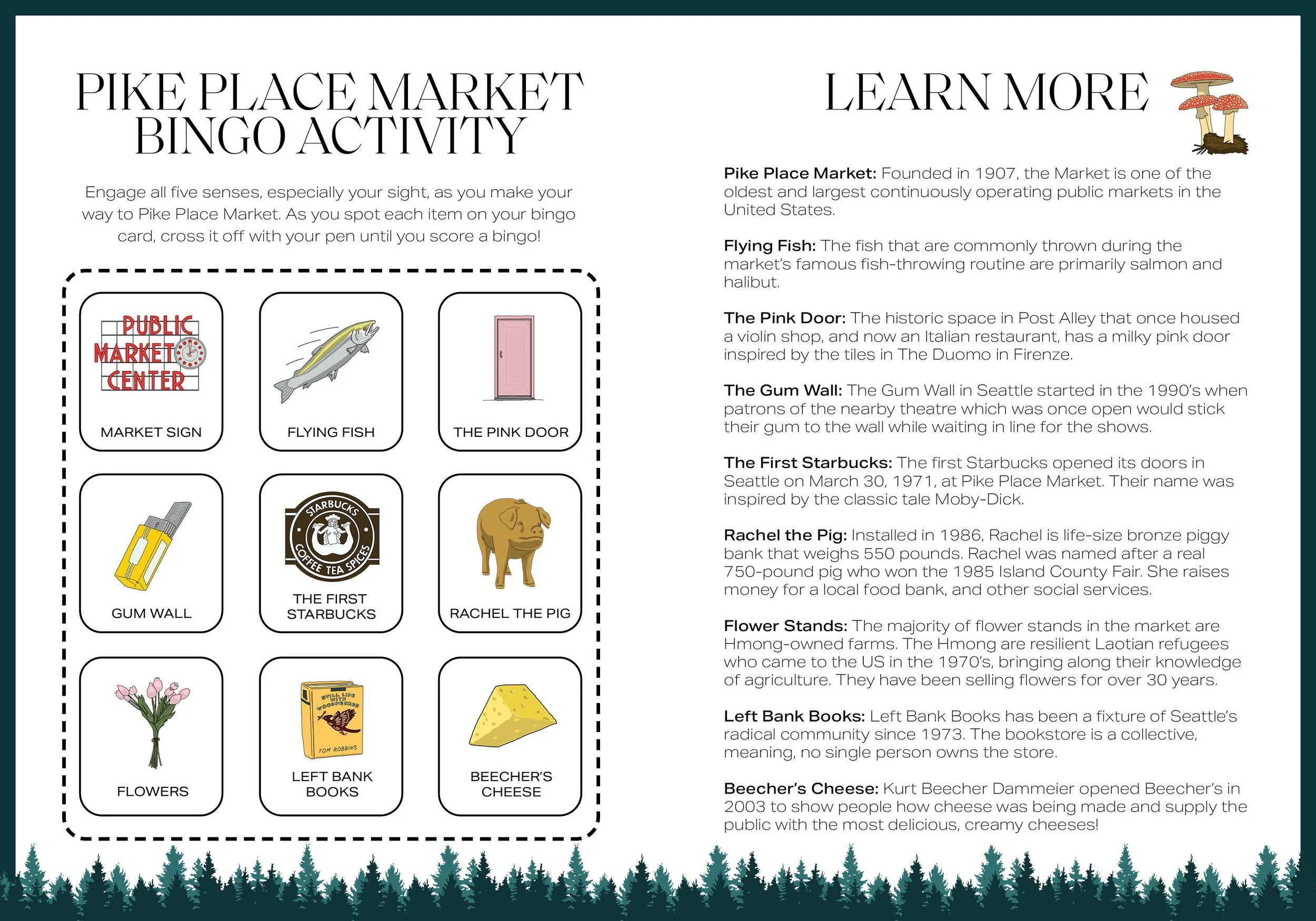
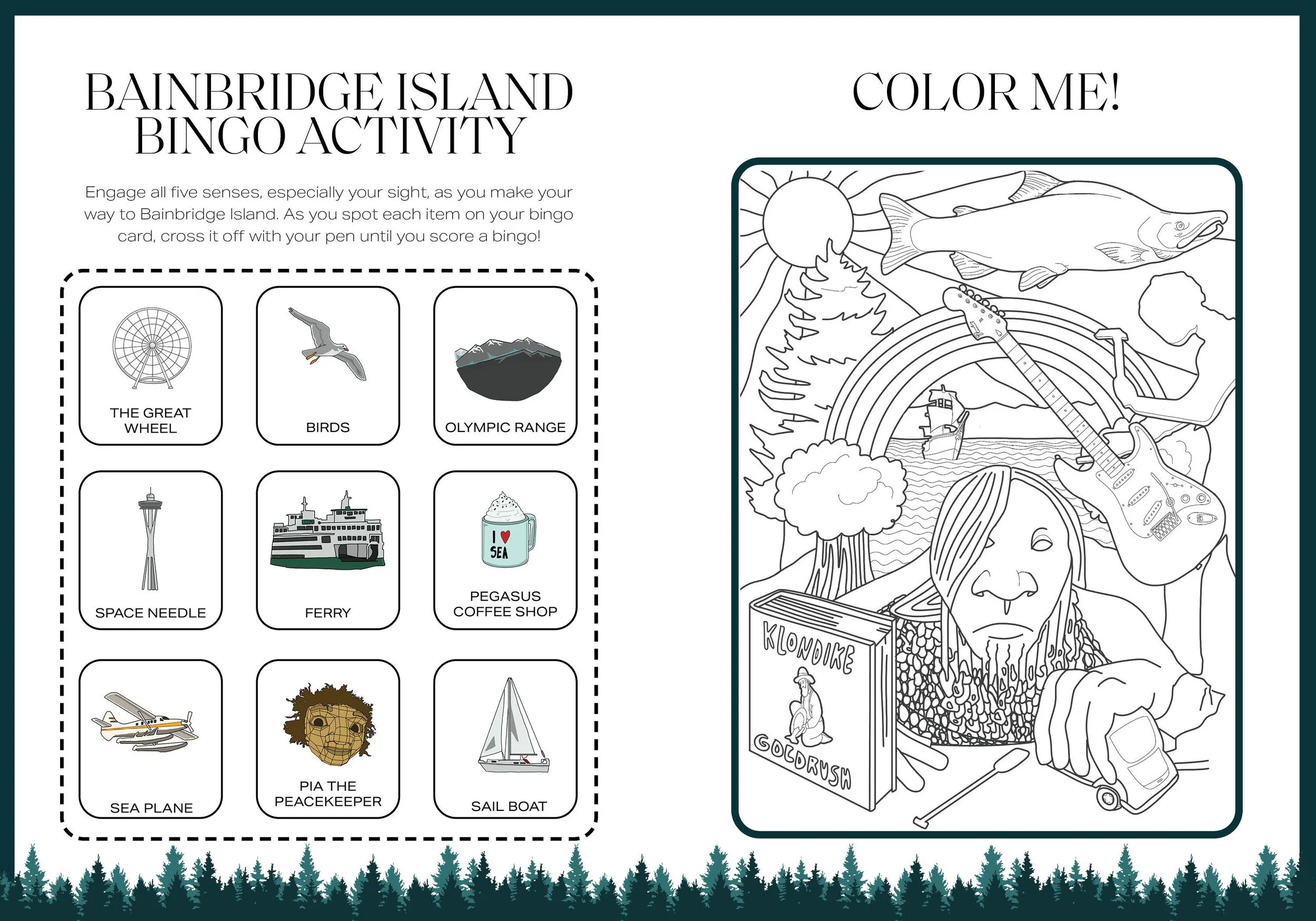
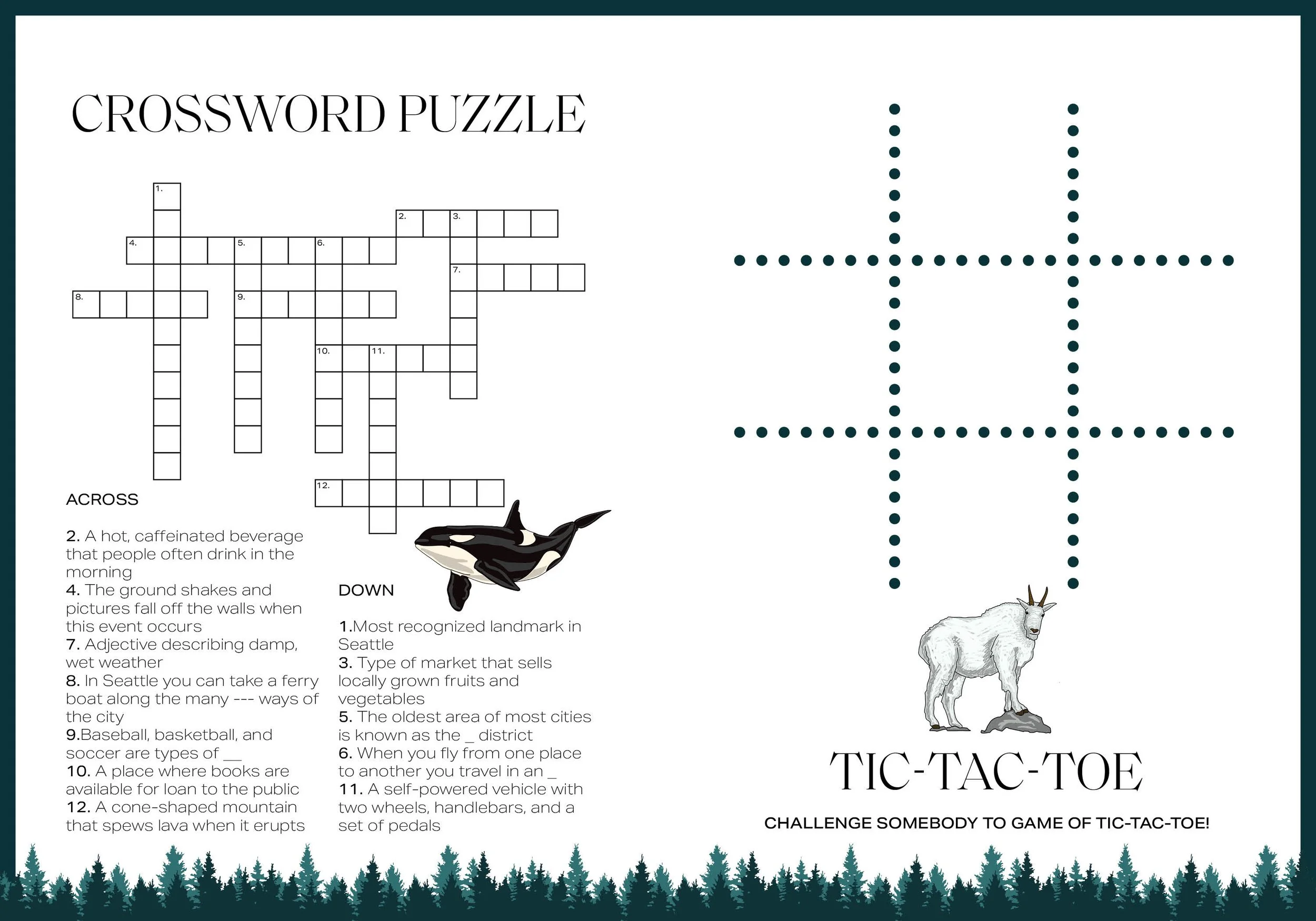
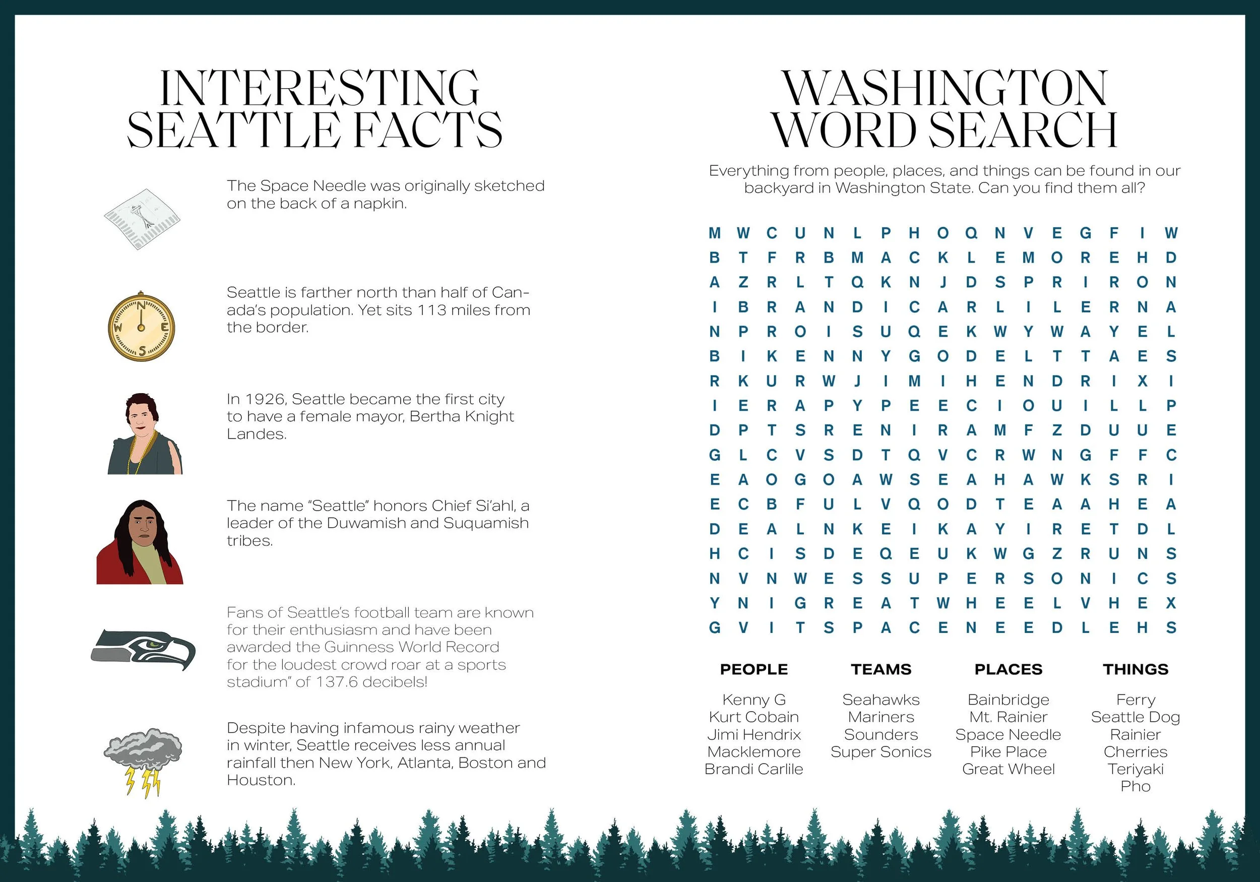
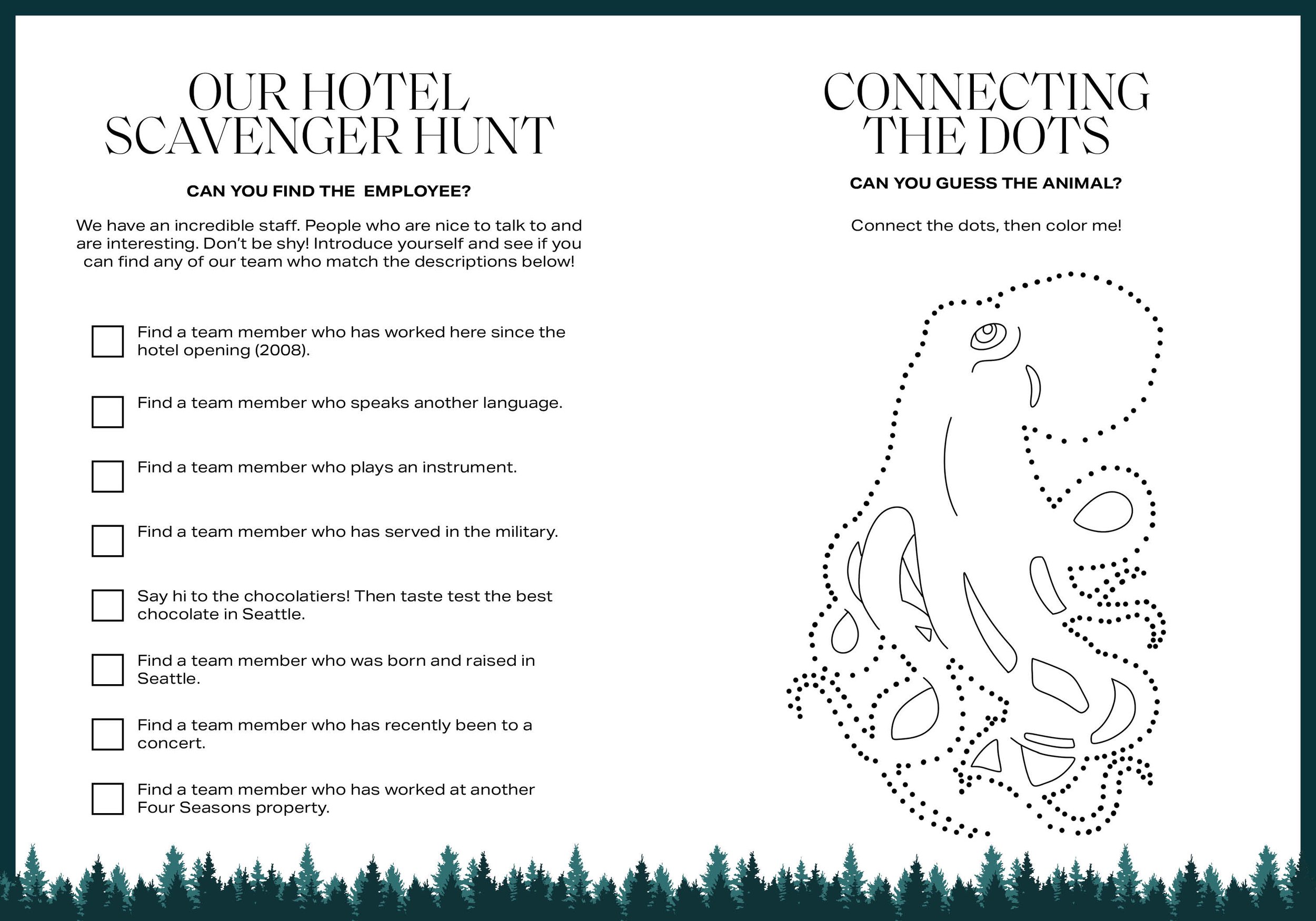
RESEARCH: Before any illustration began, the project started with UX research into how children interact with activity books at different ages. The goal was to identify which activity formats: coloring pages, word searches, crosswords, tic-tac-toe, mazes, work for which age ranges, and how to sequence them so the book holds attention across a range of ages in the same family.
The research shaped the structure of the book. Activities are ordered from lower complexity to higher, allowing younger children to engage fully with the first half while older children find challenge in the second. Every spread was designed to be completable within a typical hotel stay rather than requiring materials or setup beyond a pencil.
BRAND CONSTRAINTS: Four Seasons brand standards are among the strictest in the hospitality industry. The typography, color palette, and visual language all had to remain within approved parameters while still feeling accessible and fun to a six-year-old. This is a genuine design constraint: the instinct to make children's content loud, colorful, and playful runs directly against a brand that communicates through restraint, elegance, and negative space.
The solution was to let the illustrations carry the energy while the layout, typography, and color system stayed within brand. The pages feel warm and inviting without breaking the visual discipline Four Seasons requires.
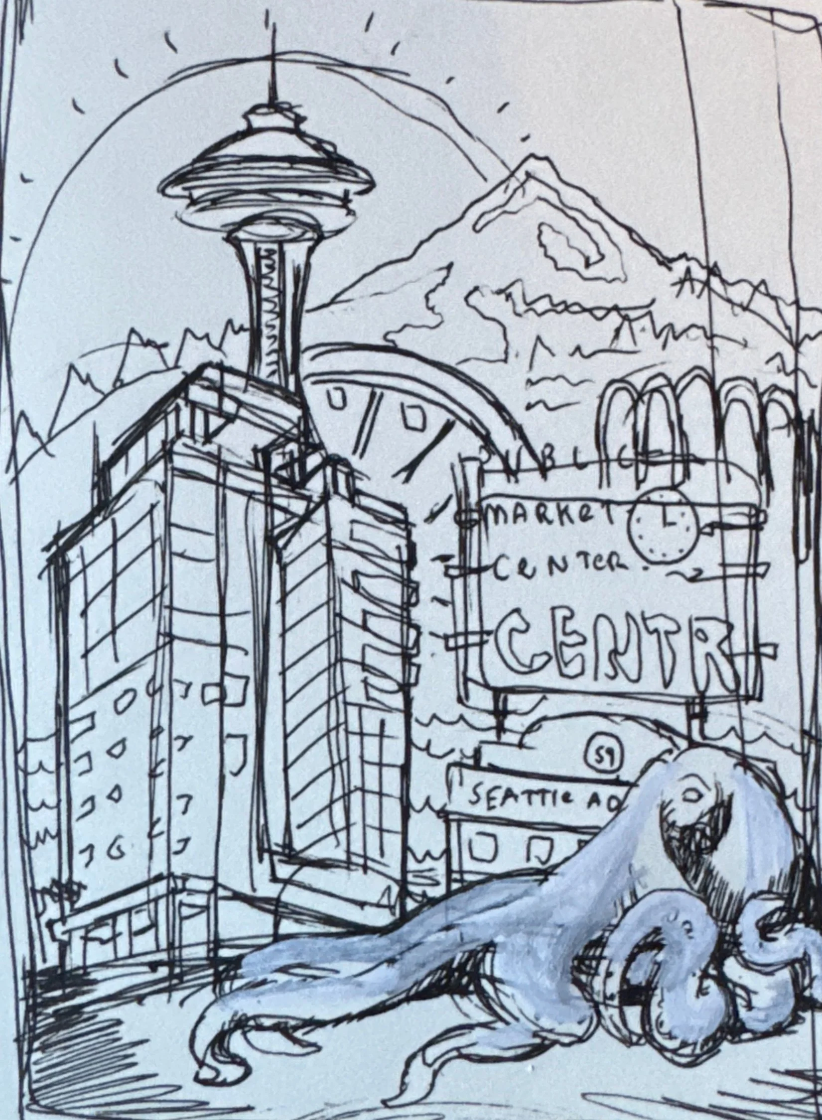
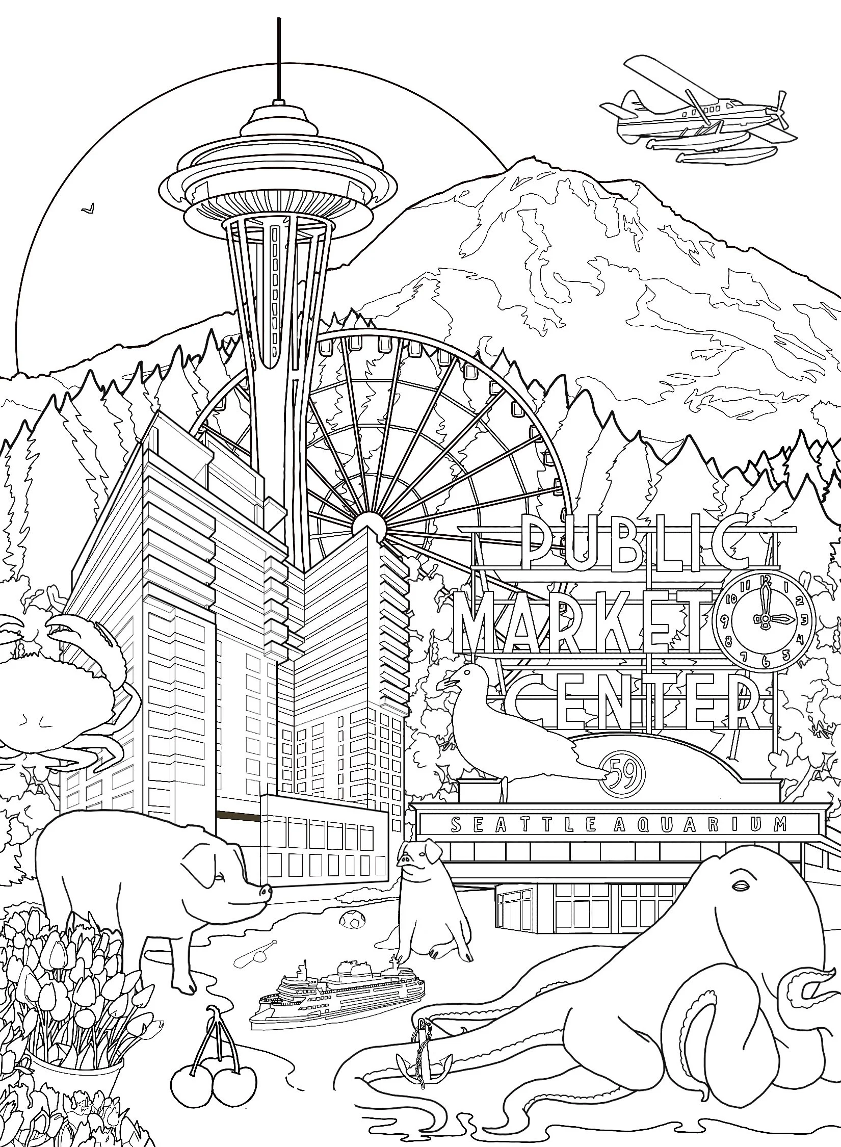
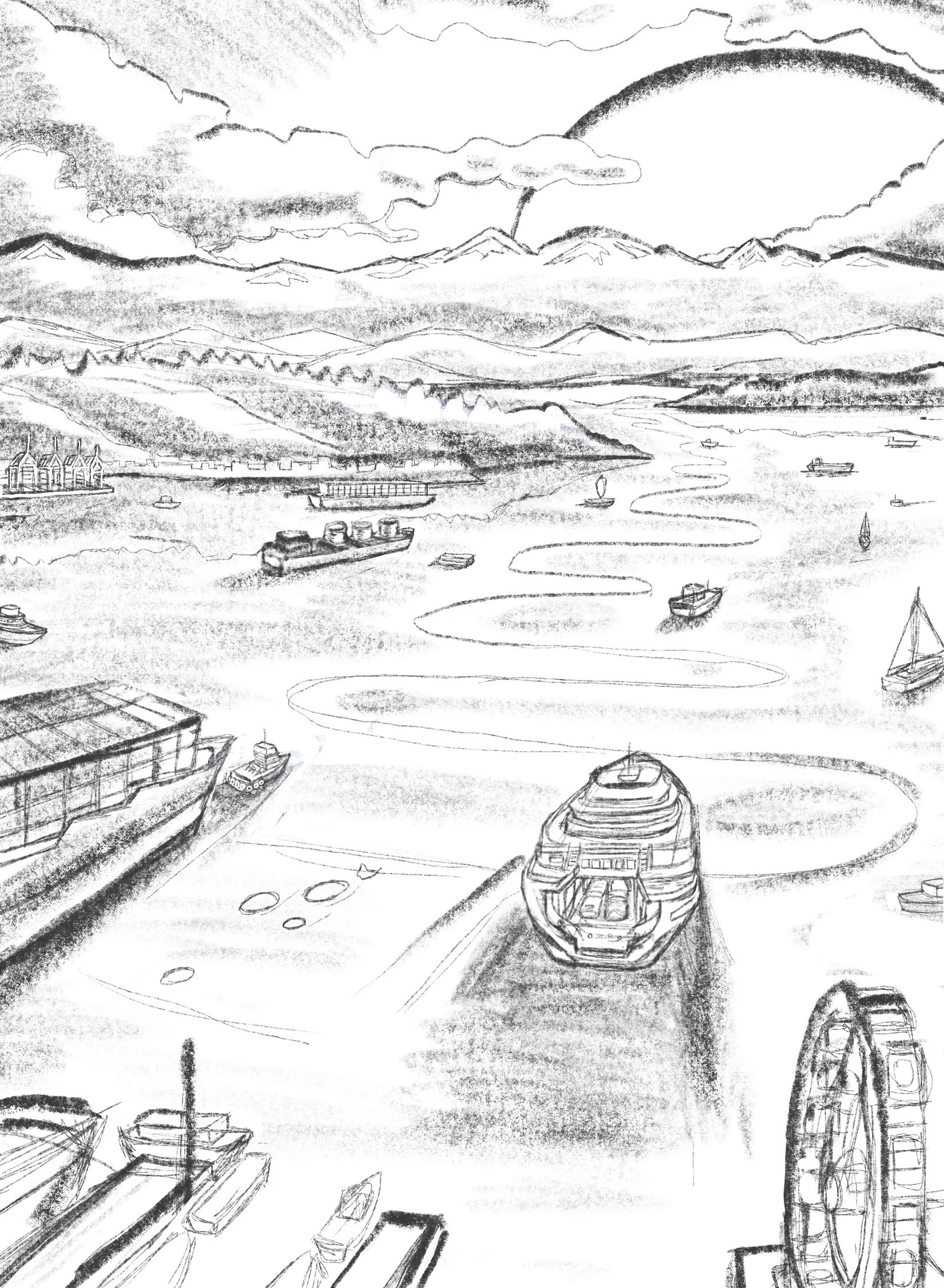
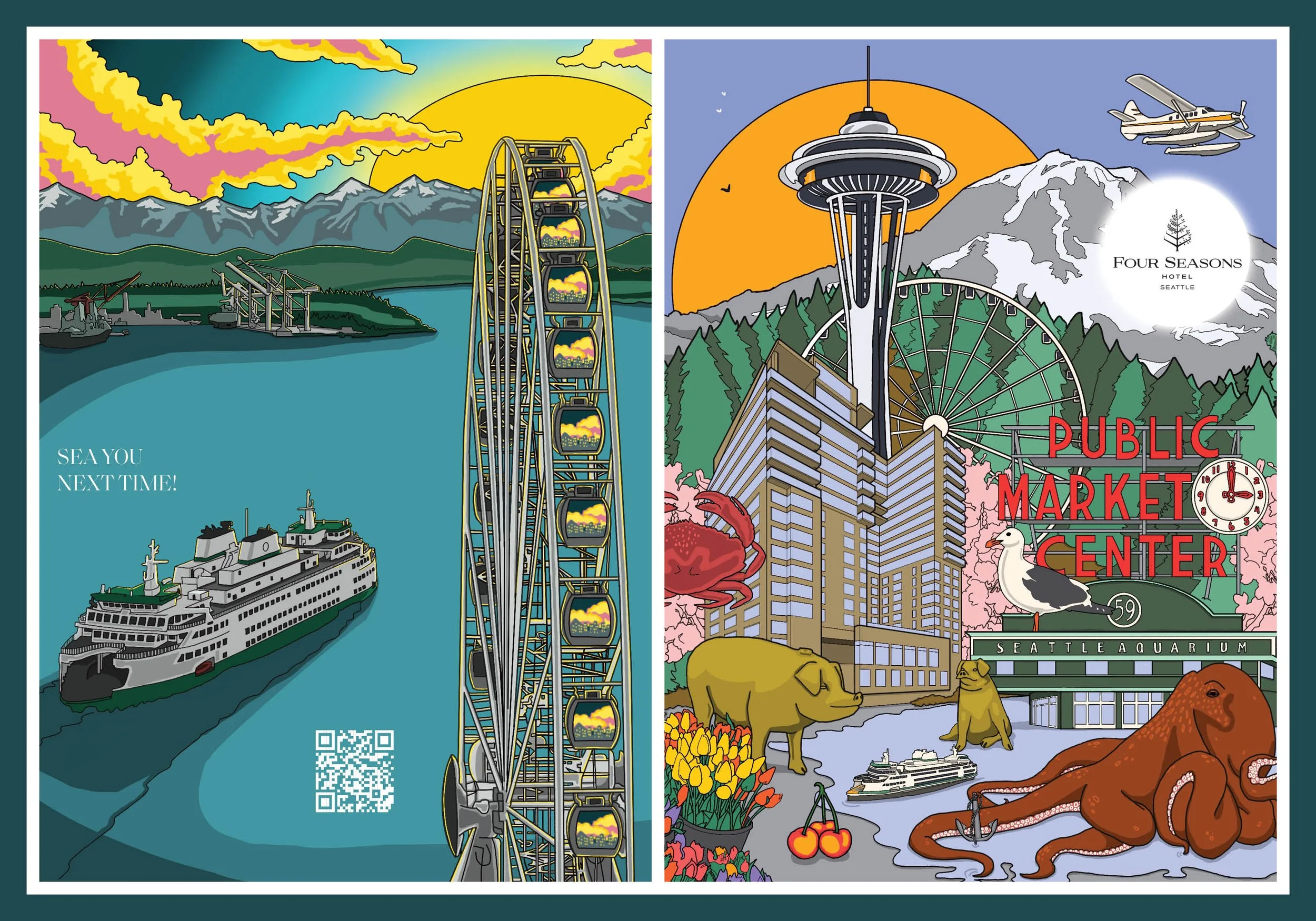
ILLUSTRATION: Every image in the book is original illustration. The cover spread shows Seattle as a child would want to see it (the Space Needle rising above Pike Place Market, a Washington State Ferry crossing the sound, the Olympic Mountains in the background) everything bathed in warm afternoon light. It is a love letter to the city that works for a guest who has never been here and for a Seattle local who has seen it a hundred times.
Interior illustrations carry individual scenes i.e. the Sleepy Octopus coloring page, the Seattle Freeze crossword, the tic-tac-toe grid, the word search hidden inside a Seattle skyline outline. Each spread has its own visual moment while remaining part of a coherent illustrated world.

RESULT: Delivered print-ready files with zero revision cycles. Guest satisfaction scores improved and reported guest disruptions declined following the book's introduction. The project was completed within a three-month timeline from brief to final files.
Zero revision cycles on a project of this complexity (original illustration, strict luxury brand standards, UX-informed structure, print production) is the result of front-loading the research and getting alignment on direction before execution rather than discovering problems during review.
Contact Me