
Art Director • Hospitality / Editorial
A cocktail menu that reads like a graphic novel
Stampede Cocktail Club is a Seattle institution: an immersive, sci-fi-and-fantasy dive that changes its menu every few months and has built a following on how strange and specific it is. I direct the visuals, meaning seasonal menus, the non-alcoholic menu, posters, and day-to-day social. The seasonal menu is the centerpiece, and each one is built as its own illustrated narrative rather than a list of drinks.
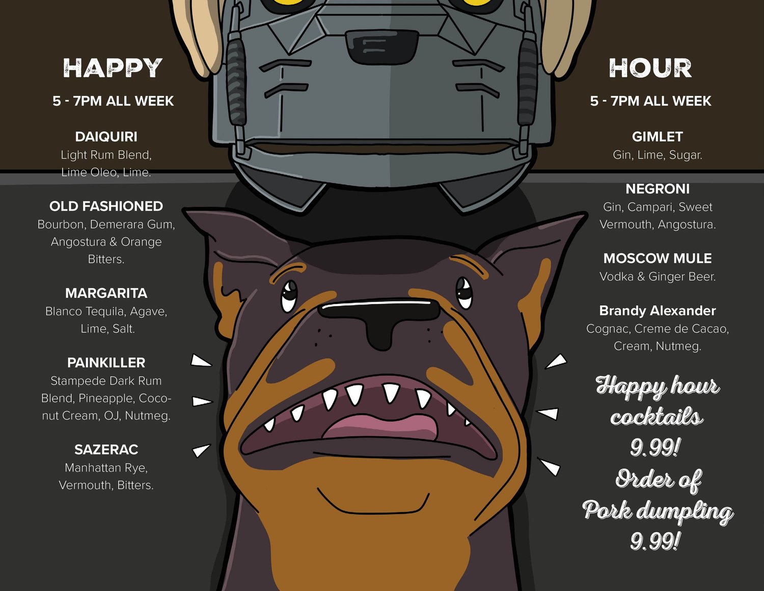
The adventures of a cyber dog
Driven by the intrigue of sci-fi and fantasy, the owner wanted the winter menu built as a graphic-novel story: the adventures of a kidnapped pup, turned cyber dog, trying to find his way home. Each cocktail lives inside a chapter of that story.
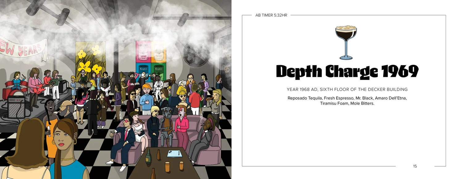
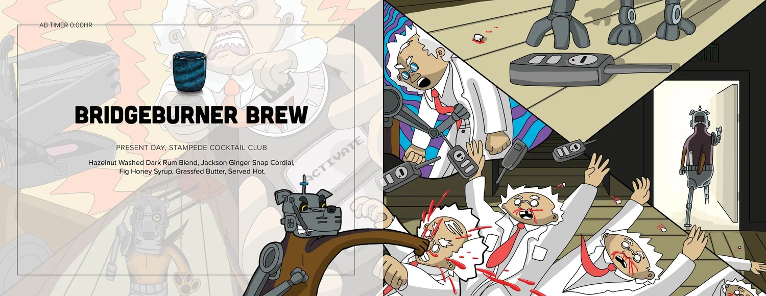
Pen and paper first
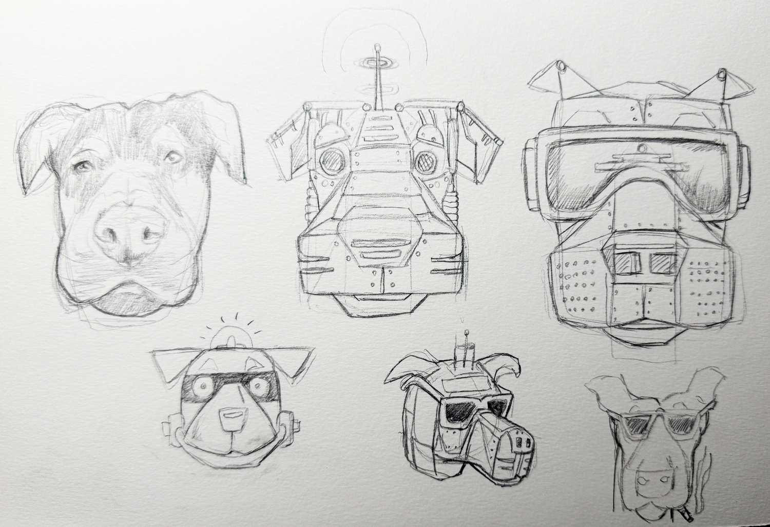
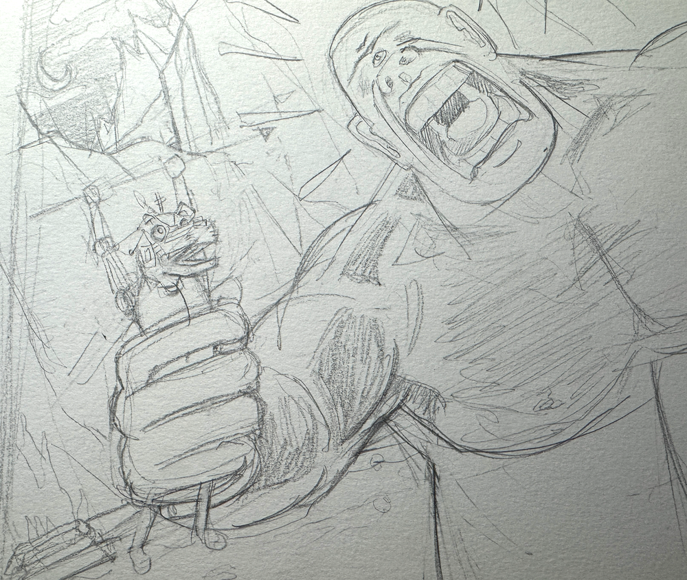
I started with illustration, because pen and paper is the fastest way to get ideas out. The owner originally wanted the main character, a cartoon version of his dog, to have attitude and get into all sorts of trouble. After a real-world event made the original concept untenable, we scrapped that rendition and refocused on pure epic adventure: an illustrated page on one side, unique fonts and illustrated versions of each drink on the other.
With that much visual weight, the risk is a customer getting lost. So I kept certain elements consistent across every page. The customer could trust the menu to keep one visual language no matter how wild each page got, and focus on the story instead of hunting for their cocktail.
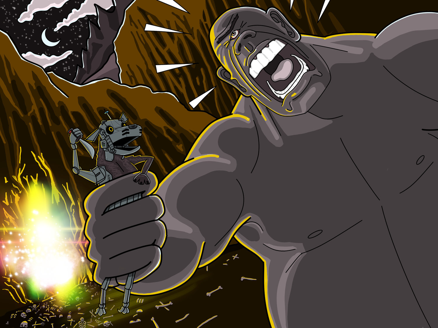
Ancient stone, tied together
The serif I chose for the lead page evokes ancient Greek stone etching, paired with a softer global typeface that runs as a stringer through the whole menu. That pairing is the through-line tying every wildly different page together aesthetically. Once the first page worked, I repeated the process across the full set.
People asked to take it home
The menu released the first day of December 2025 and was very well received. Multiple customers have asked to buy the menu to take home. You see people laughing and pointing out favorite pages, showing them to each other. Boosting interaction and social exchange between customers was part of the goal for the menu, and it worked.
A whodunit, cast from the bar itself
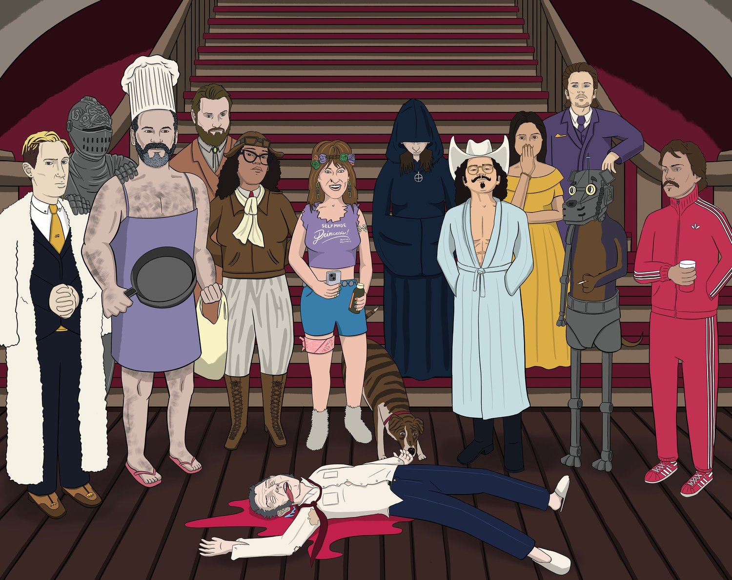
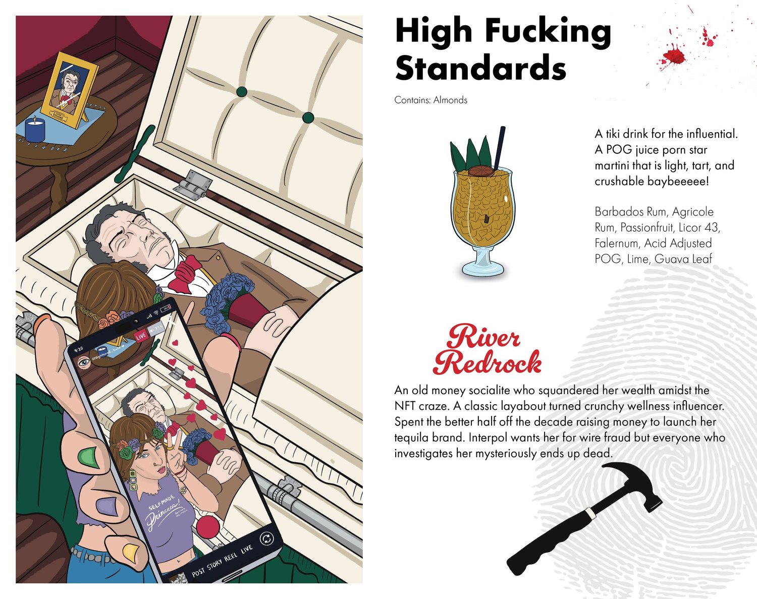
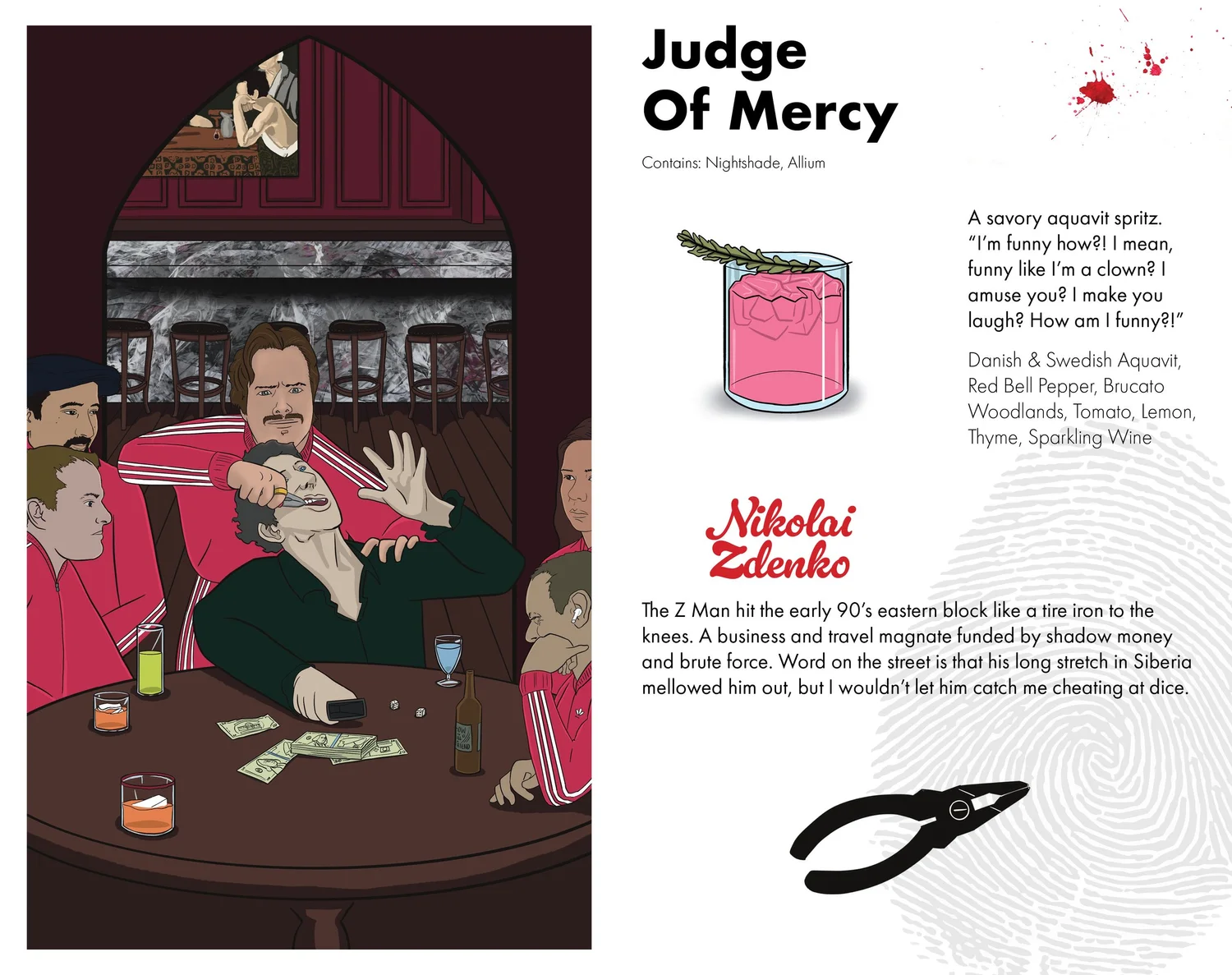
The second seasonal menu took the shape of a Clue-style mystery, a whodunit built around the bar’s own world. I illustrated each of the bartenders and familiar faces from the community as the cast of suspects, so regulars could find themselves and each other inside the menu. The drinks live inside the mystery the way the winter cocktails lived inside the cyber-dog story.
Casting real people as the characters did something the winter menu couldn’t: it made the menu personal to the room. A regular opening it doesn’t just read a themed list. They recognize the person who made their last drink, drawn into the plot.
Loud, but balanced
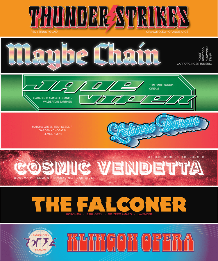
Stampede is known for delicious NA cocktails, so everyone can have fun, not just those who drink. For New Year, we wanted a menu that was interesting to look at and bombastic: a study of fonts, loud yet balanced.
The day-to-day
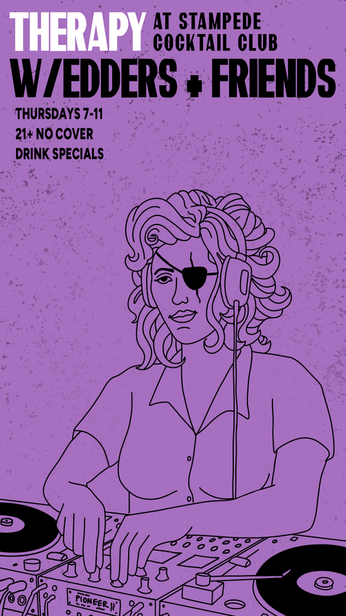
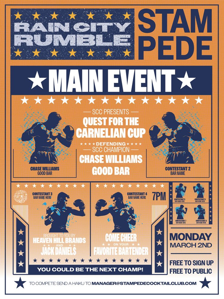
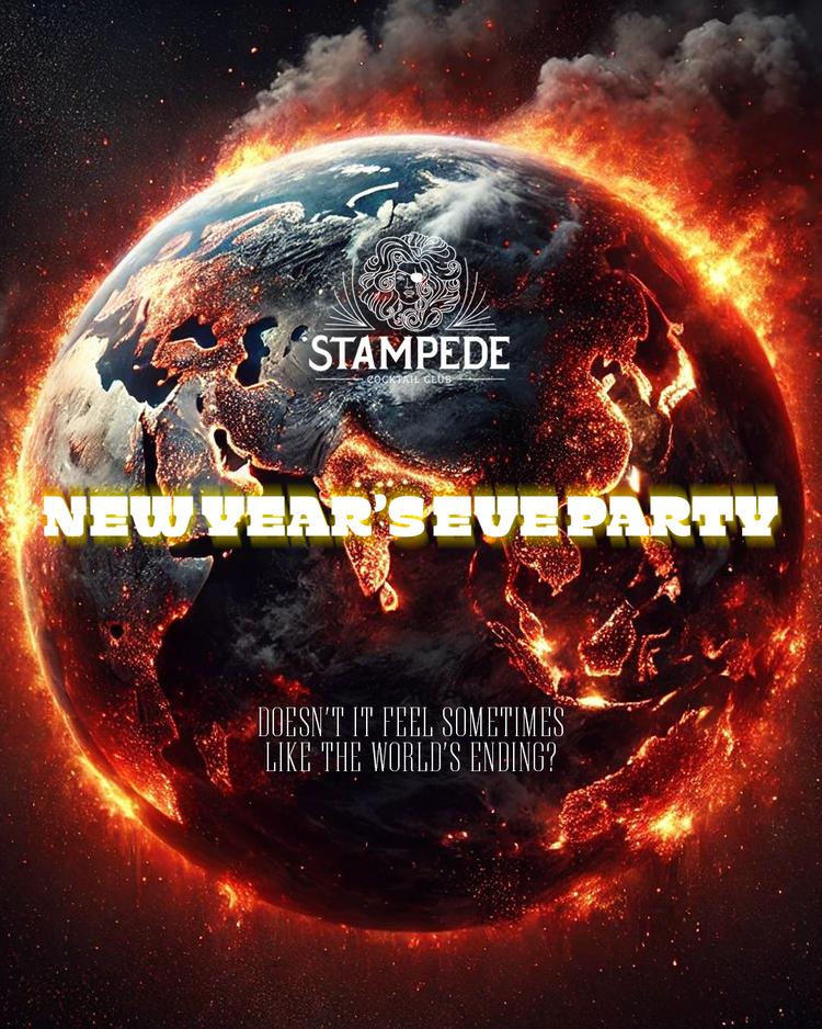
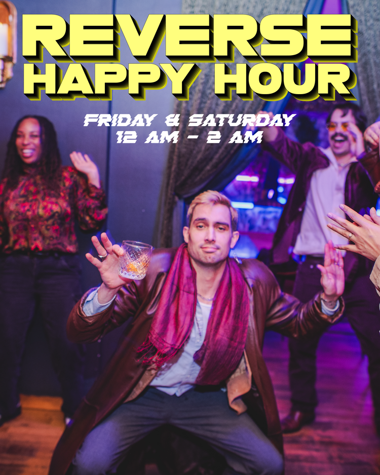
A collection of posters and social posts created for the bar, often several concepts for the same event. This is the day-to-day work, the steady cadence between the big seasonal menus that come around every six months.
A menu people want to keep
A drinks menu that customers ask to take home is a menu doing more than listing drinks. Building each seasonal menu as its own illustrated narrative, held together by a consistent visual language underneath the chaos, turned a functional object into part of why people come to Stampede in the first place.
Contact Me