
Self-initiated • Technical Illustration
The manual behind the machine
An illustrated parts catalog for a 133cc two-stroke engine, drawn to the standard a manufacturer could publish as is. It recreates the IPC methods I use professionally, on an engine I'm free to show, and sits inside Stanley Black & Decker's published brand system — a real manufacturer's guidelines, applied to prove the work holds outside my own taste.
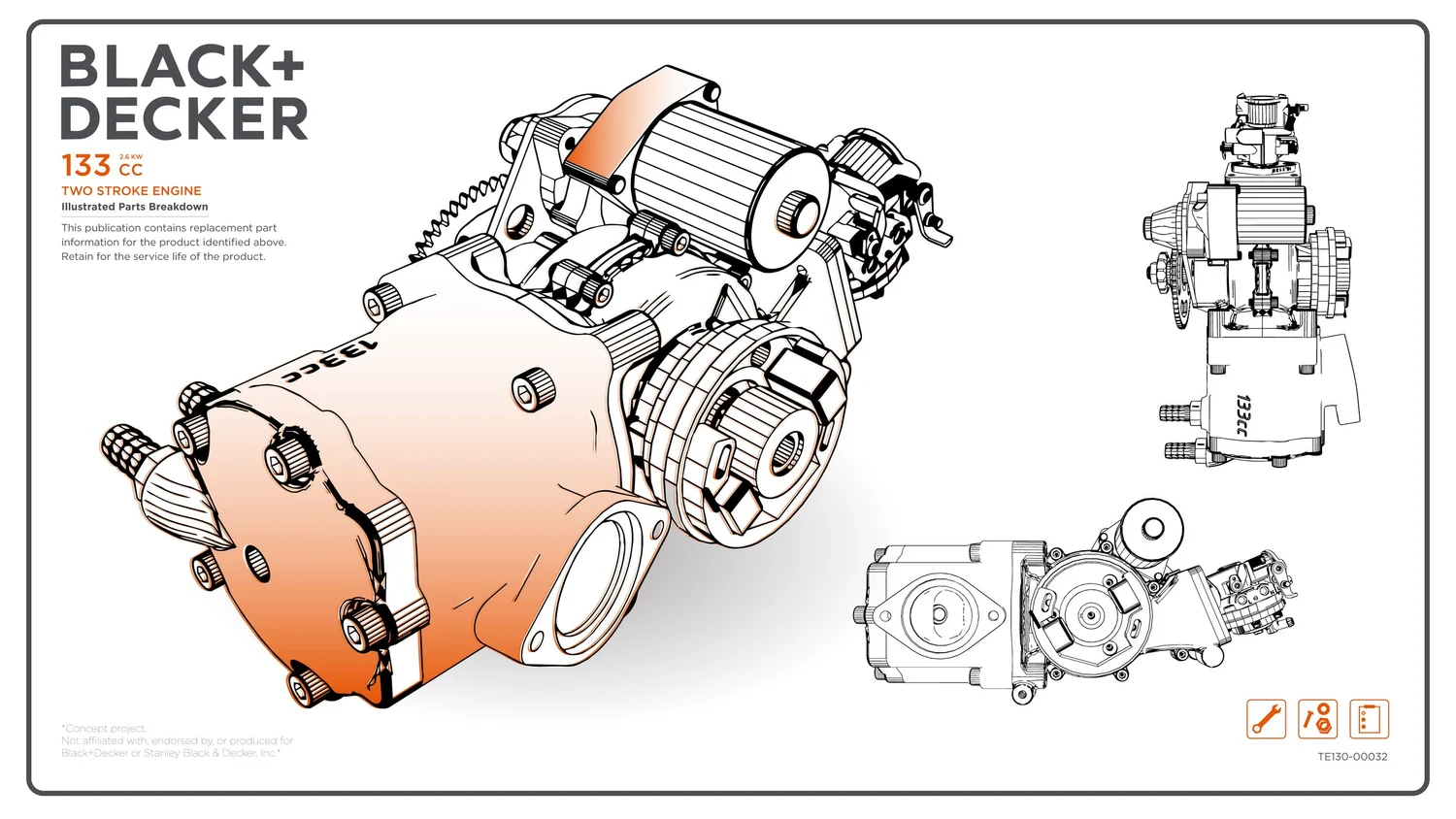
Showing the work I can’t show
My strongest technical illustration work — a 60-page illustrated parts catalog deployed across operations in ten countries — was produced under NDA and can't be shown. So I rebuilt the capability on something I own: a full IPC treatment of a 133cc two-stroke engine, held to the same standard I work to professionally.
The constraint I set was that it had to be publishable, not just presentable. Every plate follows one line-weight standard and one callout system, and the whole set is drawn inside Stanley Black & Decker's published brand guidelines, so it reads as a manufacturer's document rather than a designer's study.
Working inside someone else's brand system is most of the job in real IPC production, and it's the part that's hardest to fake. Aligning line work, callouts, type, and color to a published standard — while keeping every plate technically accurate — is the actual craft the finished manual hides.
Exploded, numbered, on-brand
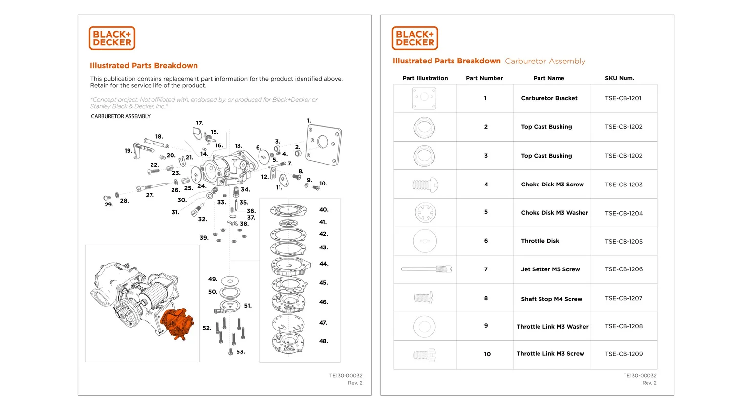
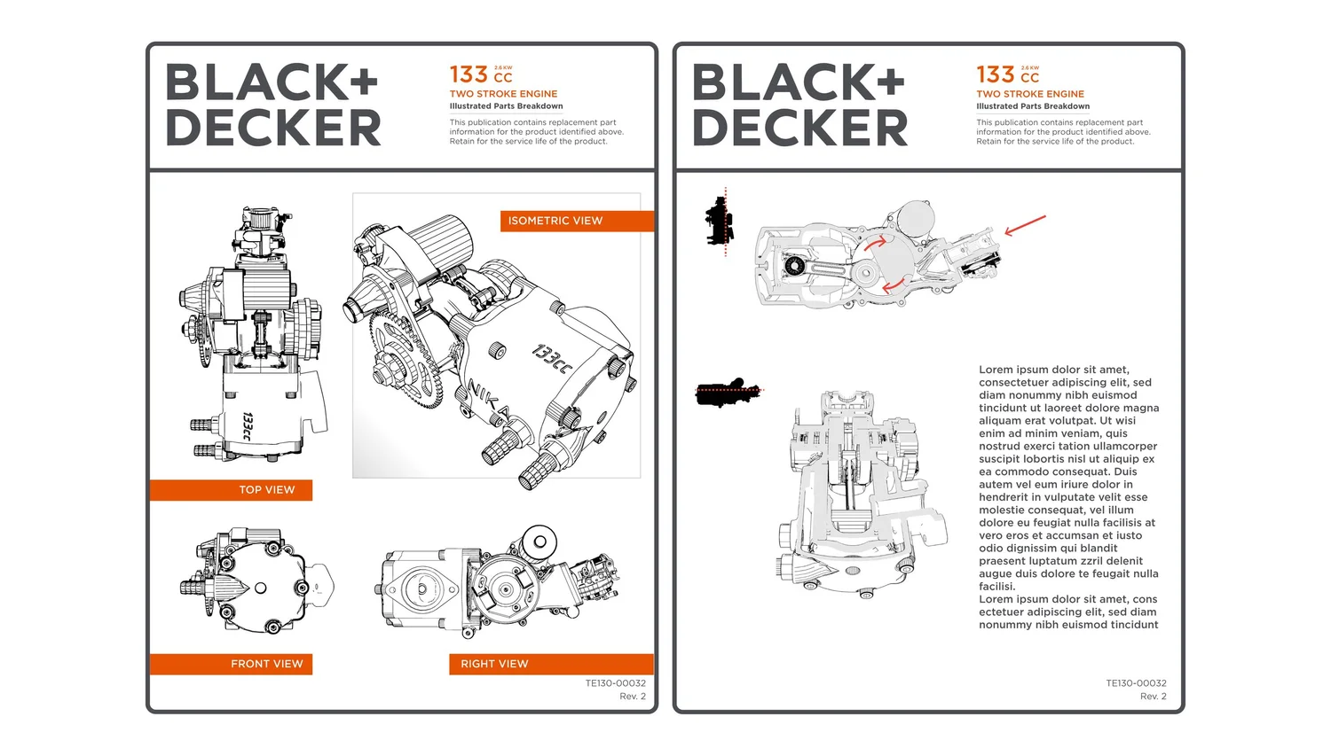
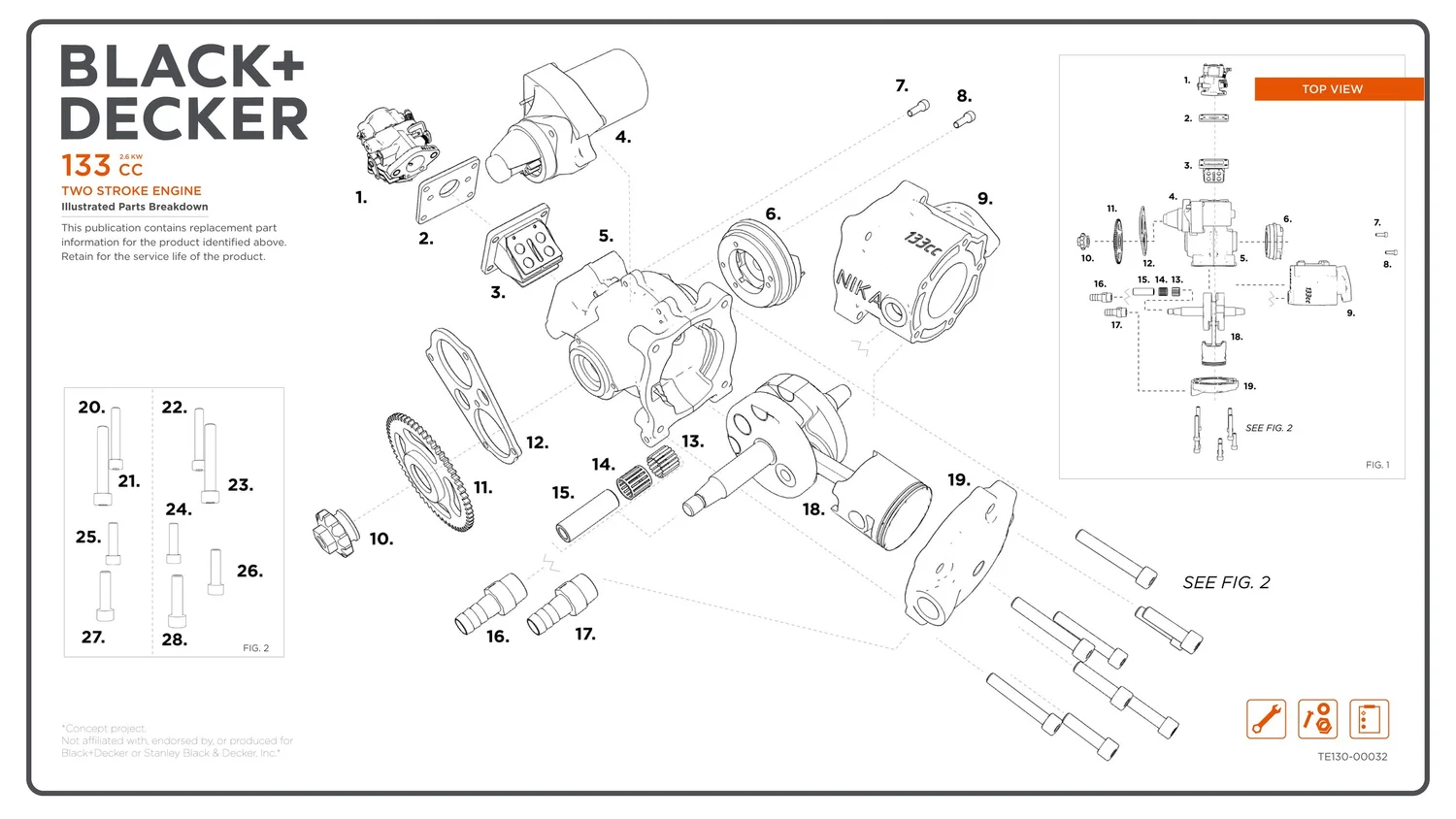
Each plate is drawn from the assembly rather than traced from a render, so part hierarchy and numbering carry through into the callouts instead of being retyped. Line weight, balloon style, and leader conventions hold across every view.
One CAD source, every deliverable
The pipeline matters more than any single page. Illustrations are generated from the CAD assembly rather than traced from renders, so part hierarchy, names, and quantities carry through into the parts table instead of being retyped — and when the model changes, the figures follow.
The assembly comes in with its tree intact, then gets restructured: engineering organizes parts by how the product was designed, documentation needs them ordered by how it comes apart and goes back together. Different trees, and the second one belongs to the technician. The breakdown is planned before any art is drawn — parts grouped, callout order set, and lookalike hardware flagged, while changes are still cheap.
Only then does line art get made, and it gets made to the constraint: one line-weight standard, consistent leaders and balloons, and a callout system that reads at the size the plate actually prints. The goal is a drawing a technician trusts without a caption.
Working inside the brand system
Drawing inside Stanley Black & Decker's published guidelines is the point of the exercise. Type, color, line treatment, and icon style all follow the brand system rather than my own defaults, so the finished plates read as documentation that manufacturer could actually ship. Matching a house style you didn't set is most of what production illustration asks for.
The plates are built so the system carries forward: a defined grid, reusable callout components, and an icon set drawn to one style, so the next plate or the next icon stays consistent without re-deciding anything. Consistency is what the system produces by default rather than something re-earned each drawing.
That's the same instinct behind the Tensar render library and every asset system I build: solve it once, structure it so it's reusable, and hand it over in a state where the routine case never comes back to the designer.
A system, not a stack of drawings
The deliverable that matters isn't any single plate. It's the standard that produces all of them consistently, and would produce the next one the same way. Grid, line weights, callout conventions, and icon style live in the system rather than in the head of whoever drew the last plate.
It's the same discipline as the NDA'd catalog it stands in for: draw it right once, structure it so it's reusable, and the routine case never comes back to the illustrator.